 Home
Home CSS
CSS HTML
HTML XHTML
XHTML JavaScript
 Bootstrap
 jQuery
 PHP
PHP XML
XML JSON
JSON Python
 C++
C++ Java
Java C#
C# SQL
SQL Interview Q
Bootstrap Grid CSSIn the realm of web development, creating responsive and visually appealing layouts is paramount. CSS Bootstrap Grid, a robust framework, stands out as a powerful tool that streamlines the process of building flexible and responsive web designs. With its grid-based layout system, Bootstrap has revolutionized the way developers create web pages. This comprehensive guide will delve into the nuances of the Bootstrap Grid System, exploring its features, functionality, best practices, and practical examples. What is Bootstrap?Bootstrap, at first evolved via Mark Otto and Jacob Thornton at Twitter, is an open-source, front-give framework. It consists of HTML, CSS, and JavaScript components geared toward simplifying net development. Bootstrap helps the advent of regular, responsive, and mobile-first net designs with minimum effort. Importance of Responsive Web DesignWith the proliferation of diverse devices used to get entry to the net, developing websites that adapt seamlessly to diverse display screen sizes and orientations is vital. Responsive internet layout ensures the most useful consumer experience throughout computer systems, laptops, tablets, and smartphones. Bootstrap's grid device plays a pivotal position in accomplishing this responsiveness. Grid Basics: Rows and ColumnsThe Bootstrap Grid System is constructed on a 12-column format. Webpages are divided into rows, such as as many as 12 columns. Developers can allocate these columns to deal with one-of-a-kind content elements. Columns may be mixed or stacked to create flexible layouts. Container, Row, and Column StructureBootstrap employs three primary components for its grid system:
Responsive ClassesBootstrap provides responsive classes to define how columns behave on different devices. These classes, such as col-xs-, col-sm-, col-md-, and col-lg-, specify column widths for extra-small, small, medium, and large screens, respectively. This approach enables developers to craft layouts tailored to specific screen sizes. Offset, Nesting, and Ordering Columns
Implementing Bootstrap Grid System1. Getting Started with BootstrapIntegrating Bootstrap into an undertaking is straightforward. Developers can include Bootstrap's CSS and JavaScript documents via Content Delivery Networks (CDNs) or by downloading them directly from the Bootstrap website. Once related, the framework's classes turn out to be to be had for use inside HTML markup. Basic Grid Layout Example Let's explore a simple example to demonstrate Bootstrap's grid system: HTML Code: Output: Laptop View: 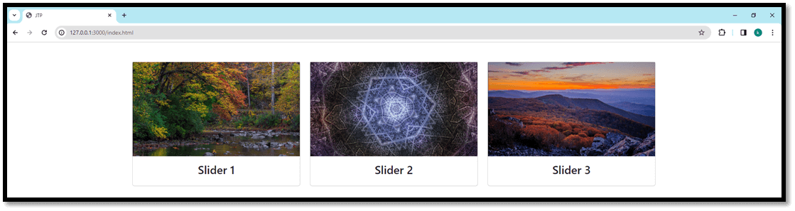
Mobile View: 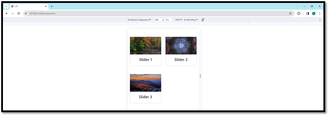
In this case, a field holds a row with three columns, every spanning four columns on medium-sized monitors and above. 2. Image Gallery/GridDeveloping an image gallery or grid format is simplified using Bootstrap's grid device. By using columns and rows, developers can create visually lovely grids that elegantly display pictures or media content material. Example: HTML Code: Output: Laptop View: 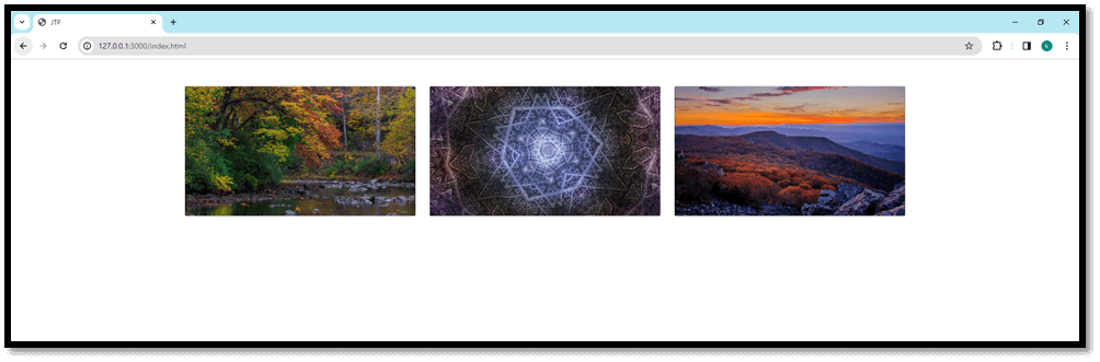
Mobile View: 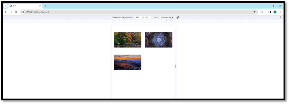
In this example, images are displayed in a responsive grid layout, adjusting the number of columns based on the screen size for optimal viewing. 3. Testimonial or Quote CarouselBootstrap's grid device can also be used in conjunction with the Carousel factor to create a responsive testimonial or quote slider. By structuring the content material inside columns, builders can layout a sliding carousel that showcases testimonials or costs in a visually attractive manner. HTML Code: Output: Laptop View: 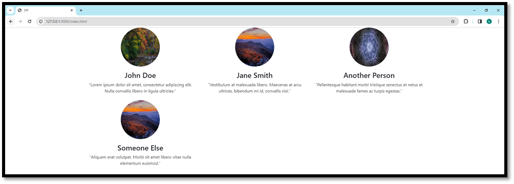
Mobile View: 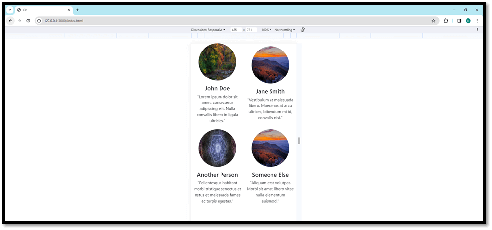
Utilizing columns within carousel items allows for multiple testimonials to be displayed side by side or stacked based on the screen size, creating an engaging and responsive carousel experience. Advanced Grid Layout TechniquesDevelopers can leverage advanced techniques to craft intricate layouts:
Customizing Bootstrap GridBootstrap's flexibility permits for personalization. Developers can override default styles, create custom breakpoints, or increase the grid machine to match unique task necessities. Customizing instructions or including new ones empowers builders to tailor Bootstrap to their needs while preserving its middle capability. Best Practices and Tips1. Maintain Consistency Consistency is key to a user-friendly interface. Maintain a regular grid shape throughout the internet site to ensure a cohesive design and seamless personal experience across pages. 2. Optimize for Performance Avoid excessive nesting and column usage. Overcomplicated grids may additionally affect overall performance. Opt for easier solutions every time possible to decorate website performance. 3. Utilize Utility Classes Wisely Bootstrap gives application lessons for brief styling adjustments. However, immoderate use of software lessons might result in code redundancy. Balance the use of application lessons with maintaining easy, maintainable code. 4. Test Across Devices Always check your designs on various devices and display sizes to ensure responsiveness and visual consistency. Advanced Features of Bootstrap Grid System1. Flexbox Integration Bootstrap four introduced a migration from the conventional drift-based totally format to utilizing Flexbox as its default format model. Flexbox provides more flexibility and control over elements' alignment, distribution, and ordering in the grid system, enhancing responsiveness and simplifying complicated layouts. 2. Alignment and Justification Classes Bootstrap presents alignment instructions, including align-gadgets, justify-content material, and align-self, that permit developers to align and justify-content material vertically and horizontally inside columns or rows. These lessons offer granular control over the positioning of factors inside the grid. 3. Responsive Embeds The grid gadget seamlessly integrates with responsive embed training to make sure multimedia elements like films, maps, or iframes maintain their aspect ratios and modify in step with different screen sizes without breaking the format. 4. Bootstrap Breakpoints and Media Queries Bootstrap's predefined breakpoints (greater-small, small, medium, and massive screens) are aligned with CSS media queries, allowing builders to craft responsive designs effortlessly. Customizing those breakpoints or adding new ones using media queries allows first-class-tuning layouts for unique gadgets or viewport sizes. Customization and Extensibility1. Theming and Custom Builds Bootstrap gives enormous theming abilities via Sass variables, permitting builders to customize the grid device's default patterns, such as colors, typography, spacing, and breakpoints. Additionally, developers can create custom builds by choosing particular components or enhancing Sass variables to lessen the framework's report length, optimizing performance. 2. Extending the Grid System Developers can increase Bootstrap's grid device by developing custom instructions or additives to address specific format necessities. By leveraging Bootstrap's modular structure, it's viable to create reusable additives that align seamlessly with the grid, improving flexibility and scalability. 3. Integration with Other Bootstrap Components The grid gadget seamlessly integrates with various Bootstrap components, including navigation bars, cards, bureaucracy, and models. This integration guarantees consistent alignment and responsiveness across distinct additives, simplifying the improvement method and keeping visible concord. Impact on Modern Web Development Practices1. Mobile-First Approach Bootstrap's mobile-first technique advocates designing for smaller screens first and then progressively improving layouts for larger displays. This method ensures a solid basis for responsive design, prioritizing cell customers' revel without sacrificing functionality or aesthetics. 2. Rapid Prototyping and Development The grid device's simplicity and flexibility allow fast prototyping and iteration. With predefined training and responsive layout principles, builders can fast mock up layouts, experiment with exclusive preparations, and iterate on designs correctly. 3. Framework Agnostic Use Cases While Bootstrap offers a complete grid device, its ideas and concepts are adaptable to different CSS frameworks or maybe custom-constructed solutions. Understanding the middle principles of grid-based totally format layout empowers builders to create responsive layouts irrespective of the framework used. Use Cases and Application Scenarios1. E-commerce Websites Bootstrap's grid machine is particularly beneficial for e-commerce systems that require diverse layouts to exhibit merchandise, categories, filters, and promotional content. By leveraging the grid's flexibility, builders can create product grids, responsive carousel displays, and fluid checkout pages tailor-made for seamless buying reviews across gadgets. 2. Portfolio and Showcase Websites For portfolios or show off web sites, the grid machine allows the advent of visually captivating galleries, photo grids, and venture showcases. By combining columns and responsive training, developers can craft dynamic portfolios that adapt elegantly to various screen sizes, permitting creatives to display their paintings effectively. 3. News and Blog Platforms News and weblog websites necessitate properly prepared content layouts. Bootstrap's grid gadget aids in developing dependent grids for article lists, featured testimonies, sidebars, and advertisement sections. The responsive nature of the grid ensures readability and navigability throughout different gadgets. 4. Dashboard and Admin Interfaces Developing responsive dashboards or admin panels calls for a flexible layout gadget. Bootstrap's grid lets developers layout data-rich interfaces with configurable grid-primarily based additives, making sure a constant and intuitive enjoyment for administrators or users handling complex information. Optimization Strategies for Bootstrap Grid System1. Minimizing Grid Complexity While the grid device offers flexibility, it is critical to preserve simplicity. Overcomplicating layouts with excessive nesting or complicated column structures can restrict overall performance. Strive for stability among flexibility and ease to optimize load times and responsiveness. 2. Leveraging Bootstrap's Utility Classes Bootstrap gives software instructions for margin, padding, alignment, and show, enabling builders to make short changes without including excessive custom CSS. However, really apt use of these utility training is crucial to save you code bloat and keep code clarity. 3. Optimizing for Performance Implementing performance optimization techniques together with CSS minification, JavaScript bundling, and making use of browser caching for Bootstrap's CSS and JavaScript files can appreciably improve page load instances. Additionally, lazy-loading pix within grid layouts can beautify ordinary performance. Practical Examples1. Responsive Navbar Using Grid Classes Bootstrap's grid gadget may be used to create a responsive navbar. By utilizing grid instructions inside the navbar shape, developers can design navigation menus that fall apart gracefully on smaller screens while keeping a based format on large displays. 2. Grid-based Form Layout Developing forms with varied input fields is simplified with the grid device. By organizing shape factors within columns, builders can create visually attractive and user-pleasant forms that adapt seamlessly to one-of-a-kind display screen sizes, enhancing shape readability and value. 3. Media Object Layouts Bootstrap's grid system enables the creation of media object layouts, which include displaying snapshots with accompanying textual content. Utilizing columns and alignment training, builders can craft enticing layouts that gift content in a visually attractive and established manner. ConclusionThe CSS Bootstrap Grid System stands as a foundational tool in internet development, catering to a myriad of use instances and situations across diverse industries. Its versatility, coupled with optimization strategies and sensible implementation examples, showcases its adaptability in addressing present day design challenges. By harnessing the strength of the grid machine, builders can create fascinating and responsive layouts for numerous packages, making sure top of the line consumer reports across gadgets. Embracing great practices and optimization strategies and exploring its sizeable capabilities, in addition, solidifies the Bootstrap Grid System's role as a cornerstone of contemporary web improvement, empowering builders to construct dynamic and user-centric net interfaces.
Next TopicBootstrap Table CSS
|
 For Videos Join Our Youtube Channel: Join Now
Feedback
- Send your Feedback to [email protected]
Help Others, Please Share


