 Home
Home CSS
CSS HTML
HTML XHTML
XHTML JavaScript
 Bootstrap
 jQuery
 PHP
PHP XML
XML JSON
JSON Python
 C++
C++ Java
Java C#
C# SQL
SQL Interview Q
Skeleton CSSSkeleton CSS is a prominent front-end framework that is known for its ease of use and effectiveness. Skeleton is a framework that offers a novel method for creating fluid and customizable user interfaces. It is ideal for those starting smaller projects or looking for a framework without the bulk of bigger rivals. At its core, Skeleton CSS stands out with its minimalist philosophy, boasting a mere 400 lines of code. It's tailored for those who want an elegant, effective tool without the complexity of more extensive frameworks. With a laser focus on responsive CSS modules, Skeleton ensures that your web designs seamlessly adapt to different screen sizes. Key Features of Skeleton CSS
Grid SystemThe 12-column format of the Skeleton grid system offers a well-balanced foundation for content organization. This grid's maximum width of 960 pixels ensures ideal viewing on a range of devices. A sturdy 12-column responsive fluid grid system is provided by Skeleton CSS, which gives an adaptable framework for organizing web layouts. Because of its ability to adjust fluidly to different screen sizes, this grid system is a vital tool for building web pages that are both visually appealing and responsive. ExampleLet's delve into some example code to illustrate how the Skeleton grid system works: Output: 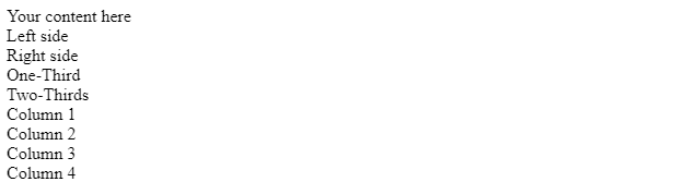
Button StylingButton plays a vital role in user interactions in web development. Skeleton CSS keeps it simple yet effective with two basic button styles: standard and primary. Standard Buttons:
Below are examples of implementing standard buttons on different elements: Output: 
Primary Buttons
Implementation of primary buttons follows a similar pattern: Output: 
The buttons on Skeleton are consistent, simple, and practical. They come with simple button designs that you can alter to fit the style and appearance of your website. The button styles uphold a dependable visual concept, which facilitates their seamless integration with form components, guaranteeing a well-thought-out and unified online form. In essence, Skeleton CSS takes a straightforward approach to button styling. The standard and primary styles provide a versatile toolkit for developers, offering buttons that are not only practical but also seamlessly blend into a website's overall design. Form CreationSkeleton CSS simplifies the process of form creation, offering styles for various form elements. Let's delve into the creation of a basic form using Skeleton's elements and styles. Example:Consider a simple form with fields for username, email, password, and a dropdown for a reason for contact. Output: 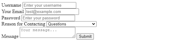
Table StylingYou can apply styles to both table heads (thead) and table rows (tr). This ensures clarity and readability when presenting data in a tabular format. In Skeleton, styling tables is straightforward. Demonstration with Simple Table Structure:Consider a simple table structure demonstrating the application of Skeleton's styling to table heads and rows. Output: 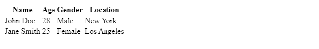
Developers may ensure that tables blend in smoothly with the overall style of their websites by employing these stylistic choices to keep a consistent design across the page. Applying consistent styles to tables without needless complication is made simple by Skeleton CSS's simplicity. Utility ClassesIn Skeleton CSS, utility classes are handy tools that provide specific styling functionalities to elements. These classes offer a quick and efficient way to apply common styles without the need for extensive custom styling. The u-full-width class ensures an element spans its container's entire width, making it responsive. It is applied to elements like images or containers to maintain a visually balanced layout. The u-max-full-width class has a maximum width constraint, preventing elements from stretching too wide on larger screens. The u-pull-right class floats an element to the right side of its container, aligning buttons or navigation items to the right. The u-cf class clears any floated elements within a container to prevent layout issues. Applying Utility ClassesLet's see how these utility classes can be applied in a real-world scenario: Output: 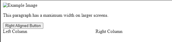
Benefits of Utility ClassesUtility classes enhance efficiency, consistency, and responsive design by simplifying the styling process, ensuring uniformity across elements, and creating layouts that adapt to different screen sizes, such as u-full-width. You may maintain a balance between efficiency and flexibility in styling by using these utility classes in your Skeleton CSS projects, which will result in a more responsive and integrated web design. Creating a Skeleton TemplateLet's break down the process into key sections: Navbar, Body, Sidebar, and Footer. 1. Navbar:In Skeleton, creating a simple navbar involves using the grid system and applying basic styles. Here's a snippet to get you started: Output: 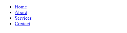
2. Body:The body of your webpage encompasses the main content. Utilize the grid system to create a flexible layout. Here's an example: Output: 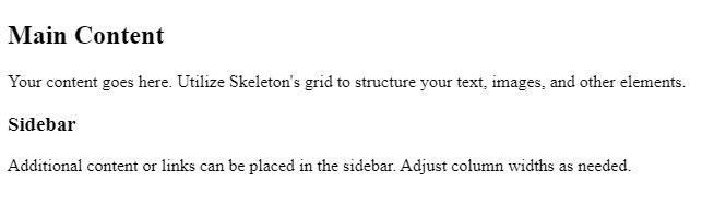
3. Sidebar:Adding a sidebar is a common design choice. Adjust the column widths and styles based on your project requirements. Here's a basic structure: Output: 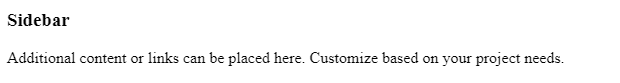
4. Footer:The footer is often overlooked but plays a crucial role. Use the grid system to structure your footer. Example: Output: 
ConclusionIn conclusion, this tutorial explores Skeleton CSS's fundamental aspects, including grid mastery, button styling, form crafting, table elegance, utility classes, and template creation. It highlights the 12-column fluid grid system, button styles, form crafting, table elegance, utility classes, and template creation. Skeleton CSS offers simplicity without compromise, allowing for vast possibilities in web development. The tutorial encourages exploration, customization, and pushing boundaries. Download Skeleton CSS to create seamless, responsive web experiences.
Next TopicStack Elements in CSS
|
 For Videos Join Our Youtube Channel: Join Now
Feedback
- Send your Feedback to [email protected]
Help Others, Please Share


