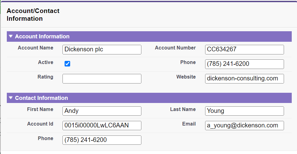
<apex: inputCheckbox> Component in Visualforce PageThe <apex: inputCheckbox> is a HTML input element of type checkbox. It is another input element used for getting the input from the user for the controller method that doesn't correspond to the field on a Salesforce object. The HTML pass-through attributes are supported by this component using the "html-" prefix, which are attached to the generated <input> tag. The <apex: inputCheckbox> has the following attributes: 1. accesskeyThe acesskey is a string type attribute that defines the keyboard access key that puts the checkbox in focus. We can select or deselect the checkbox when it is in focus. Syntax 2. dirThe dir is a string-type attribute used to specify the direction in which the generated HTML component should be used. RTL and LTR are the two possible values for the dir attribute. Syntax 3. disabledThe disabled is a Boolean type attribute that specifies whether this checkbox should be displayed in the disabled state or not. By default, its value is set to false. Syntax 4. idThe id is a string type attribute, i.e., a unique identifier that allows this component to be referenced by other components in the page. Syntax 5. immediateThe immediate attribute is of type Boolean. If its value is true, the action associated with the component will happen immediately. The function will not process the validation rules associated with the checkbox on the page. Syntax 6. labelThe label is a string-type attribute used to display text next to the control and reference the control in the error message. Syntax 7. langThe lang is a string-type attribute used for specifying the base language used for the generated HTML output. The possible values of this attribute are en and en-US. Syntax 8. onblurThe onblur is a string-type attribute used to invoke the JavaScript method when the onblur event occurs or simply when the focus moves off the checkbox field. Syntax: 9. onchangeThe onchange is a string-type attribute used to invoke the JavaScript method when the onchange event occurs or simply when the user changes the content of the checkbox field. Syntax: 10. onclickThe onclick is a string-type attribute used to invoke the JavaScript method when the onclick event occurs or when the user clicks the checkbox field. Syntax: 11. ondblclickThe ondblclick is a string type attribute used to invoke the JavaScript method when the ondblclick event occurs or when the user clicks the checkbox field twice. Syntax: 12. onfocusThe onfocus is a string-type attribute used to invoke the JavaScript method when the input event occurs or the focus is on the field. Syntax: 13. onkeydownThe onkeydown is a string-type attribute used to invoke the JavaScript method when the onkeydown event occurs or simply when the user presses a keyboard key. Syntax: 14. onkeypressThe onkeypress is a string-type attribute used to invoke the JavaScript method when the onkeypress event occurs or simply when the user holds down or presses a keyboard key. Syntax: 15. onkeyupThe onkeyup is a string-type attribute used to invoke the JavaScript method when the onkeyup event occurs or when the user releases a keyboard key. Syntax: 16. onmousedownThe onmousedown is a string-type attribute used to invoke the JavaScript method when the onmousedown event occurs or simply when the user presses the mouse button. Syntax: 17. onmousemoveThe onmousemove is a string type attribute used to invoke the JavaScript method when the onmousemove event occurs or simply when the user moves the mouse pointer. Syntax: 18. onmouseoutThe onmouseout is a string-type attribute used to invoke the JavaScript method when the onmouseout event occurs or simply when the user moves the mouse pointer away from the checkbox. Syntax: 19. onmouseoverThe onmouseover is a string-type attribute used to invoke the JavaScript method when the onmouseover event occurs or simply when the user moves the pointer over the <apex: inputCheckbox>. Syntax: 20. onmouseupThe onmouseup is a string-type attribute used to invoke the JavaScript method when the onmouseup event occurs or when the user releases the mouse button. Syntax: 21. onselectThe onselect is a string-type attribute used to invoke the JavaScript method when the onmouseup event occurs or simply when the user selects the checkbox. Syntax: 22. renderedThe rendered is a Boolean type attribute that specifies whether this component needs to be rendered on the page or not. By default, its value is set to true. Syntax: 23. requiredThe required is a Boolean type attribute that specifies whether this checkbox is a required field or not. By default, its value is set to false. Syntax: 24. selectedThe selected is a Boolean type attribute that specifies whether this checkbox should be rendered in its checked state or not. By default, its value is set to false. Syntax: 25. styleThe style is a string type attribute used to specify the inline CSS style that will be applied for displaying the checkbox component. Syntax: 26. styleClassThe styleClass is a string type attribute used to specify the style class that will be applied for displaying the checkbox component. Syntax: 27. tabindexThe tabindex is a string type attribute used to specify the order in which this field is selected compared to other page components when a user presses the Tab key repeatedly. The value of this attribute should be between 0 to 32767. Syntax: 28. titleThe title is a string-type attribute that specifies the text to display as a tooltip when the user's mouse pointer hovers over this component. Syntax: 29. valueThe value is an Object type attribute, i.e., a merge field that references the controller class variable that is associated with this field. Syntax: Let's take an example to understand how we can use the <apex: inputCheckbox> component on the Visualforce page. ApexInputCheckboxExample.vfp ApexInputCheckboxController.apxc Output  |