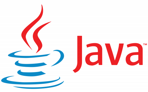
Java LogoJava is a famous and widely used object-oriented programming language. It was developed by Sun Microsystems in 1995. Later in 2009, Oracle Corp. acquired Java. During this period Java also changes its logo. In this section, we will discuss about the visual identity of Java i.e. Java logo. Also, we will discuss its source and meaning in detail. History of Java LogoThe visual identity of the well-known programming language is fun and can be recognized in a flash. The cup of coffee in blue and red shading mix has been with the brand since its starting and was just upgraded once, in 2003, keeping the original sense and color shading range. Evolution of Java Logo
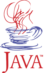
1995:When Java was launched in 1995, it had no visible identity. 1996-2003:The first Java logo was created in 1996, just after the release of the language. The Java logo is prototyped as a blue coffee cup with red steam above it. The logo was a recognition for the Java engineers, who have a lot of coffee while developing the Java programming language. The coffee that they have consumed was Java coffee beans. It is a variety of coffee. Java coffee beans is a wet-processed (washed) coffee grown on the island of Java in Indonesia. So, the name of the programming language and the visible identity of the language were picked from the Java coffee beans by the founder of the Java programming language James Arthur Gosling. James Arthur Gosling often referred to as Dr. Java, OC is a Canadian computer scientist, best known as the founder and lead designer behind the Java programming language. Let's have a look at the Java logo. 
The logo was designed with smooth curved lines. It looks like a sketch. The cup in blue color represents a cup of hot coffee and the red smooth curved line just above the cup represents the steam. In simple words, it represents a cup of hot coffee. The name of the programming language (JAVA) in capital letters was placed just under the emblem. The first letter J was enlarged in comparison to other letters. The logo continued with the programming language for seven years i.e. 1996 to 2003. 2004 to Present:The present Java logo was modified in 2004. The blue coffee cup with red steam and a red wordmark are still there, but the contours are modified and made bolder. The cup is now more accurate and consists of only three thick smooth lines, while the steam of two vertical curves. 
The major change was made to the engraving (curving), such as the normal sans-serif textual style was supplanted by a modern, smooth sans-serif with somewhat adjusted lines and particular cuts. Another significant thing is that now the name of the programming language is written in a title case, with as it were "J" promoted. The principal letter has its tail somewhat abbreviated, which consummately adjusted the red rich steam lines, which are extended and pointed. The Java logo is instantly recognizable and timeless. Having nothing in common with the company's purpose, its coffee cup became an iconic symbol in the industry and brilliantly shows how extremely far from each other things can work together in building a strong brand.
Next TopicUndulating Number in Java
|
 For Videos Join Our Youtube Channel: Join Now
Feedback
- Send your Feedback to [email protected]
Help Others, Please Share


