PrimeFaces TooltipIt is a small pop-up box that displays information on the event. It is used to display message to the user when the user interact with the component. It includes various features like cutom effects, events and theme support. PrimeFaces provides <p:tooltip> component to create informative message in the JSF application. It also has various attributes that are tabled below. | Attribute | Default value | Type | Description |
|---|
| Value | null | Object | It is used to set value of the component. | | showEvent | mouseover | String | It is used to set event to display tooltip. | | showEffect | fade | String | Effect to be used for displaying. | | hideEvent | mouseout | String | It is used to set event for hiding the tooltip. | | hideEffect | fade | String | It is used to set effect to be used for hiding. | | showDelay | 150 | Integer | It is used to set delay time to show tooltip in milliseconds. | | hideDelay | 0 | Integer | It is used to set delay time to hide tooltip in milliseconds. | | for | null | String | It is used to attach the tooltip. | | style | null | String | It is used to set inline CSS style of the tooltip. | | escape | true | Boolean | It defines whether html would be escaped or not. | | trackMouse | false | Boolean | Tooltip position follows pointer on mousemove. | | beforeShow | null | String | It is used to execute script before tooltip is shown. | | position | right | String | It is used to set position of the tooltip. |
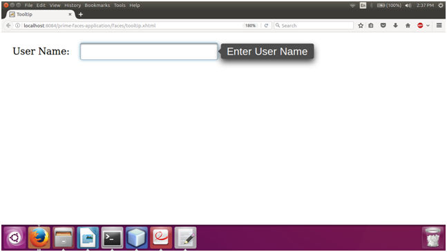
ExampleHere, in the following example, we are implementing <p:tooltip> component. This example contains the following files. JSF File// tooltip.xhtml Output: 
| 