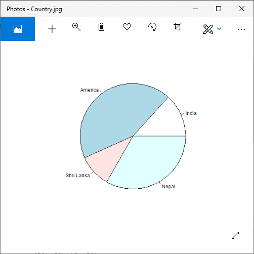
R Pie ChartsR programming language has several libraries for creating charts and graphs. A pie-chart is a representation of values in the form of slices of a circle with different colors. Slices are labeled with a description, and the numbers corresponding to each slice are also shown in the chart. However, pie charts are not recommended in the R documentation, and their characteristics are limited. The authors recommend a bar or dot plot on a pie chart because people are able to measure length more accurately than volume. The Pie charts are created with the help of pie () function, which takes positive numbers as vector input. Additional parameters are used to control labels, colors, titles, etc. There is the following syntax of the pie() function: Here,
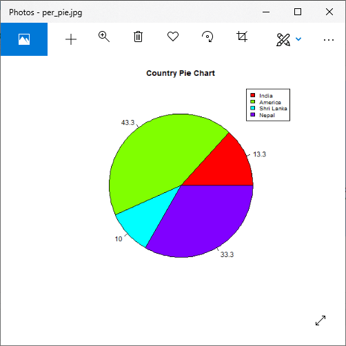
ExampleOutput:  Title and colorA pie chart has several more features that we can use by adding more parameters to the pie() function. We can give a title to our pie chart by passing the main parameter. It tells the title of the pie chart to the pie() function. Apart from this, we can use a rainbow colour pallet while drawing the chart by passing the col parameter. Note: The length of the pallet will be the same as the number of values that we have for the chart. So for that, we will use length() function.Let's see an example to understand how these methods work in creating an attractive pie chart with title and color. ExampleOutput:  Slice Percentage & Chart LegendThere are two additional properties of the pie chart, i.e., slice percentage and chart legend. We can show the data in the form of percentage as well as we can add legends to plots in R by using the legend() function. There is the following syntax of the legend() function. Here,
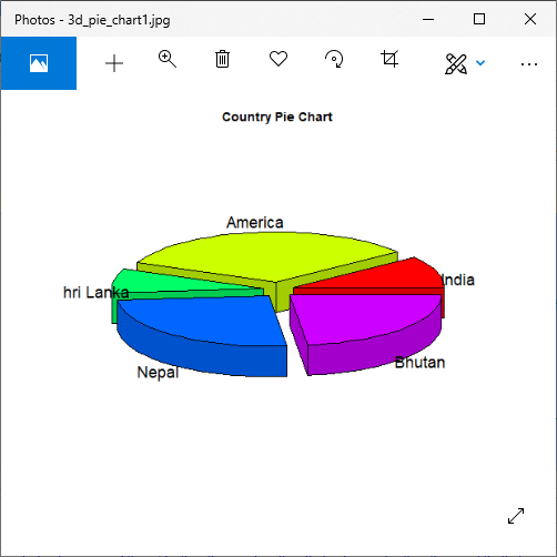
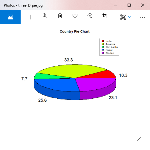
ExampleOutput:  3 Dimensional Pie ChartIn R, we can also create a three-dimensional pie chart. For this purpose, R provides a plotrix package whose pie3D() function is used to create an attractive 3D pie chart. The parameters of pie3D() function remain same as pie() function. Let's see an example to understand how a 3D pie chart is created with the help of this function. ExampleOutput:  ExampleOutput:  Next TopicR Bar Charts |