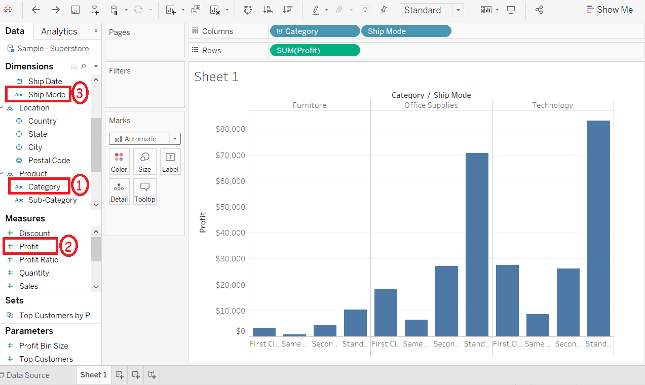
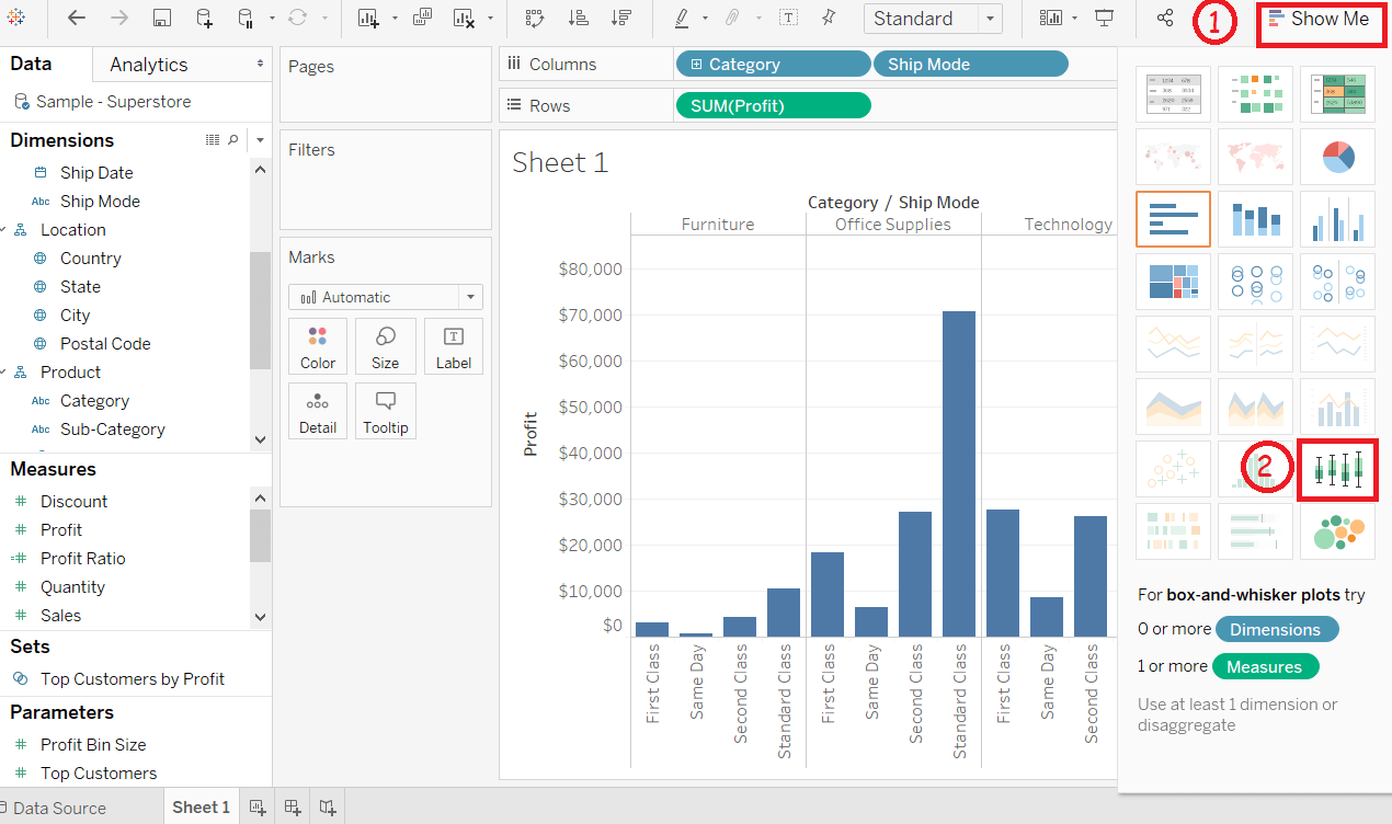
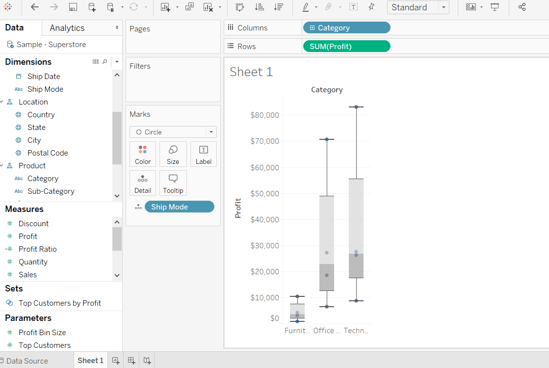
Tableau Box PlotThe box plot is also called the box-and-whisker plots. They show the distribution of value along an axis. All box indicates the middle 50 percent of the data where the middle two quartiles of the data's distribution. On both sides, the remaining 50 percent of data represents by lines called whiskers. To display all points within 1.5 times of interquartile range, which is all aspects within 1.5 times of the width of the adjoining box, or all points at the maximum area of the data. The Box Plot takes one or more measures with zero or more dimensions. For example, consider the data source such as Sample-Superstore and find the size of Profits field for the dimension Category for each ShipMode field values. Below are the steps to create a box plot. Step 1: Drag the dimension Category and drop into the Columns shelf. Step 2: Drag the measure Profit and drop into the Rows shelf. Step 3: Also drag the dimension ShipMode and drop into the right of the Category field in the Columns shelf.  Step 4: Choose the Box-and-Whisker plot from "Show Me".  The below chart appears that shows the box-and-whisker plot.Automatically Tableau reassigns the ShipMode to the Marks pane.  Next TopicTableau Heat Map |