Tableau Gantt ChartA Gantt chart is used for the comparison of data between categories. Also, it can be used to identify the time taken for each process. It shows the progress of the value of a task over some time. It is broadly used in project management and other types of variation study over some time. Gantt chart takes at least a dimension and a measure in addition to the time dimension. For example, using the data source such as Sample-Superstore, time is taken for shipping by each type of Ship Mode is given. For create, a Gantt chart follows the procedure is given as follows. Step1: go to the worksheet.
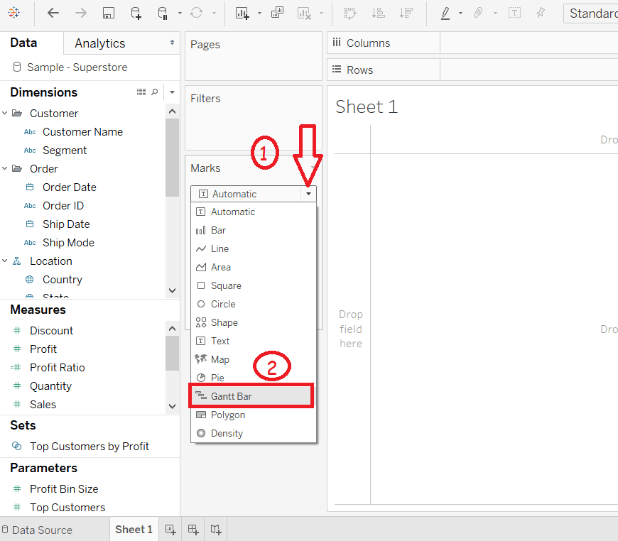 Step2: Drag Order Date into the column shelf. Step3: Right click on the Order Date field and select the "Day" as shown in the below screenshot. 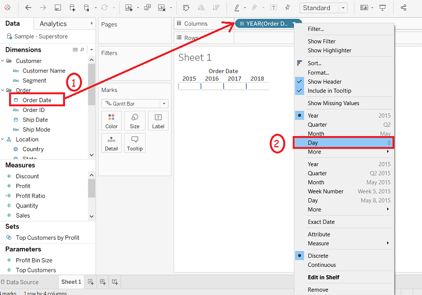 Step4: Click on the Analysis option in the menu bar. Step5: And select the Create Calculated Field option from the list. 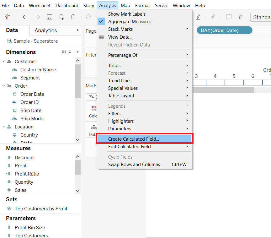 Step6: Enter the name of the calculated field such as "shipping". Step7: Write the expression "DATEDIFF ('day', [Order Date], [Ship Date])" to create the difference between the Order Date and Ship Date. Step8: Click on the OK button. 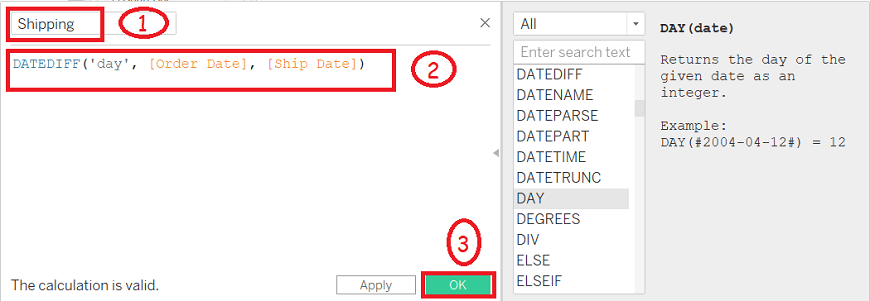 Step9: Drag Ship Mode into the rows shelf. Step10: Drag calculated field Shipping into the Size pane under Marks shelf. 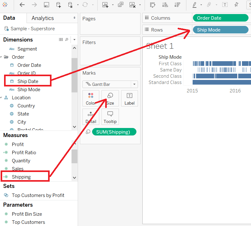 After completing all the above steps, it creates the Gantt chart that shows the time taken for each shipment across different Ship Mode, shown in the below screenshot. 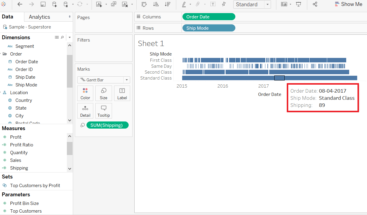 Next TopicTableau Crosstab Chart |