 |

WPF Button ControlWPF is easy to use; with the help of the WPF, developers can easily create UI based applications. Here are some points which should be noted:
Now we will talk about Button Controls:1. Button Control: Every GUI is incomplete without the use of the Button. WPF is very flexible and allows us to do all the things. Just like other WPF control, we can add Button by adding the button tag to our window. Button class shows the basic type of button control. Namespace used: System.Windows.Controls The button element shows the WPF Button Control in XAML at the time of the design. Attributes of Button, like width and height, shows the width and height of the Button. The content property of the Button will set the text of the button control. The x: Name attribute will show the Name of the control. Name is known as the unique identifier of the control. We will use the XAML code to create the button control. We use this code to set the Name, height, width, and content of the control. We put the text between the tags. Here text will act as the content of the Button. By default, the location of the Button is in the center of the page. We will write the below code to design the Button and to set the content in the Button. MainWindow.XAML OUTPUT 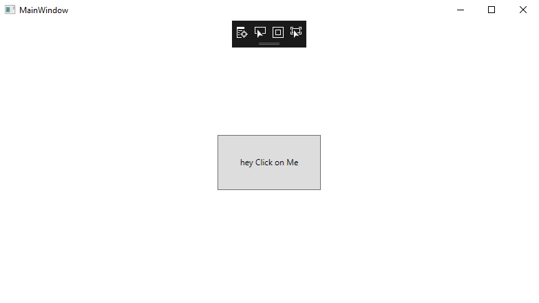
Event handling on ButtonThe Click attribute of the Button element will add the click event handler. After clicking on the button, button will show us a message which we want to show through the MessageBox. The code written in the click event handler will be executed on clicking the button. For event handling, we will write the below code: MainWindow.XAML Now we will show the output of the code before clicking on the button control. Before clicking on the button, the output is shown in the below screenshot: 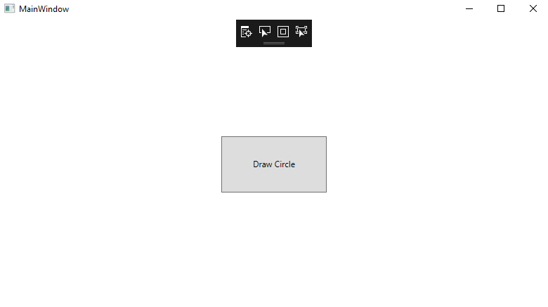
After clicking on the Button, Button will show us the message as shown in the below screenshot: 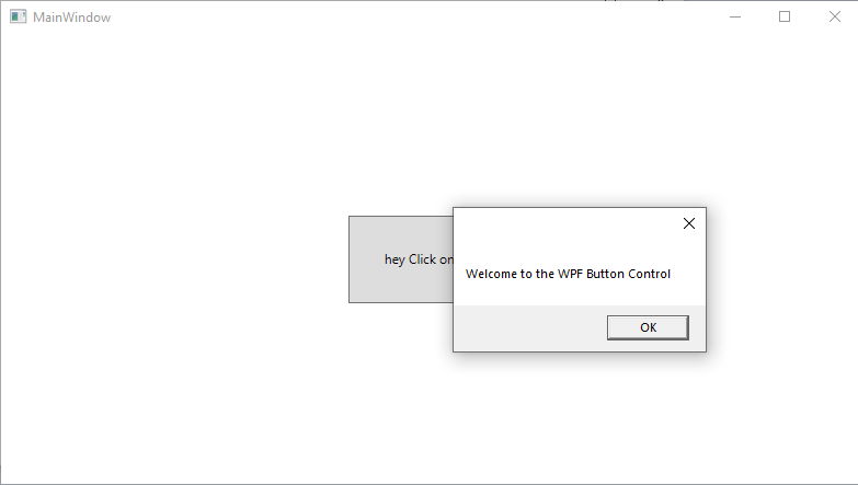
Button with the ImagesThe many user interface framework includes the regular Button and other several features as well. One of the most commonly used features is ImageButton, which means that the Button contains the image before the text. One of the main advantages of the WPF is that the Button itself provides the different controls inside the Button. That is why we can easily add the image control in the WPF button. For adding the image to the button control with the event handling, we will write the below code: MainWindow.XAML The output of the above code will look as shown in the below screenshot. OUTPUT 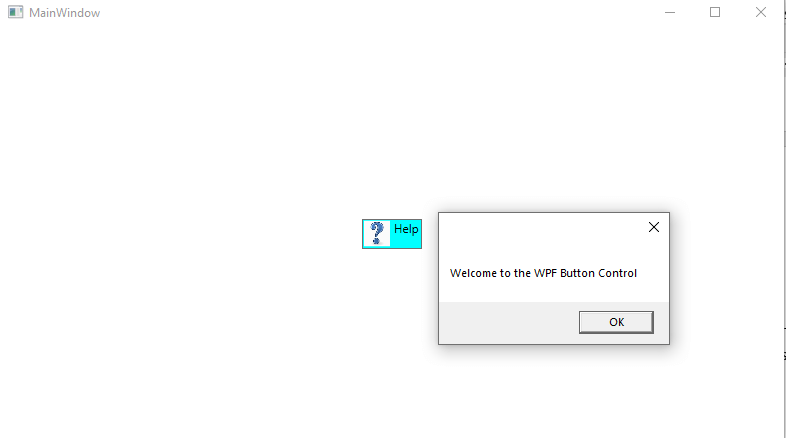
Button with Formatted ContentThe text in the content of the Button will change into the TextBlock control, which means that we can control the formatting of the text. For this, we have different properties on the button control, which includes foreground, background, font-weight, and so on. With the use of the WPF, we can easily change the formatting of the text inside the Button control. We will write the following code for the content formatting in the button as shown below: MainWindow.XAML The output of the above code is as shown in the below screenshot: OUTPUT 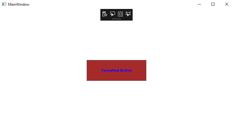
Wrap UpAbove we explained about creating the button control, perform event handling, formatting the content of the button control, add the image in the Button.
Next TopicWPF CheckBox Control
|
 For Videos Join Our Youtube Channel: Join Now
Feedback
- Send your Feedback to [email protected]
Help Others, Please Share


