 |

PrimeFaces DialogIt is a panel component which can overlay other elements on page. It is used to create a pop-up that can be used to display other elements too. It provides two methods show() and hide() to manage visibility of the component. The <p:dialog> is used to create dialog box in JSF application. It also has various attributes that are tabled below. Dialog Attributes
ExampleHere, in the following example, we are implementing <p:dialog> component. This example contains the following files. JSF File// dialog.xhtml Output: 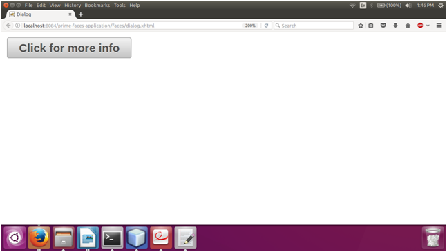 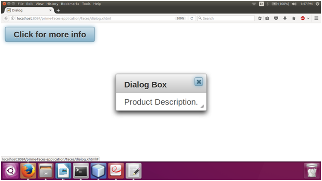
Next Topic#
|
 For Videos Join Our Youtube Channel: Join Now
Feedback
- Send your Feedback to [email protected]
Help Others, Please Share


Like/Subscribe us for latest updates or newsletter 


