 Home
Home CSS
CSS HTML
HTML XHTML
XHTML JavaScript
 Bootstrap
 jQuery
 PHP
PHP XML
XML JSON
JSON Python
 C++
C++ Java
Java C#
C# SQL
SQL Interview Q
CSS Media QueryIntroductionWith the help of media in CSS, we can use media queries to apply different styles for different devices. With the help of a media query, we can also check the device's height, width, resolution, and orientation (Portrait/Landscape). The main aim of the CSS rule is to make the webpage more responsive to deliver the optimized design for the different screen sizes. With the help of media queries, we can also specify the style for the screen readers. Syntax:We can write the media query with the help of the below syntax. Used KeywordsBelow are some keywords that will be used while writing the media queries. These are as follows.
Media TypesThere are different types of media available in the media query. These are as follows.
Media FeaturesMany features are being used for the media query. These are as follows.
With the help of this, the user can hover over any element.
With the help of this feature, we can perform a mechanism that is used for pointing devices.
With the help of this, we can set the ratio between the width and height of the screen's viewport.
With the help of this, we can set the color for all the components of the output device.
With the help of this, we can set the range for the color component that the output devices or user agent supports.
With the help of this, we can set the number of colors to display to the user.
With the help of this, we can specify the number of rows and columns to be displayed on the web page.
With the help of this, we can set the height of the viewport which is going to be displayed on the webpage.
With the help of this, the user can hover over any element.
With the help of this, we can define the inverted colors for any of the devices.
With the help of this, we can define the level of the lights.
With this help, we can set the maximum height and width for displaying the viewport on the web page.
With the help of this, we can define the number of bits per color component that will be displayed on the webpage.
With the help of this, we can define a maximum number of colors that the output devices can display.
With the help of this, we can set the maximum height for the display area of the browser.
With the help of this, we can define the maximum number of bits per color for the monochrome devices.
With the help of this, we can specify the maximum resolution to be displayed in the output devices.
With the help of this, we can set the maximum width for the display area of the browser.
With this help, we can set the minimum height and width for displaying the viewport on the web page.
With the help of this, we can define the minimum number of bits per color component that will be displayed on the webpage.
With the help of this, we can define a minimum number of colors that the output devices can display.
With the help of this, we can set the minimum height for the display area of the browser.
With the help of this, we can specify the minimum resolution to be displayed in the output devices.
With the help of this, we can set the minimum width for the display area of the browser.
With the help of this, we can provide the number of bits to display on the monochrome devices.
With the help of this, we can set the viewport that it is going to display in landscape mode or portrait mode.
With the help of this, we can control the situation when the content overflows the viewport.
With the help of this, we can control the situation when the content with an inline axis overflows the viewport,
With the help of this, we can create the primary input mechanism for a pointing device.
With the help of this, we can set the resolution for the devices by taking the help of dpi or PCM.
With the help of this, we can perform the scanning process for the devices.
With the help of this, we can perform the updation of output devices.
With the help of this, we can set the width of the viewpoint. Example:Output: When the screen resolution is more than 764 px, the webpage looks like below. 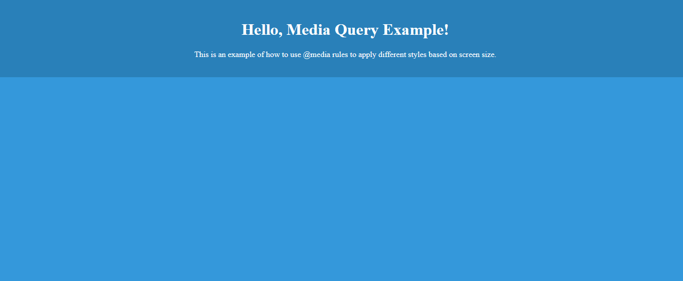
When the screen resolution is less than 764 px, the webpage looks like below. 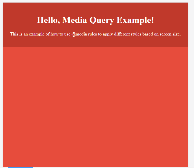
Next TopicCSS 2d Transforms
|
 For Videos Join Our Youtube Channel: Join Now
Feedback
- Send your Feedback to [email protected]
Help Others, Please Share


