| |

Comparison Charts In ExcelExcel
Microsoft Excel is a robust spreadsheet application that has become necessary in both professional and home environments. Excel, created by Microsoft, is a versatile platform for organizing, analyzing, and visualizing data. The software is distinguished by its grid interface, which allows users to enter data into cells arranged in rows and columns. Excel includes many functions and formulae that enable users to execute sophisticated calculations ranging from fundamental arithmetic operations to extensive statistical analysis. As a result, it is a must-have tool for jobs like financial modelling, data analysis, and project management. One of Excel's primary assets is its ability to produce dynamic and customizable charts and graphs, allowing users to show their data visually appealing and intelligibly. Excel also facilitates collaboration with features such as shared workbooks and real-time co-authoring, making it a powerful tool for project teams. Furthermore, Excel interfaces smoothly with other Microsoft Office apps such as Word and PowerPoint, providing a smooth workflow for users who need to incorporate spreadsheet data into documents and presentations. Excel's versatility and user-friendly interface have made it a go-to software for consumers and organizations, whether for budgeting, tracking spending, managing inventory, or constructing sophisticated models. Comparison ChartsComparison charts are graphical representations of the similarities and contrasts between two or more sets of data or variables. By displaying information visually intuitively, these charts play an essential role in assisting individuals, businesses, and organizations make informed decisions. The bar chart is a standard comparison chart in which variable length bars indicate the values of different categories or groups. The pie chart is another common kind that displays data in a circular graph, with each slice representing a percentage of the total. Comparison charts are standard in many industries, including business, finance, education, and research. They give a quick and effective way to convey complicated information, allowing users to spot trends, patterns, and outliers quickly. These charts improve data comprehension and make it easier for viewers to draw meaningful conclusions by using colours, labels, and other visual components. When working with numerical data, comparison charts are handy since they allow stakeholders to easily compare volumes, percentages, or proportions. Comparison charts, whether used for sales performance monitoring, market research, or academic presentations, are a helpful tool for making data-driven decisions and successfully expressing information. 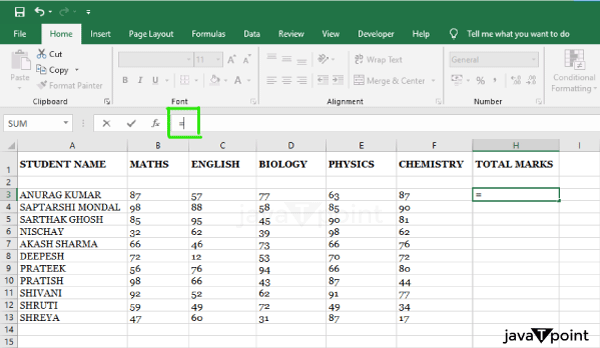
Comparison Charts In ExcelComparison charts are an essential feature in Microsoft Excel for visually representing and analyzing data sets. Excel has several chart formats well-suited for data comparison, making it an excellent platform for developing meaningful visualizations. To illustrate variations and trends in their data, users may quickly build comparison charts such as bar charts, column charts, line charts, and pie charts. Users commonly organize their data into columns or rows to generate a comparison chart in Excel, with each column or row representing a separate category or group of values. Excel's user-friendly interface enables simple data entry and manipulation. After entering the data, users can choose the suitable chart type based on their specific requirements. Excel's charting tools allow users to customize colours, labels, and other chart elements to improve visual clarity. Furthermore, Excel allows dynamic chart updating, which means that if the underlying data changes, the chart will immediately update to reflect those changes. This functionality is especially beneficial for individuals who work with dynamic or often updated data sets. Excel's broad flexibility and user-friendly charting capabilities make it the go-to software for creating solid and effective comparison charts in various professional and personal scenarios. Excel's charting features provide a versatile solution for visually presenting data for analysis and decision-making, whether comparing sales numbers, project milestones, or survey results. 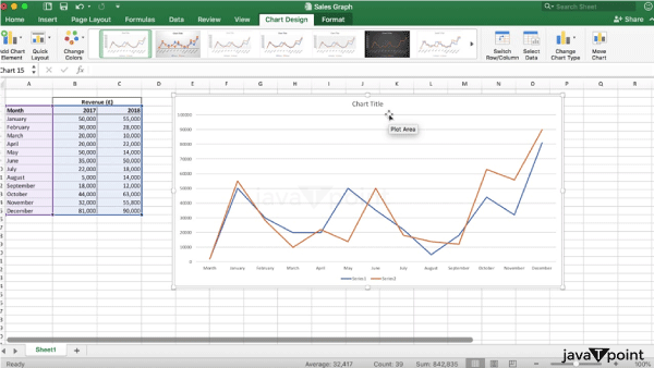
Creation Of Comparison Charts In ExcelCreating extensive comparison charts in Microsoft Excel entails multiple stages, from organizing your data to selecting the proper chart type and customizing the chart's appearance. Here's a detailed guide: 1. Sort Your Data:Ensure your data is well-organized and that each category or set of variables has a clear description. Arrange data in columns or rows to make it easier to read and analyze. 
2. Determine The Data Range:Highlight the cells holding your data by clicking and dragging. Labels are required for Excel to read the data appropriately and label the chart axes. 3. AddAChart:After you've selected your data, navigate to the "Insert" tab in the Excel ribbon. 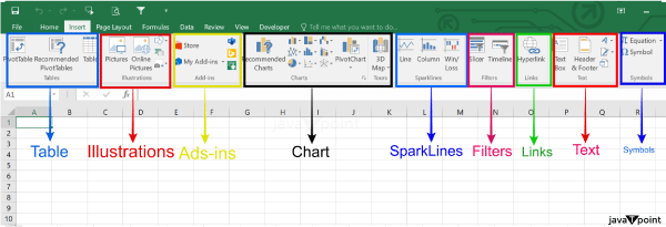
From the "Charts" menu, select the type of chart you want. If you wish a column chart, choose "Clustered Column" or "Stacked Column," and if you want a bar chart, select "Clustered Bar" or "Stacked Bar." 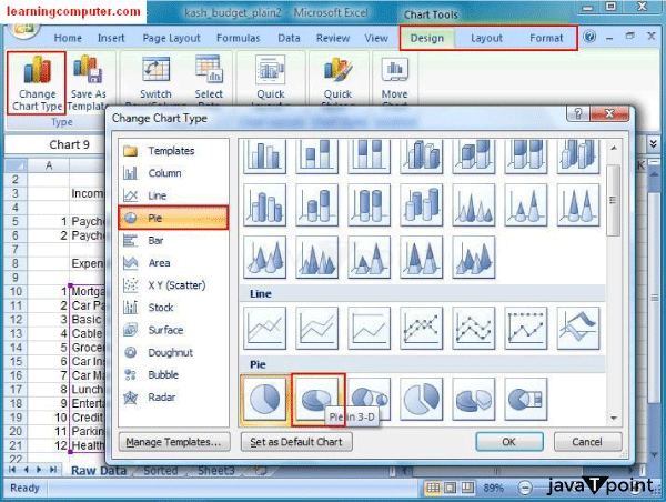
4. Personalize Your Chart:To pick and customize the chart's elements, click on them: Titles and Labels: To alter the chart title, axis labels, or legend, simply click on them. The legend is used to identify each data series. If necessary, you can move or hide it. 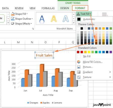
Data Labels: To display actual values, add data labels to each bar or column. Right-click on the data series, choose "Add Data Labels," and then arrange them as desired. Colours: To change the colour of particular bars or columns, click on them. Colour coding helps to emphasize key points. 5. Design Options For Charts:For further possibilities, go to the "Chart Tools" or "Design" tabs: Chart Designs: To customize the chart's general appearance, select from various styles. 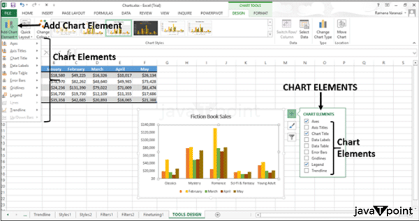
Chart features: This option allows you to add or delete features such as gridlines, data labels, and trendlines from your chart. 6. OptionsForDataSeriesAndAxis: To access more choices, right-click on some aspects of the chart: Format Data Series: Customize each data series's fill, border, and effects. Axis Format: Change the appearance of the horizontal and vertical axes. 7. Alter The Rows/Columns:Try switching the rows and columns if your chart isn't displaying correctly. Right-click on the chart and select "Switch Row/Column" from the menu that appears. 8. Incorporate Trend lines Or Error Bars:Click on the data series, then go to the "Chart Tools" or "Format" tab and pick "Trendline." To add error bars, click on the data series, select "Chart Tools," then "Error Bars." 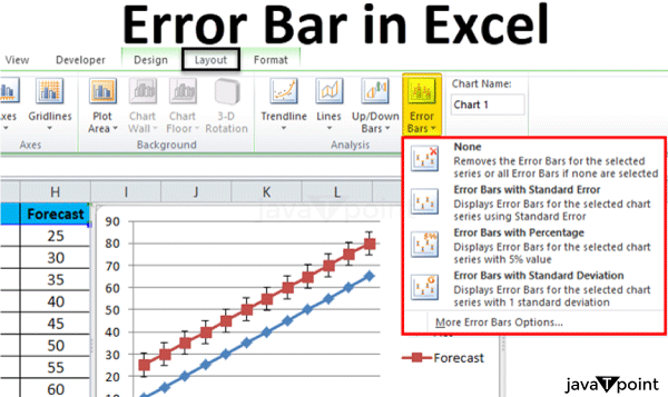
9. Save And Distribute:To protect your effort, save your Excel file. The chart can be copied and pasted into other Office applications or exported as an image (PNG, JPEG) for use in presentations or reports. 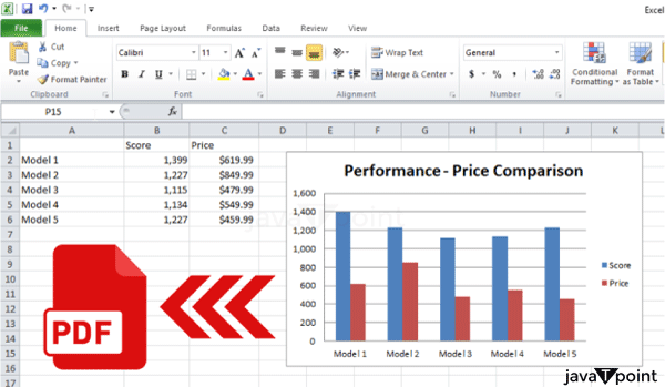
These extensive procedures should help you create comprehensive and customized comparison charts in Microsoft Excel. Experiment with different variables to match your visualization requirements. ExamplesLet's look at some instances of comparison charts made in Microsoft Excel: Example 1:ComparisonOf SalesPerformance (ColumnChart):
Organize Your Information: Product names are shown in Columns A and B. Columns C and D show sales data for two years in a row. Insert a Graph: Go to the "Insert" tab after selecting the data range (including labels). Select the "Clustered Column Chart." Make Your Chart: Add a title to the chart, such as "Sales Performance Comparison." Add labels and units to the axes. To improve visual separation, change the colours of the columns. Options for Chart Design: Experiment with different chart styles in the "Chart Tools" or "Design" tab. Example 2:Comparing Market Shares (PieChart):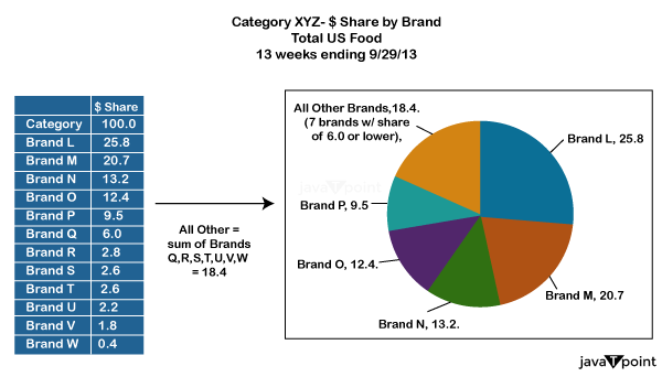
Organize Your Information: Column A: Business Names Column B: Market share percentages that correspond Insert a Graph: Go to the "Insert" tab after selecting the data range. Select "Pie Chart." Make Your Chart: Add a title to the chart, such as "Market Share Comparison." Slices can be exploded to emphasize individual companies. Data labels with percentages should be added. Options for Chart Design: Try out different colour schemes in the "Chart Tools" or "Design" tab. These examples show how to make various sorts of comparison charts in Excel, such as column charts for numerical comparisons, pie charts for proportional data, and line charts for trend tracking. Remember to alter the colours, labels, and formatting settings to fit your individual data and research needs. ConclusionIn conclusion, we've explored Microsoft Excel's adaptability and functionality in constructing comparison charts. Excel is a powerful tool for organizing and visualizing data using numerous chart styles, such as column charts for numerical comparisons, pie charts for proportional analysis, and line charts for trend tracking across time. To successfully communicate information, the step-by-step instructions described organizing data, selecting the proper chart style, and customizing the chart's design. The user-friendly design of Excel, combined with its broad customization capabilities, allows users to personalize their charts to individual demands, whether they are analyzing sales performance, market share, or project timetables. Users can construct visually appealing and instructive comparison charts by experimenting with elements such as data labels, trendlines, and colour schemes. Furthermore, the supplied examples, such as sales performance and market share comparisons, provide practical examples of implementing these principles. Users can learn how to create meaningful visualizations that express complex information clearly and concisely by looking at these examples. Overall, Excel's comparison chart capabilities make it a valuable tool for individuals and businesses looking to analyze, display, and interpret data in a visually engaging and accessible fashion.
Next TopicComparison Graph In Excel
|
 For Videos Join Our Youtube Channel: Join Now
Feedback
- Send your Feedback to [email protected]
Help Others, Please Share


