Ms Excel Logo
The official symbol of the Microsoft Excel spreadsheet program, which is part of the Microsoft Office suite, is a graphic depiction known as the Microsoft Excel logo. The stylistic character "X" in a vivid shade of green is what the logo usually looks like, as of my most recent information update from January 2022. The letter "X" stands for the first letter in the application's name and "Excel." The logo is intended to be unique, easily identifiable, and consistent with Microsoft's overarching branding strategy.
Because only one letter was used in the logo, it has a simple, contemporary appearance and is immediately connected to the Excel program. The application's connection to data and analysis of finances may also be suggested by the colour green, which is frequently related to growth and harmony.
The Excel by Microsoft logo may have changed slightly throughout time to reflect changes in the product, brand evolution, and design trends. The uniformity of the Excel logo throughout the Microsoft Office app suite helps create a unified visual identity.
The Excel logo is an essential indicator for users to become more familiar with the software and to improve brand identification. Its design is a component of a larger plan to make the Microsoft Office ecosystem's user experience visually appealing and coherent.
Evolution of Logo:
The Microsoft Excel logo has changed multiple times over the years as of the January 2022 version. The evolution of the Excel logo reflects the changes in Microsoft's visual identity, design trends, and brand revisions. This is a broad summary of how the Excel by Microsoft logo has changed over time:
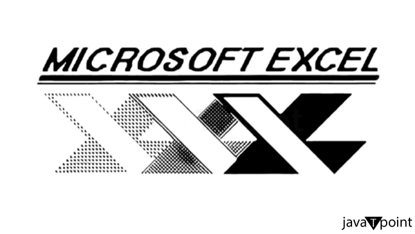
1. Early Versions (1985-1990s):
- The application's name was frequently displayed alongside a visual representation in the comparatively modest logo of the first iteration of Microsoft Excel.
- According to the fashions of the day, the logos of this era were more straightforward and more traditional in style.
2. Microsoft Office 97(1997):
- Significant changes were made to the Office logo design language with the publication of Microsoft Office 97, which included Excel 97.
- The stylized "X" in the Spreadsheet 97 logo has a gradient effect that makes it appear three-dimensional.

3. Microsoft Office 2000-2003:
- In the early 2000s, Excel logos maintained the three-dimensional design style while adding sleeker lines and sharper edges.
- The colour palettes frequently aligned with the Microsoft Office suite's overall identity during this time.

4. Microsoft Office 2007:
- Office 2007 marked a significant redesign of the user interface by introducing the "Office Fluent" and "Ribbon" appearances, which are sleeker and more contemporary.
- With its stylized "X" enclosed in a square, the Microsoft Excel 2007 logo adhered to this fresh design language, and the overall aesthetic became more understated.

5. Microsoft 2010-2013:
- These Excel versions' logos kept the fundamental design first seen in Office 2007, although they were improved in colour, shading, and general aesthetic appeal.
- The style grew more angular and more in step with the general direction of user interface design.

6. Microsoft 2016:
- The Office 2016 Excel logo, which showed a neat and uncomplicated "X" inside a square or rectangle, carried on the flat design trend.
- The colour scheme stayed true to Microsoft's corporate identity.
7. Recent Versions (Office 2019 and Microsoft 365):
- Excel's flat and contemporary look has been carried over into the most recent iterations, including Office 2019 and 365 by Microsoft.
- The emphasis on readability, a straightforward colour palette, and clear lines are frequently used to define the logos.
Design Elements:
The MS Excel logo has unique graphic aspects as of the January 2022 update, which helps to make it recognizable and accurately reflect the application. Please be aware that design components are subject to change and that since my last update, the logo may have undergone alterations or modifications. The Microsoft Excel logo's primary design elements are as follows:
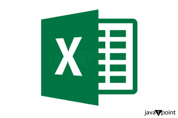
- Stylized "X": Excel's logo is centred on the stylized letter "X." The letter "X" stands for the first letter in the application's name, as well as "Excel." The "X" has a simple, contemporary design that frequently appears to be geometric and simplistic.
- Colour Palette: Traditionally, the emblem has a vivid green colour. Though the shade may differ, green is usually striking and distinctive. The colour green could evoke ideas of expansion, harmony, and the relationship between the application and data and finance analysis. The colour green complements Microsoft's entire Office suite branding.
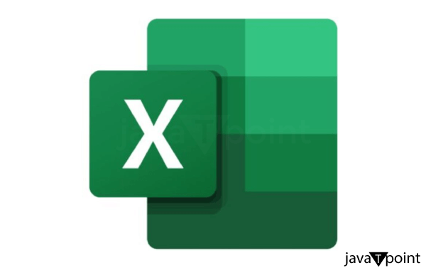
- Clean Lines and Simplicity: The Excel logo design prioritizes simplicity and clean lines. It's common practice to simply present the "X" without extraneous details. This design decision improves the logo's legibility and recognition, particularly at smaller sizes.
- Flat Design: Microsoft's logos have used flat design concepts over time. The Excel logo's two-dimensional, flat design follows this trend. The logo will appear current and classic thanks to this design strategy, which also complies with modern aesthetics.
- Consistency with Microsoft Office Suite: Visual coherence is maintained between the Excel logo and other Microsoft Office Suite application logos. This consistency contributes to creating a single and cohesive visual brand for the full suite of applications. The shared design components of the Office logos aid brand awareness.
- Geometric Shapes: Geometric shapes are frequently included in the "X" design to emphasise a modern, structured appearance. The letter's simple form helps make the logo more straightforward to read and more versatile in various settings.
Logo Consistency Across Microsoft Office Suite:
Microsoft purposefully used continuity in logo design throughout the Office Suite by Microsoft to provide each of its apps with a unified visual brand. This uniformity has multiple functions:
- Brand Recognition: Brand awareness is improved when users notice that several Office apps share the same recognisable design language. Users can easily recognise and relate each program with the more extensive Microsoft Office suite when logos are consistent.
- Unified User Experience: A consistent design language enhances a cohesive and smooth user experience. Because Office applications share design characteristics, users of one can quickly become proficient with others without facing a steep learning curve.
- Clarity and Cohesion: The Office suite has more coherence and clarity with consistent logos. A visually harmonic environment is produced for users by applying comparable design concepts, such as simple lines, a flat layout, and an exact colour palette.
- Professionalism and Trust: A consistent visual identity exudes reliability and professionalism. Users frequently link a dependable and well-designed brand to quality and dependability, which enhances the favourable opinion of Microsoft Office products.
- Cross-Application Integration: Many users' processes involve using various Office programs. Users can recognise and transition between apps more easily when logos are consistent, promoting unity throughout the Office ecosystem.
- Scalability and Adaptability: Scalability and adaptability across various platforms and devices are guaranteed for logos by implementing a uniform design language. Whether examined on a tablet, smartphone, or computer screen, the logos remain in their identifiable format.
- Branding Strategy: Microsoft uses a thorough branding approach, positioning the Office suite as a complete and integrated collection of productivity tools. Maintaining consistency in logos is essential for supporting this approach and spreading the notion that Office apps are interoperable.
Logo Usage Guidelines:
Specific guidelines for using the Microsoft Excel logo are usually found in the company's design and branding guidelines, just like they are for many other offerings from Microsoft as of the January 2022 update. These guidelines offer guidance on how to utilise the logo to uphold the integrity and consistency of the brand. The following are general guidelines for using symbols that are frequently stressed:
- Official Resources: Microsoft typically makes official resources available on its website or through dedicated branding portals, such as downloading logo templates and usage guidelines. To guarantee that the proper and most recent version of the logo is utilised, it is advised to obtain it from these official sources.
- Proportions and Scaling: To maintain legibility and visibility, logo rules typically define the smallest dimension at which the logo needs to be reproduced. They might also offer suggestions on enlarging or reducing the logo without affecting its proportions.
- Clear Space: Generally, guidelines delineate the unoccupied area surrounding the emblem, guaranteeing that it remains uncluttered by additional visual components. This white space preserves the logo's impact and visibility.
- Colour Specifications: The precise colour requirements for the logo are specified in the logo usage rules. This covers details on the primary colour version (usually in full colour) and any secondary variants (monochrome or grayscale versions). It might also say which version to use and when.
- Backgrounds and Contrast: To provide the best possible contrast and visibility, instructions are frequently given regarding the backdrop colours or patterns that the logo should be put against. For example, standards might forbid using a logo on backdrops that are too complicated or obtrusive, or they might specify a desired background colour for the logo.
Conclusion:
To sum up, the Excel by Microsoft logo, with its eye-catching green "X," captures the spirit of the popular spreadsheet program. The logo's flat design and simple lines perfectly match the Microsoft Office suite and convey a contemporary and approachable style. The iconic "X" represents accuracy and organisation, consistent with Excel's primary features. Widespread familiarity is ensured by the logo's cross-platform uniformity and regular exposure to advertising and user interfaces. The logo has remained consistent throughout history by balancing modern design elements and classic brand identification. The Excel logo's worldwide ubiquity and correlation with productivity further solidify its standing as a legendary symbol in the office software industry.
|

 For Videos Join Our Youtube Channel: Join Now


