| |

Diagram Vs ChartDiagrams and charts are visual representations that help to express complex information clearly and straightforwardly. These graphical tools are significant communication aids, allowing persons to show facts, correlations, and trends in an easily digestible style for varied audiences. Diagrams frequently made up of labelled shapes and lines, are particularly useful for illustrating processes, systems, or structures. They aid in the visual comprehension of complex subjects, making it easier for viewers to understand the relationships between diverse components. Diagrams, whether utilized in scientific research, technical design, or educational settings, provide an effective technique for conveying information that exceeds the constraints of textual descriptions. On the other hand, charts such as bar graphs, pie charts, and line graphs are specialized visual representations of numerical data. These technologies represent quantitative data, allowing for value comparison and identifying patterns or trends across time. Charts are commonly used to make data-driven arguments more convincing and accessible in business reports, scientific papers, and presentations. Charts enable decision-makers to gain insights and make educated decisions by transforming raw data visually and intuitively. The purpose of both diagrams and charts is to improve communication and understanding by utilizing the visual power of graphic representation. DiagramsDiagrams are visual representations of information, relationships, or processes that use graphical elements. They are practical tools for simplifying complex concepts and aiding comprehension of complex ideas. Diagrams exist in various shapes and sizes, each customized to specific uses and industries. Flowcharts, organizational charts, mind maps, Venn diagrams, and network diagrams are all examples of diagrams. 
1. Flowcharts: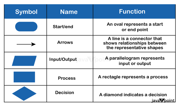
A flowchart is a diagram that depicts a process or system using a series of shapes connected by arrows. Each figure represents a phase in the process, and the arrows show how events flow or sequence. Flowcharts are frequently used in project management, software development, and business process documentation because they help depict the logical evolution of tasks or decision-making processes. 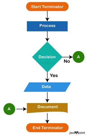
2. Organisational Charts:Organizational charts visually portray an organization's hierarchical structure, highlighting the links and roles of individuals or departments within the corporation. Boxes or circles are commonly used to depict positions or individuals, with lines linking them to show reporting or functional ties. These diagrams are critical for understanding the chain of command, enabling effective communication, and enhancing organizational transparency. 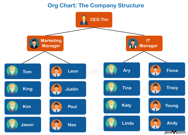
3. MindMaps:Mind maps represent ideas, thoughts, or information organized around a primary subject. They use branches or nodes spreading from a central point to indicate many elements or subtopics, assisting in the visual organization and linking related information. Mind maps are commonly used in brainstorming sessions, collecting notes, and creative problem-solving. 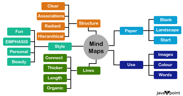
4. VennDiagrams:Venn diagrams show the relationships between multiple sets of elements by using overlapping circles. They are handy for comparing and contrasting features or detecting commonalities. Venn diagrams are often used to visually represent set theory and interactions between diverse groups in mathematics, logic, and statistics. 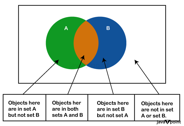
5. NetworkDiagrams:Network diagrams show the interactions and linkages between different parts of a system or network. They utilize nodes to represent components and lines to establish their connection. Network diagrams are widely used to visualize the structure and interconnections of complex systems in computer science, telecommunications, and project management. 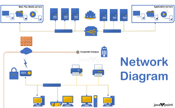
6. Entity-Relationship Diagrams (ERDs):In database architecture, ERDs show the connections between database entities (like tables). They indicate relationships between entities with lines, attributes with diamonds, and commodities with rectangles. Database designers can better grasp a database system's dependencies and structure using ERDs. 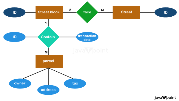
7. IshikawaOrCause-And-Effect Diagrams, Often Known As Fishbone Diagrams:Fishbone diagrams are a helpful tool for determining and visualizing the possible sources of an issue or outcome. The "bones" in the diagram, resembling a fish skeleton, stand for several possible causes. This kind of diagram is frequently used in root cause analysis and quality management. 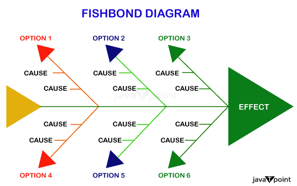
8. GanttCharts:Gantt charts, which show project timelines across time, are bar charts. Project managers can see each task's duration, dependencies, and overall progress by visualizing the tasks or activities as horizontal bars along a timeline. Gantt charts are a standard tool in project management for planning, tracking, and sharing project schedules efficiently. 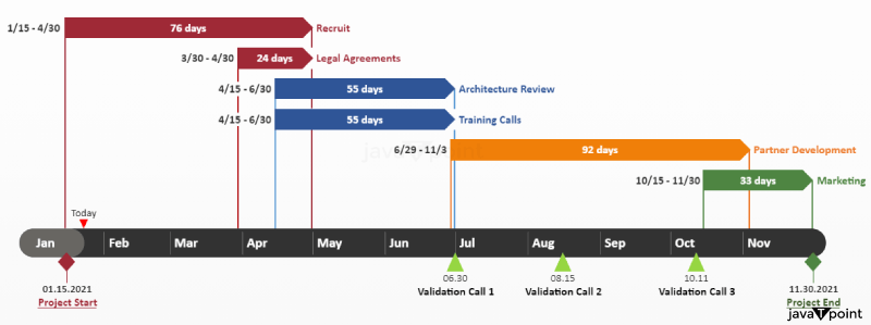
9. UMLDiagrams:A standardized collection of diagrams used in software engineering to graphically depict system behaviours and architecture are known as Unified Modelling Language (UML) diagrams. Class diagrams, which show the relationships between classes in a system, and sequence diagrams, which show the evolution of interactions between system components over time, are common types. 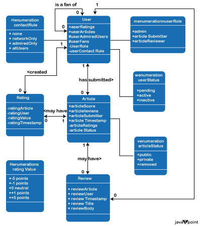
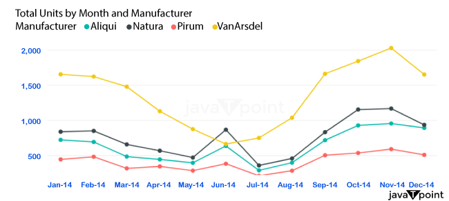
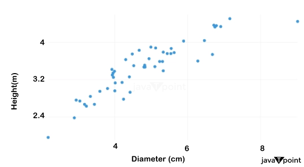
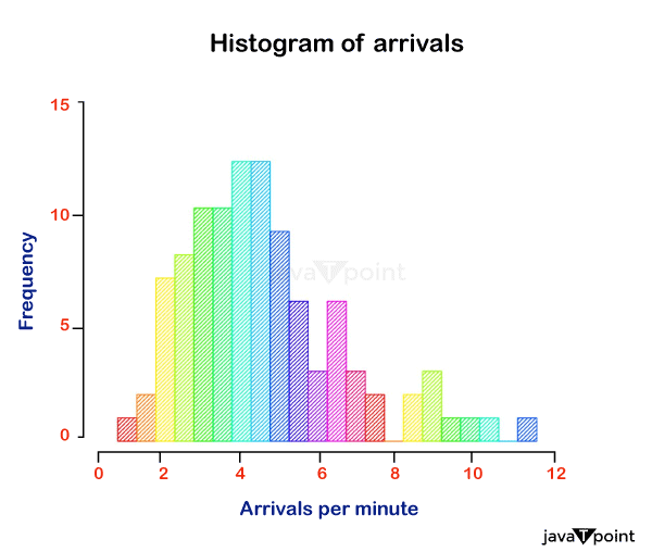
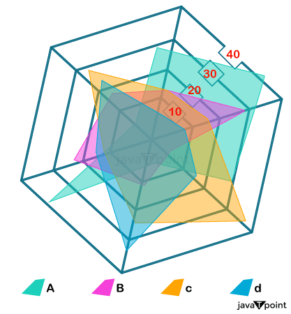
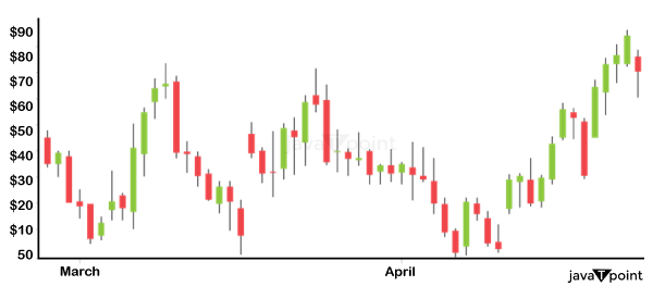
Diagrams are essentially adaptable instruments that cut over language boundaries and provide a universal way to communicate information. Diagrams are essential for improving comprehension in various fields and disciplines, whether used to simplify complicated procedures, illustrate linkages, or assist in problem-solving. ChartsCharts are graphic depictions of data that are intended to aid people in rapidly and efficiently understanding and interpreting information. They are essential in many domains, such as research, business, education, and media, since they convert unprocessed data into simple representations. The following chart kinds are listed along with thorough explanations for each: 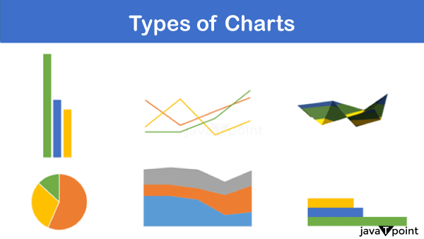
Charts are essential tools that help decision-makers, analysts, and communicators present complex information understandably and visually. The type of chart selected relies on the characteristics of the data and the specific insights one aims to convey. Diagram Vs ChartHere is a table that illustrates the main distinctions between charts and diagrams:
Charts and diagrams differ in their content, purpose, and application areas, yet they aim to improve communication through visual representation. Charts are specifically made to communicate numerical data and trends, whereas diagrams show non-numerical relationships and structures. ConclusionWe have now covered the importance and features of charts and diagrams, two robust instruments supporting efficient communication across various fields. Diagrams use graphical elements to depict relationships, processes, and structures well. Examples of these include flowcharts, organizational charts, and mind maps. They communicate non-numerical and abstract information in disciplines such as physics, engineering, and education. Conversely, charts?such as pie charts, line graphs, and bar charts?are explicitly used to visualize quantitative data and patterns. Charts are frequently used in business, statistics, finance, and data analysis because they give numerical data a clear and concise representation that facilitates the identification of trends, comparisons, and insights. Using the visual power of graphic representation, charts and diagrams play crucial roles in improving comprehension and communication. The type of information being communicated will determine which option is best, whether it is numerical data and trends (charts) or conceptual links and structures (diagrams). When used in tandem, these visual aids enable professionals in various professions to communicate complicated ideas clearly and clearly.
Next TopicHow to Combine Duplicates in Excel
|
 For Videos Join Our Youtube Channel: Join Now
Feedback
- Send your Feedback to [email protected]
Help Others, Please Share


