| |

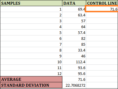
Control charts in ExcelOverview of Excel Control ChartsControl charts were statistical visual tools for tracking the performance of a process over time. Whether everything is operating as it should or whether there are some problems. Under statistical process control (SPC), key tools assess how well any system or process is performing and whether it is operating smoothly or not. It is possible to reset the procedures if there are any problems. Control charts are usually utilised in manufacturing processes to determine whether or not the processes are under control. A description of a control chartJust a line chart can be called a control chart. Its generation aims to determine when the points of control fall outside the real upper and lower bounds or whether they are there for the data and fall between them. The process is under control if the control points are well inside the limitations. The process is deemed to be out of control if a portion of the points falls outside the control range. Microsoft Excel can construct control charts and make the process easier even if other Statistical Process Control (SPC) programs are available. Excel Control Chart ExampleAssume the following: 12 observations of data from a manufacturing company. We wish to check if the process stays well inside the bounds of control. If the process is out of control, we will create a control chart to determine that. View the partial data picture shown below. 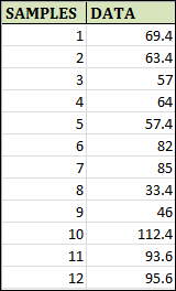
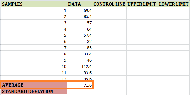
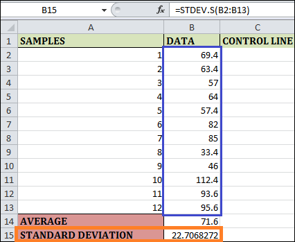
Step 1: The function "AVERAGE(B2:B13)" is used in the cell by B14, which calculates the Average of 12 Samples. 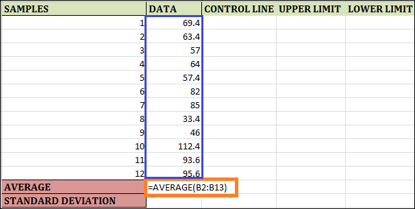
Step 2: To find the sample's standard deviation based on the given data, enter the formula "STDEV.S(B2:B13)" in cell B15. A sample standard deviation is computed using this formula. We use a different formula to find the population standard deviation using Excel. 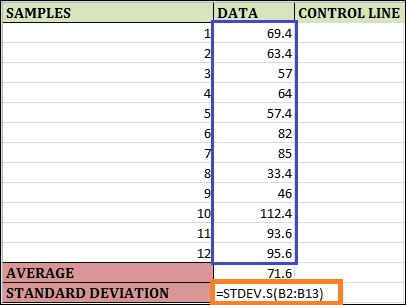
Step 3: Go to cell C2 in column C, called the CONTROL LINE, and enter a formula as =$B$14. The $ symbol makes the columns and rows in this formula constants. The formula imputed in cell C2 will be the same in every cell when you drag and populate the remaining rows for column C. Fill the remaining cells in column C by dragging and dropping. The result can be seen below. 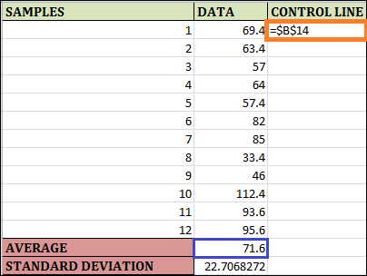
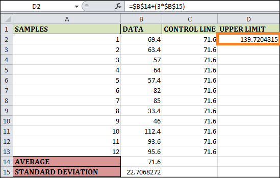
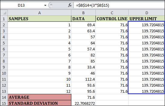
Step 4: The formula is for the Upper Limit. Consequently, enter the formula in cell D2 as =$B$14+(3*$B$15). Once more, the maximum is set for the entire sample's observations. As a result, we have made rows and columns constant by using the $ symbol. You can see the result below by dragging and filling the last cell in column D. 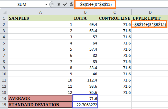
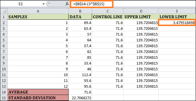
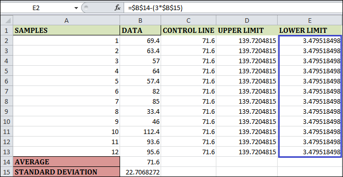
Step 5: The control chart's lower limit can be expressed as shown in cell E2. To solve for this, enter =$B$14-(3*$B$15). The $ symbol in this formula allows it to compute the bottom limit, which is fixed across all weekly observations. You can see the result below by dragging and adding a formula to the remaining cells. 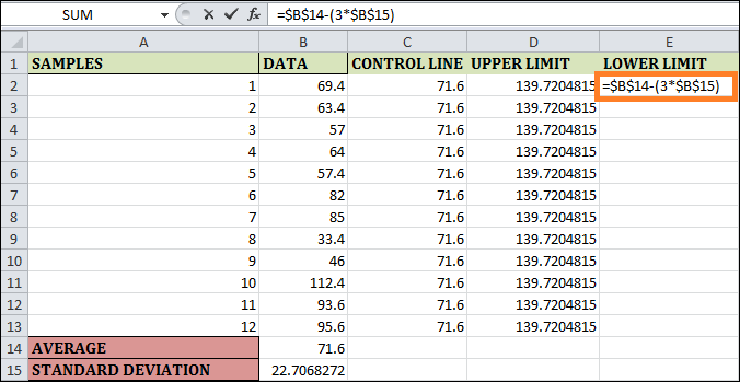
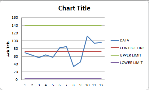
Explanation:
Step 6: On your Excel sheet, choose the data of columns A as well as B (spread throughout A1:B13) and select the Insert tab from the Excel ribbon. Go to the Insert Line & Area Chart button under the Charts section. 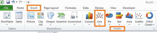
Step 7: Insert a line or area chart in the dropdown menu. A few line & area chart options will appear under Excel. Choose Line with Markers within the 2-D Line section out of all of those, then hit Enter.
Step 8: Select the "Select Data" option by right-clicking the graph. Press the "Edit" button to open the "Select Data Source" dialogue box. 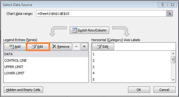
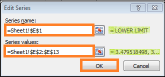
Step 9: In Legend Entries (Series), enter Control Line as the "Series name" and the appropriate control line values as the "Series values" in the "Edit Series" dialogue box following the click of the "Edit" button. Once completed, click the "OK" button. 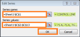
Step 10: Click the "Edit" button, then in the "Edit Series" dialogue box, enter the Upper Limit as a "Series name" and the matching Upper Limit numbers as "Series values." When finished, click the "OK" button. 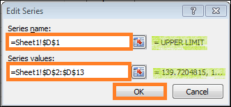
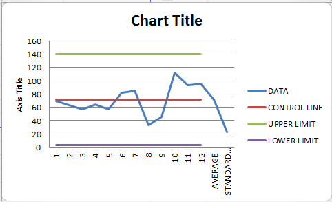
Step 11: You can close this graph by giving it the title "Control Chart." 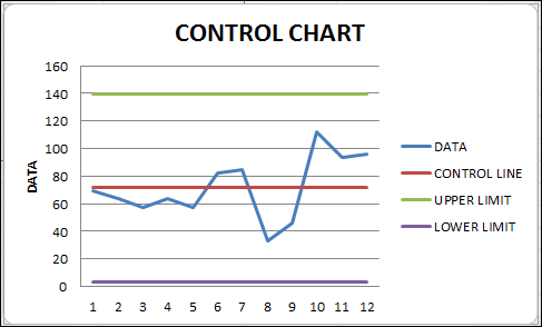
In Excel, a control chart may be drawn in this manner. Points to Keep in Mind
Next TopicData Maintenance in Excel
|
 For Videos Join Our Youtube Channel: Join Now
Feedback
- Send your Feedback to [email protected]
Help Others, Please Share


