| |

Bell Curve in ExcelA bell curve is a symmetrical graph used in statistics showing how data tend to cluster around a mean or centre value in a given dataset. It is also called a conventional normal distribution or a Gaussian curve. Plotting values directly on the chart to form a bell-shaped curve-hence the name-the x-axis displays the values' relative probability of appearing in the dataset, while the y-axis shows the data's likelihood of occurring in the dataset. 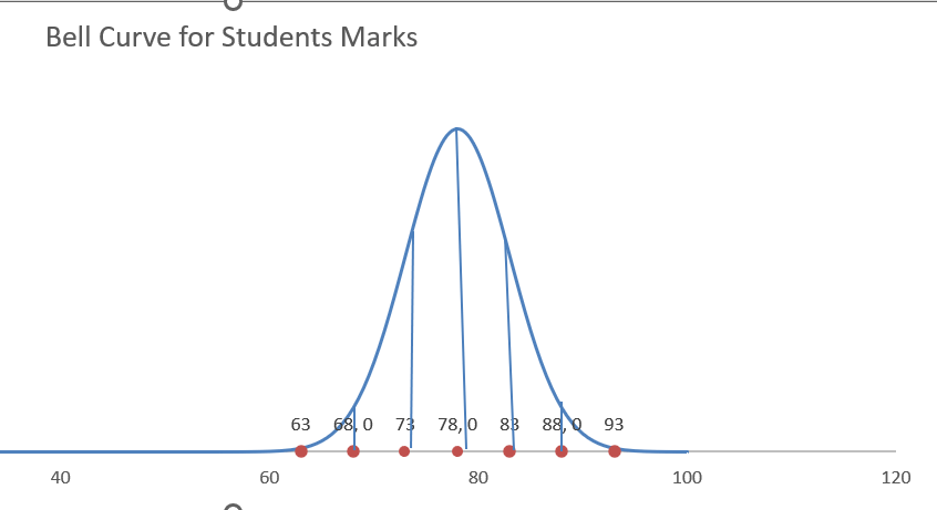
With the help of the graph, we may determine if a given number is within the expected fluctuation or needs additional research since it is statistically significant. Learn how to build a normal distribution bell curve in Excel from the beginning with this step-by-step tutorial: Methods for making an Excel bell curve with a normal distributionIt takes two pieces of information to plot a Gaussian curve:
Conversely, a lower standard deviation indicates a higher curve and fewer dispersed data. A useful criterion to remember while analyzing any kind of normal distribution curve is the 68-95-99.7 rule, which states that around 68% of your data will be located within one standard deviation of the mean, 95% within two standard deviations, and 99.7% within three standard deviations. We will go from theoretical to practice now that you understand the fundamentals. Getting StartedUsing 200 students' test results as an example, suppose you wish to grade them "on a curve," which bases the students' grades on how well they performed in comparison to the other students in the class: 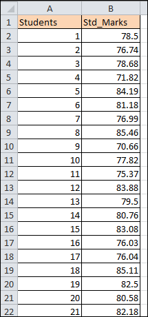
Step 1: Calculate the mean.If you aren't initially provided with the standard deviation and mean values, you can quickly and simply compute them by following a few easy steps. Let us address the mean initially. You may obtain your standard measurement using the AVERAGE function since the mean is the average value of the sample or population with data. To determine the average exam score in the dataset, enter the next formula onto any empty cell (F1 in this case) adjacent to your real data (columns A and B): 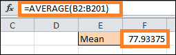
Just a brief reminder: you probably have to round up the formula's output. To accomplish it, just wrap everything in the ROUND operation in the manner described below: 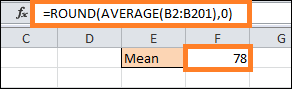
Step 2: Find the standard deviationOne down and one to go. Fortunately, Excel provides a unique feature that will handle all the tedious work of calculating the standard deviation for you: Once more, all values in the designated cell range (B2:B201) are selected by the formula, which then calculates the standard deviation. However, remember to round the result as well. 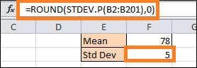
Step 3: Configure the curve's x-axis parameters.Simply put, the chart comprises a large number of intervals, or steps, connected by a line to form a smooth curve. The exam score will be represented visually by the x-axis values in this instance, and the y-axis values will indicate the chance that a student will receive that score on the test. As long as you remember to adjust the horizontal axis of the scale later, you may easily remove any unnecessary data. In theory, you can add as many intervals as you like. Ensure that the range you choose encompasses all three standard deviations. To put up another helper table, let's start a count at one (because there is no way for a student to receive a negative exam result) and go up to 100. Whether it's 100 or 1000, it doesn't matter.
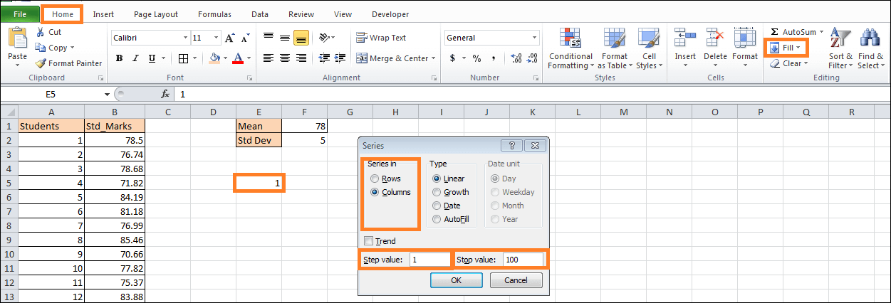
Then, 99 cells in column E(E6:E99) will be filled with the values from 2 to 99. Step 4: Determine the normal distribution values for each x-axis value.For each interval, find the normal distribution's values, which are the x-axis values representing the probability of a student receiving a particular exam score. Thankfully, Excel's NORM.DIST function is the workhorse that can handle all of these computations for you. In your first interval's cell (F4) on the right, type this formula (E4): This represents the decoded version so you can make the necessary adjustments: To make the formula for each of the other intervals (E6:E104) easy to use, you lock the standard deviation (SD) and mean values. 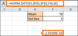
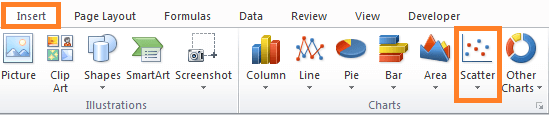
Double-click on the filling handle to copy the formula into the remaining cells (F6:F104). Step and do Step 5: Make a scatter plot using smooth lines.The bell curve building phase has finally arrived:
Step 6: Place the label tableYour bell curve is there, technically. Yet, because there isn't any information describing it, it would not be easy to read. Now that we have labels for every standard deviation value either below or above the mean (you may additionally utilize them to show the z-scores), let's add them to the normal distribution to make it appear more informative. For that, create another table as follows: 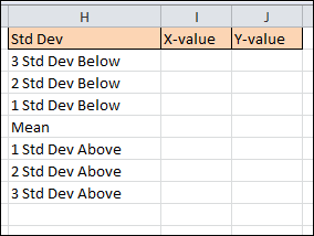
Copy the Mean value (F1) in columns X-Value (I5) next to its corresponding cell. 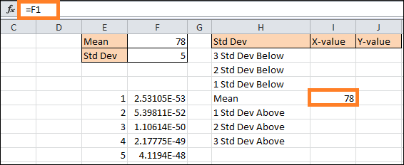
Next, calculate the standard deviation using this straightforward formula in cell I4. The values below the mean: 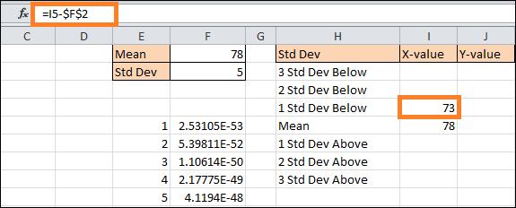
In short, the formula deducts the sum of the values of the previous standard deviations from the mean. To duplicate the formula in the final two cells (I2:I3), drag the handle for filling upward at this point. Apply the mirror formula,
Once the data markers are where you want them to be, enter the y-axis value labels (J2:J8) with zeros.
Step 7: Fill in the chart with the label dataAdd all of the prepared data now. Select Data can be selected by right-clicking on the chart plot. Choose "Add" from the dialogue box that appears. 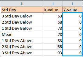
Click "OK" after selecting the right cell ranges for the helper table (I2:I8 for "Series X " and J2:J8 for "Series Y "values). 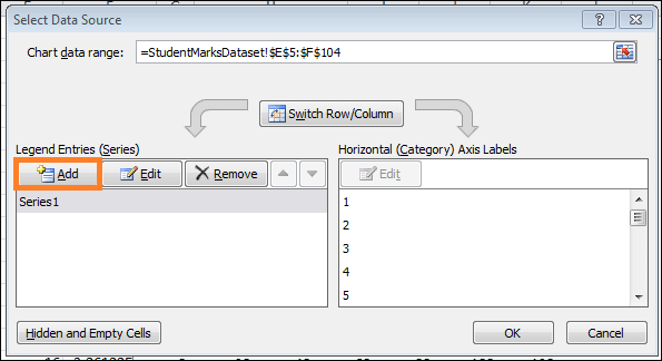
Step 8: Modify the label series's chart type.The chart type of the newly added series must be changed for the data markers to appear as dots. Right-click on the graph plot and choose "Change Chart Type." 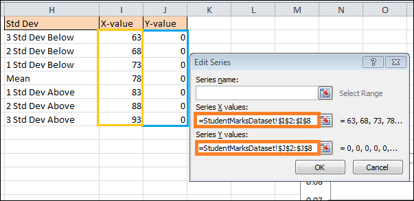
Create a combo chart after that:
Note: Ensure that "Series1" remains a "Scatter with Smooth Lines." When you create a combo, Excel will occasionally alter it. Ensure that "Series1" is not shifted onto the Secondary Axis by unchecking the box beside the chart type.3. Select "OK." 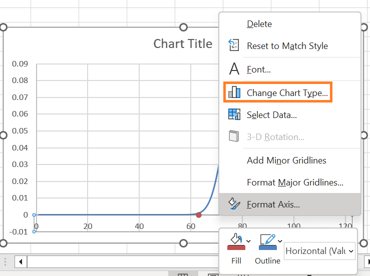
Step 9: Scale the horizontal axis differently.Adjust the horizontal axis scale to centre the chart over the bell curve. Select "Format Axis" from the menu by right-clicking on the horizontal axis. 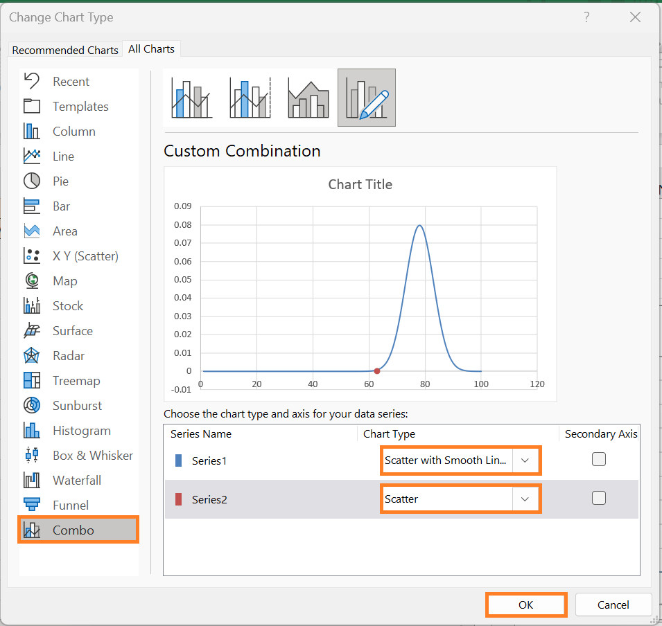
After the task pane displays, carry out these actions:
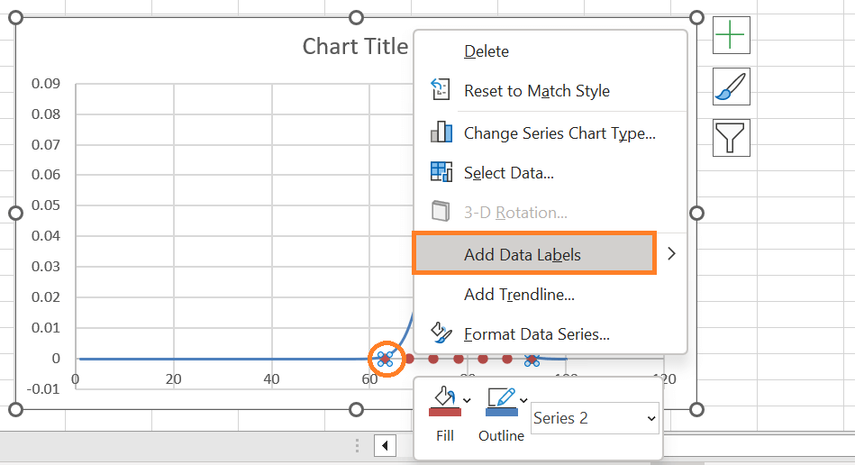
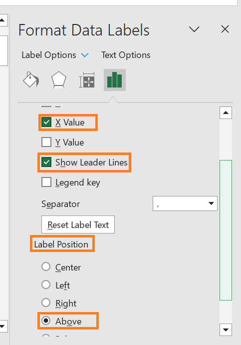
Although you have the standard deviation range, you can adjust the axis scale range as you see fit. However, to display the "tail" of the curve set the Bounds values slightly away from all of the third standard deviations. Step 10: Put the customized data labels in place and followRemember to include the custom labels for the data as you finalize your chart. Choose "Add Data Labels" from the menu when you right-click on a dot representing Series "Series 2." 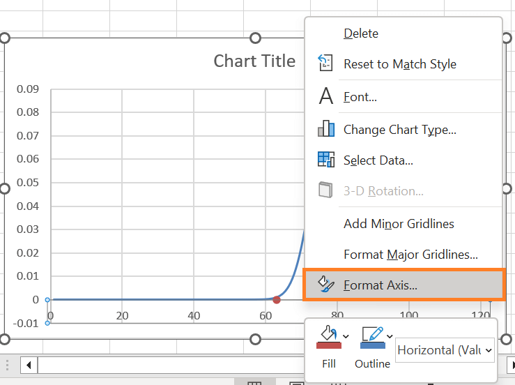
Afterwards, put the labels you previously configured above the data markers and swap out the default ones.
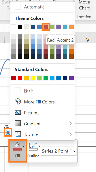
Moreover, the gridlines can now be eliminated by right-clicking on them and selecting Delete. Step 11: If desired, change the data markers' colour.To help the dots match your chart style, you can finally recolour them.
Remove the borders surrounding the dots as well:
Step 12: If desired, add vertical linesYou can add vertical lines into the chart as a last modification to help highlight the SD values.
To draw precisely vertical lines of each of the dots to where each meets the bell curve, hold down the "SHIFT" key and drag the mouse. 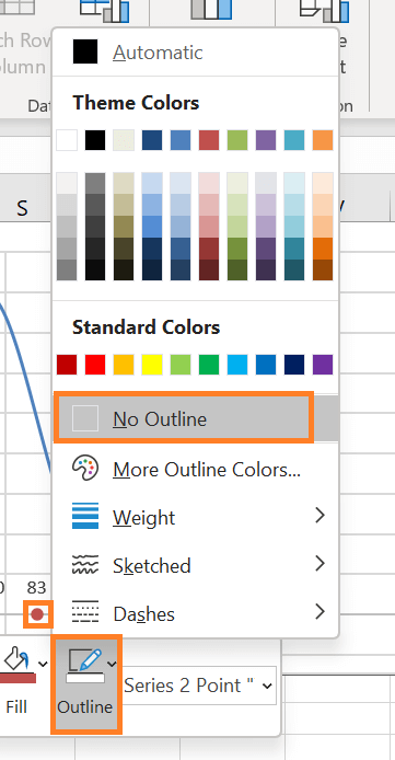
Your enhanced bell curve, displaying your important distribution data, is ready when you change the chart title. 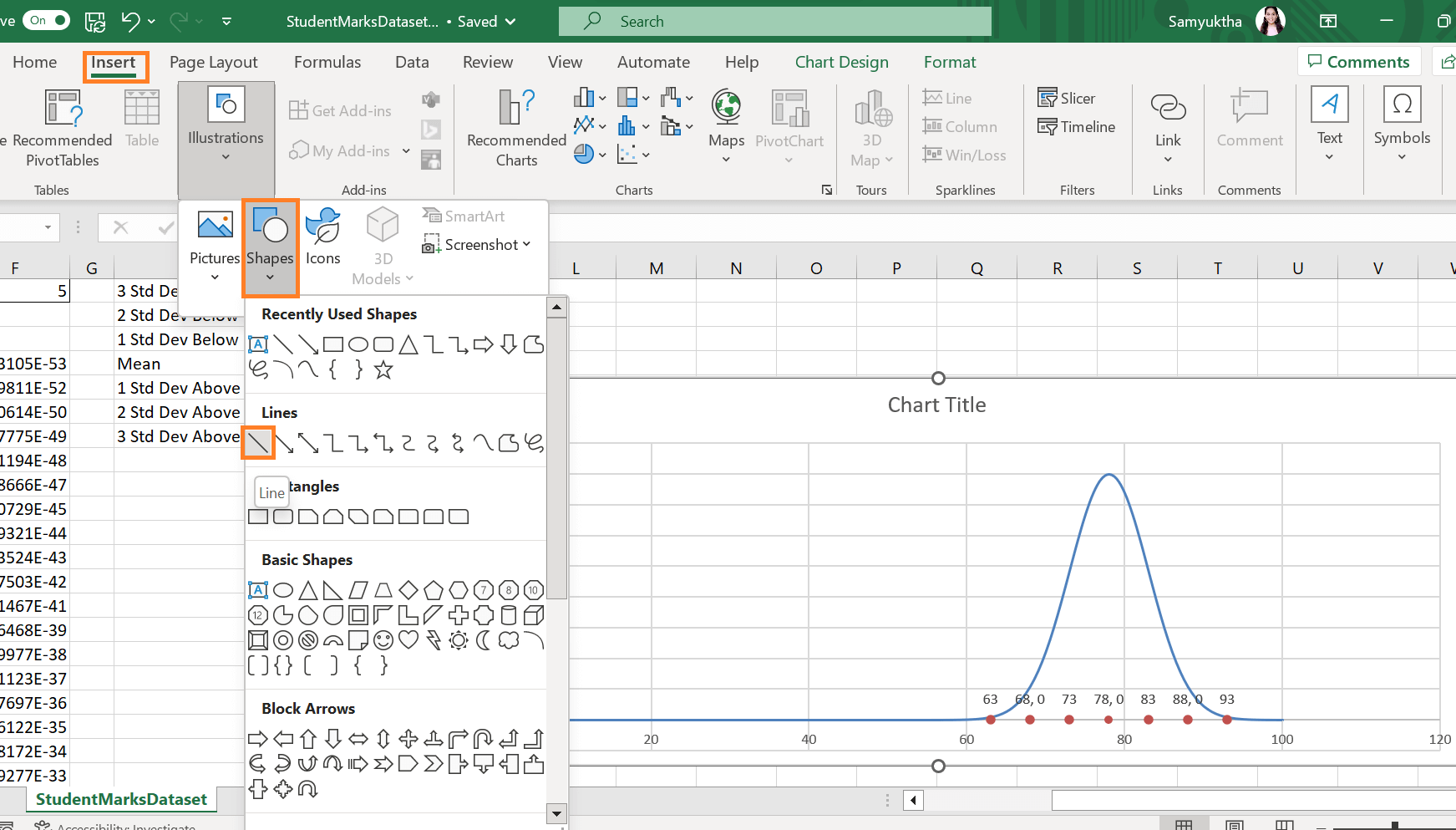
That's the way it's done. With these simple steps, you can draw a bell curve with a normal distribution from any dataset!
Next TopicBest Excel Skills
|
 For Videos Join Our Youtube Channel: Join Now
Feedback
- Send your Feedback to [email protected]
Help Others, Please Share


