| |

Data Validation IconIcons for data validation act as a link between intricate technical procedures and intuitive user interfaces. These icons improve the general accessibility and usability of apps, lower the possibility of mistakes, and boost the effectiveness of data management procedures. A progress indicator's dynamic progression provides a visual narrative of the process by charting the path from the start of data entry to the completion of validation. Data validation icons are more than simply decorative accents, which means they can be used to design all the essential documents such as mind maps and graphs. They are essential road maps that enable users to confidently negotiate the complex world of data interaction. Data validation indicators become more than just visual elements in this large composition; they take on the role of the guiding notes. Data validation icons are more than simply decorative elements; they are also essential tools that enable users to confidently negotiate the complex world of data interaction. The warning triangle opens a channel of communication that is subtle and suggests caution without explicitly rejecting anything. The narrative behind each icon is explained via the tooltip information, which acts as the storyteller and provides context. The narrative behind each icon is explained via the tooltip information, which acts as the storyteller and provides context. Icons perform the part of visual notes in the symphony of data validation, creating a melodic story that transforms the user experience into a harmonic interaction of form and function. While signaling problems, the red X also acts as a teacher, pointing users in the direction of a learning environment where errors are easily fixed and become an essential part of the interaction process. The comprehensive method converts data validation icons from static symbols into dynamic catalysts that lead users on an exploratory trip while simultaneously validating data. The checkmark transforms into a digital smile, highlighting successful validation as a victory moment and giving consumers a sense of achievement. The isolated exclamation point takes on the role of a helpful friend, providing advice and insights. Every icon turns becomes a touchstone for a meaningful emotional connection, assisting users on a digital journey that focuses on development rather than just validation. The below are the steps to be followed to go to data validation: First we will be going to the data option, then we will be choosing the data validation, the below image shows how the data validation icon looks 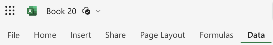

Deeper Description about LogoThe different design aspects of the logo include: ShapeThe shape of a data validation icon is a critical aspect of its design, contributing significantly to the visual language. One of the primary considerations in shaping data validation icons is simplicity. Beyond individual symbols, the overall shape and composition of a data validation icon can be influenced by the surrounding context within the user interface. In the design of these icons, the choice of shapes is also influenced by universal symbols and cultural associations. Typically triangular, it communicates a sense of urgency. ColorData validation icons' use of colour is crucial for conveying information, influencing user perception, and improving the user experience in general. Other colours enter the picture to provide advice and nuance beyond the binary spectrum of success and failure. The omnipresent, usually green checkmark turns into a sign of acceptance, telling users that the system has accepted their data since it meets certain standards. Red denotes a departure from the usual, alerting users to check and correct their data entry. from the comforting greens of successful validation to the warning reds of mistakes and the yellow or orange cautionary tones. Design ElementsEffective design is built on consistency, and data validation icons are no different. Data validation symbols are mostly used to communicate information clearly and concisely. Clarity in communication is frequently correlated with simplicity in design. Data validation icons are made accessible through design so that anyone with a range of needs and abilities can use them. Scalability should be considered while designing icons to guarantee the best possible presentation on a range of screen sizes and resolutions. It's critical to consider the possibility of cultural variations in how symbols are understood. The usage of dark mode in user interfaces is growing in popularity, therefore data validation icons need to be made to blend in with both bright and dark color schemes. ConclusionAs a result, creating data validation icons is a complex process that involves more than just aesthetics. The process of creating data validation icons is a painstaking orchestration in which every component plays a part in the overall harmony of user interaction. Data validation icons need to be created with the future in mind-that is, with an eye towards anticipating changes as technology advances. The resonance of a checkmark transforms into a digital affirmation as users go through interfaces, going beyond simple confirmation. Additionally, the data validation icons' adaptation to many platforms, cultural settings, and dark modes shows a dedication to diversity and user-centric design.
Next TopicExcel Courses
|
 For Videos Join Our Youtube Channel: Join Now
Feedback
- Send your Feedback to [email protected]
Help Others, Please Share


