| |

Comparison Graph In ExcelExcel
Microsoft Excel is a robust spreadsheet application that has become necessary in both professional and home environments. Excel, created by Microsoft, is a versatile platform for organizing, analyzing, and visualizing data. The software is distinguished by its grid interface, which allows users to enter data into cells arranged in rows and columns. Excel includes many functions and formulae that enable users to execute sophisticated calculations ranging from fundamental arithmetic operations to extensive statistical analysis. As a result, it is a must-have tool for jobs like financial modelling, data analysis, and project management. One of Excel's primary assets is its ability to produce dynamic and customizable charts and graphs, allowing users to show their data visually appealing and intelligibly. Excel also facilitates collaboration with features such as shared workbooks and real-time co-authoring, making it a powerful tool for project teams. Furthermore, Excel interfaces smoothly with other Microsoft Office apps such as Word and PowerPoint, providing a smooth workflow for users who need to incorporate spreadsheet data into documents and presentations. Excel's versatility and user-friendly interface have made it a go-to software for consumers and organizations, whether for budgeting, tracking spending, managing inventory, or constructing sophisticated models. Comparison GraphsA comparison graph is a visual representation that allows people to compare and contrast data between two or more entities, allowing them to grasp differences and similarities clearly and concisely. These graphs typically use graphic components such as bars, lines, or pie charts to demonstrate the relationships and changes in data sets. The x-axis frequently indicates the categories being compared, while the y-axis represents the measured values. A comparison graph aids easy comprehension of large data sets by presenting information graphically, allowing users to rapidly spot trends, patterns, or disparities. 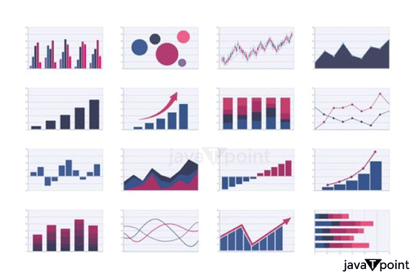
Comparison graphs are widely used in various disciplines, including business, education, and research. In industry, for example, comparison graphs can be used to evaluate the performance of competing goods, track financial metrics over time, or analyze market trends. Comparison graphs can be used in education to highlight pupils' progress, compare test scores, or demonstrate the effectiveness of instructional approaches. Researchers, on the other hand, can use these graphs to visually describe experimental results, making it easier to interpret their findings. Overall, comparison graphs are practical tools for decision-making, communication, and analysis in various areas. Comparison Graphs In ExcelA comparison graph in Microsoft Excel is a dynamic and adaptable tool that allows users to graphically analyze and compare data sets quickly. Excel provides several chart types that can be used for this purpose, including bar charts, line graphs, and pie charts. In Excel, users may easily create a comparison graph by entering data into spreadsheet cells, selecting the necessary data range, and selecting the suitable chart type from Excel's Chart menu. Based on the input data, the software then automatically develops a visually beautiful and informative graph, making it accessible to both novice and advanced users. One distinguishing aspect of Excel comparison graphs is their ability to highlight trends, patterns, and variations in the data. Users can improve the clarity and aesthetics of the chart by modifying the colours, labels, and other formatting choices. Excel also allows you to include numerous data series in a single graph, making it simple to compare different sets of information. Excel's comparison graphs are handy for finance, marketing, and project management professionals, where data-driven decision-making relies significantly on clear and concise visual representations. Creation Of Comparison Graphs In ExcelA comparison graph in Excel is made up of a few easy steps. Let's go over how to make a basic bar chart widely used for comparing values. This example presupposes that you have data in an Excel spreadsheet. Input Your Data:Begin by entering your information into an Excel spreadsheet. For example, you could have categories in one column and values in another. Make sure your data is well-organized and has distinct headings. 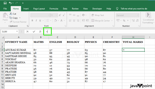
Choose Your Information:Mark the information you want to include in the comparison graph. Insert A Graph:In the Excel ribbon, navigate to the "Insert" tab. Select "Chart" or "Insert Chart " depending on your Excel version." 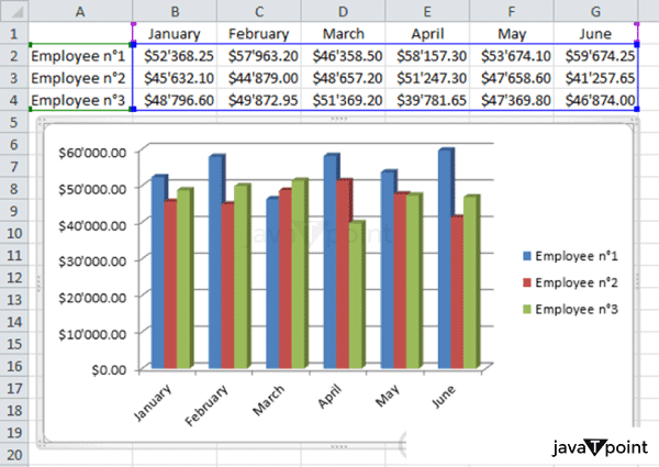
Select the chart you want (for example, "Clustered Bar" for a simple comparison). Excel will create a default chart based on the data you've chosen. Make Your Own Chart:To select chart elements (for example, bars and axis labels), click on them. Select "Format" or "Format Data Series" from the context menu to change the colours, labels, and other chart elements. You can also add a title to the chart by clicking on the title field and inputting your title. 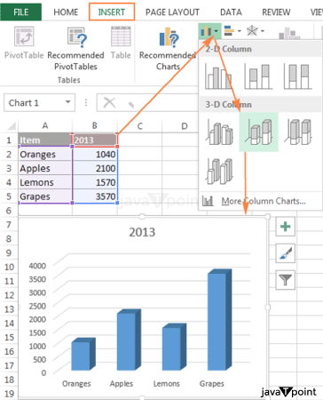
Final Alterations:To make the graph more straightforward and visually appealing, make any extra alterations, such as expanding the chart, adding data labels, or modifying the axis scale. Save And Distribute:Save your Excel file if you're satisfied with your comparison graph. 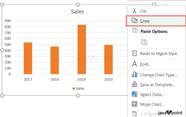
The chart can also be copied and pasted into other documents or presentations. Remember that Excel has various chart options, so feel free to experiment with different types (line charts, pie charts, and so on) depending on the nature of your data and the kind of comparison you want to make. ExamplesExample-1
Using a hypothetical example, let's create a comparison bar chart in Excel. In this example, we will analyze the sales performance of two products (Product A and Product B) over several months. Enter Your Information: Open Excel and enter the following information into a spreadsheet. Choose Your Information: Highlight the entire data set, including headers. Insert a Graph: Navigate to the "Insert" tab. Then, select "Chart" or "Insert Chart." Select "Clustered Bar" for the chart type. Excel will create a clustered bar chart with months on the x-axis and sales amounts on the y-axis by default. Make Your Chart: To pick the bars, click on them. Right-click and select "Format Data Series" to change the colours and other settings. Add a title to the chart by right-clicking on it and selecting "Monthly Sales Comparison." To improve readability, you can customize by modifying axis labels, legends, and other elements. Final alterations: Add data labels by right-clicking on the bars and selecting "Add Data Labels." The sales values will be displayed on the bars as a result. Adjust the chart's size and layout as appropriate. Save and distribute: Save your Excel spreadsheet. You can also copy and paste the chart into a presentation or document. This example shows a basic comparison bar chart, but Excel provides many customization options that allow you to personalize the chart to your exact requirements. Experiment with additional features like trendlines, error bars, and alternative chart layouts to build graphics that successfully express your data. Example-2Let's look at how to make a comparison line chart in Excel. In this example, we'll examine the monthly expenses of two departments (Department X and Department Y) over a year. 
Enter Your Information: Enter the following information into an Excel spreadsheet. Choose Your Information: Highlight the entire data set, including headers. Insert a Graph: Navigate to the "Insert" tab. Then, select "Chart" or "Insert Chart." Select the "Line" chart type. Excel will create a line chart with months on the x-axis and spending figures on the y-axis by default. Make Your Chart: To choose the lines, click on them. Right-click and select "Format Data Series" to change the colours and other settings. Add a title to the chart by right-clicking on it and selecting "Monthly Expense Comparison." Adjust the axis labels, add a legend, and experiment with other formatting choices to further personalize the chart. Final alterations: Click on the lines to add data labels, then right-click and select "Add Data Labels." The expense figures will be displayed on the lines as a result. Increase the size of the chart and adjust the layout as needed. Save and distribute: Save your Excel spreadsheet. Copy and paste the chart into presentations or reports. This example shows a comparison line chart, which helps display patterns and fluctuations over time. Excel's versatility allows you to play around with different chart styles and customization choices to present your data in the most understandable way possible. ConclusionIn conclusion, we've gone over how to make comparison graphs in Microsoft Excel, focusing on two basic types: bar charts and line charts. These graphs are effective visual aids for analyzing and comparing data sets. We looked at how to make a comparison bar chart and a comparison line chart using hypothetical data in the examples presented. We created a bar chart comparing the sales performance of two products over several months. Input data, pick a date range, insert a clustered bar chart, customize the chart elements, make final adjustments, and save or share the chart were all steps. We compared the monthly expenses of two departments over a year in the case of a line chart. Similarly, we discussed data entry, selection, chart insertion (line chart), customization, final adjustments, and saving or sharing. Excel's user-friendly design and various chart options make it accessible to users of all ability levels. Creating visually appealing and helpful comparison graphs in Excel improves your ability to analyze and share insights effectively, whether you're comparing sales statistics, expenses, or any other data. Customizing colours, labels, and other features allows you to personalize the visual representation to your needs. These graphs can be seamlessly integrated into presentations, reports, and other publications, increasing the accessibility and impact of data analysis.
Next TopicCreate a Search Box In Excel
|
 For Videos Join Our Youtube Channel: Join Now
Feedback
- Send your Feedback to [email protected]
Help Others, Please Share


