| |
Python Tutorial
Python OOPs
Python MySQL
Python MongoDB
Python SQLite
Python Questions
Plotly
Python Tkinter (GUI)
Python Web Blocker
Python MCQ
Related Tutorials
Python Programs

Advance Bar Graph in PythonBar plots are a popular way to represent data visually in Python. They are especially useful for comparing the values of different categories or groups. In this tutorial, we will learn how to create a bar plot (easy to advance) in Python using the Matplotlib library. Before we start, let's make sure that we have the required libraries installed. We will need the Matplotlib library, which can be installed using pip install matplotlib. Now, let's start by creating a simple bar plot. We will use the Matplotlib library's bar() function to create a bar plot. The bar() function takes two arguments: the x-coordinates of the bars, and the heights of the bars. Here is an example: Explanation: This will create a simple bar plot with four bars. The x-coordinates of the bars are 1, 2, 3, and 4, and the heights of the bars are 10, 20, 15, and 30. The resulting plot will look like this: Output: 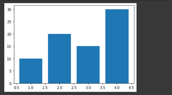
We can customize the appearance of the plot by using various options available in the bar() function. For example, we can change the color of the bars by using the color parameter. We can also specify the width of the bars using the width parameter. Here is an example: Explanation: This will create a bar plot with red bars that are half a unit wide. The resulting plot will look like this: Output: 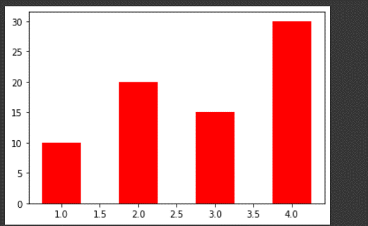
We can also add labels to the x-axis and y-axis of the plot using the xlabel() and ylabel() functions. For example: Explanation: This will add labels to the x-axis and y-axis of the plot. The resulting plot will look like this: Output: 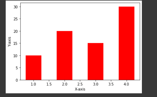
We can also add a title to the plot using the title() function. For example: Explanation: This will add a title to the plot. The resulting plot will look like this: Output: 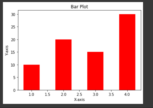
We can also create a horizontal bar plot by using the barh() function instead of the bar() function. The barh() function takes the same arguments as the bar() function, but the coordinates and heights are reversed. Here is an example: Explanation: This will create a horizontal bar plot with green bars that are half a unit tall. The resulting plot will look like this: Output: 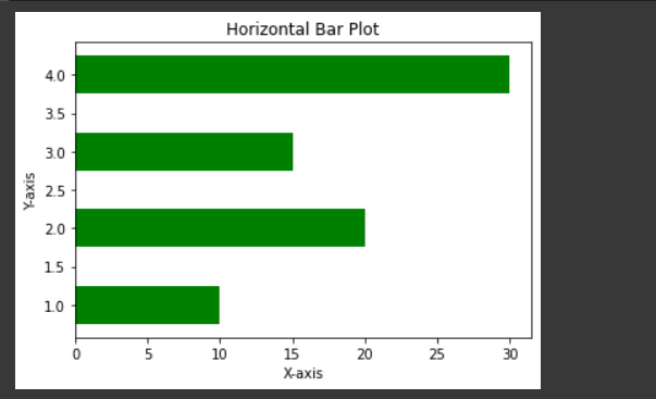
We can also create a stacked bar plot by using the bar() function multiple times with different y-values. For example: Explanation: This will create a stacked bar plot with two sets of bars. The first set of bars will be red and the second set of bars will be blue. The resulting plot will look like this: Output: 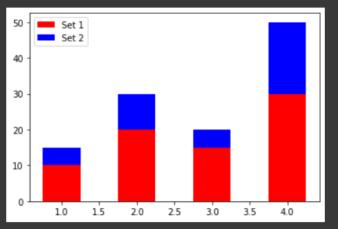
We can also create a grouped bar plot by using the bar() function multiple times with different x-values. For example: Explanation: This will create a grouped bar plot with two sets of bars. The first set of bars will be red and the second set of bars will be blue. The resulting plot will look like this: Output: 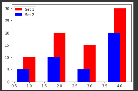
ConclusionIn this tutorial, we learned how to create bar plots in Python using the Matplotlib library. We saw how to customize the appearance of the bars and how to add labels, titles, and legends to the plot. We also saw how to create stacked and grouped bar plots. |
 For Videos Join Our Youtube Channel: Join Now
Feedback
- Send your Feedback to [email protected]
Help Others, Please Share


