 |
 Home
Home Python
 If Else
 For Loop
 Function
 Array
Array String
 Regex
Regex List
List Set
Set Tuple
Tuple Dictionary
 Programs
 Numpy
Numpy Interview Questions
Python Tutorial
Python Tutorial
Python Features
Python History
Python Applications
Python Install
Python Example
Python Variables
Python Data Types
Python Keywords
Python Literals
Python Operators
Python Comments
Python If else
Python Loops
Python For Loop
Python While Loop
Python Break
Python Continue
Python Pass
Python Strings
Python Lists
Python Tuples
Python List Vs Tuple
Python Sets
Python Dictionary
Python Functions
Python Built-in Functions
Python Lambda Functions
Python Files I/O
Python Modules
Python Exceptions
Python Date
Python Regex
Python Sending Email
Read CSV File
Write CSV File
Read Excel File
Write Excel File
Python Assert
Python List Comprehension
Python Collection Module
Python Math Module
Python OS Module
Python Random Module
Python Statistics Module
Python Sys Module
Python IDEs
Python Arrays
Command Line Arguments
Python Magic Method
Python Stack & Queue
PySpark MLlib
Python Decorator
Python Generators
Web Scraping Using Python
Python JSON
Python Itertools
Python Multiprocessing
How to Calculate Distance between Two Points using GEOPY
Gmail API in Python
How to Plot the Google Map using folium package in Python
Grid Search in Python
Python High Order Function
nsetools in Python
Python program to find the nth Fibonacci Number
Python OpenCV object detection
Python SimpleImputer module
Second Largest Number in Python
Python OOPs
Python OOPs Concepts
Python Object Class
Python Constructors
Python Inheritance
Abstraction in Python
Python MySQL
Environment Setup
Database Connection
Creating New Database
Creating Tables
Insert Operation
Read Operation
Update Operation
Join Operation
Performing Transactions
Python MongoDB
Python SQLite
Python Questions
How to install Python in Windows
How to reverse a string in Python
How to read CSV file in Python
How to run Python Program
How to take input in Python
How to convert list to string in Python
How to append element in the list
How to compare two lists in Python
How to convert int to string in Python
How to create a dictionary in Python
How to create a virtual environment in Python
How to declare a variable in Python
How to install matplotlib in Python
How to install OpenCV in Python
How to print in same line in Python
How to read JSON file in Python
How to read a text file in Python
How to use for loop in Python
Is Python scripting language
How long does it take to learn Python
How to concatenate two strings in Python
How to connect Database in Python
How to convert list to dictionary in Python
How to declare a global variable in Python
How to reverse a number in Python
What is an object in Python
Which is the fastest implementation of Python
How to clear Python shell
How to create a DataFrames in Python
How to develop a game in Python
How to install Tkinter in Python
How to plot a graph in Python
How to print pattern in Python
How to remove an element from a list in Python
How to Round number in Python
How to sort a dictionary in Python
Strong Number in Python
How to Convert Text to Speech in Python
Bubble Sort in Python
Logging in Python
Insertion Sort in Python
Binary Search in Python
Linear Search in Python
Python vs Scala
Queue in Python
Stack in Python
Heap Sort in Python
Palindrome program in python
Program of Cumulative sum in python
Merge Sort in Python
Python Matrix
Python Unit Testing
Forensics & Virtualization
Best Books to Learn Python
Best Books to Learn Django
GCD of two number in python
Python Program to generate a Random String
How to One Hot Encode Sequence Data in Python
How to write square root in Python
Pointer in Python
Python 2D array
Python Memory Management
Python Libraries for Data Visualization
How to call a function in Python
Git Modules in Python
Top Python Frameworks for Gaming
Python Audio Modules
Wikipedia Module in Python
Python random randrange()
Permutation and Combination in Python
Getopt module in Python
Merge two Dictionaries in Python
Multithreading in Python 3
Static in Python
How to get the current date in Python
argparse in Python
Python tqdm Module
Caesar Cipher in Python
Tokenizer in Python
How to add two lists in Python
Shallow Copy and Deep Copy in Python
Atom Python
Contains in Python
Label Encoding in Python
Django vs. Node JS
Python Frameworks
How to create a vector in Python using NumPy
Pickle Module of Python
How to convert Bytes to string in Python
Python Program to Find Anagram
How to convert List to Set
Python vs JavaScript
Python Holidays Module
FuzzyWuzzy Python Library
Dask Python
Dask Python (Part 2)
Mode in Python
Menu-Driven Programs in Python
Python Array vs. List
What is duck typing in Python
PEP 8 in Python
Python User Groups
Basic Commands in Python
F String in Python
How Brython Works
How to use Brython in the Browser
Arima Model in Python
Python Modulus Operator
MATLAB vs. Python
Method Resolution Order in Python
Monkey Patching in Python
Python __call__ method
Python heapq module
Python Substring
Project ideas for Python Beginners
Python Faker
Fizz-Buzz Program in Python
Tabula Python
Python Program to Print Prime Factor of Given Number
Python Program to Print Pascal Triangle
NamedTuple in Python
OrderedDict in Python
T-Test in Python
Python return statement
Getter and Setter in Python
Enum class in Python
Destructors in Python
Curve Fit in Python
Converting CSV to JSON in Python
Underscore (_) in Python
Set vs List in Python
Locating and Executing Modules
Flatten List in Python
Pair Plot in Python
Data Hiding in Python
Python Program to Find Intersection of Two Lists
How to Create Requirements.txt File in Python
Tic-Tac-Toe in Python
Python Asynchronous Programming - asyncio and await
Python main() function
strftime() function in Python
Verbose Flag in Python Regex
Python AST Module
Python Requests Module - HTTP Request
Shutil Module in Python
Python epoch to Datetime
Python del Statement
Looping technique in Python
Metaprogramming with Metaclasses in Python
Precision Handling in Python
Python Join List
strip() function in Python
Gradient Descent Algorithm
Prettytable in Python
Sentiment Analysis in Python
Convert Python List to NumPy Arrays
Traceback in Python
Time clock() Method in Python
Deque in Python
Dictionary Comprehension in Python
Python Data Analytics
Python seek() Method
Ternary Operator in Python
How to Calculate the Area of the Circle using Python
How to Write in Text File using Python
Python KeyError
Python super() Function
max() function in Python
Fraction Module in Python
Popular Python Framework to Build API
How to Check Python version
Python %s - String Formatting
Python seaborn Library
Countplot in Python
range() Vs. Xrange() Python
Wordcloud Package in Python
Convert dataframe into list
ANOVA Test in Python
Python program to find compound interest
Ansible in Python
Python Important Tips and Tricks
Python Coroutines
Double Underscores in Python
re.search() VS re.findall() in Python Regex
How to install statsmodels in Python
Cos in Python
vif in Python
__add__ Method in Python
Ethical Hacking with Python
Class Variable vs Instance
Perfect Number in Python
EOL in Python
Python Program to convert Hexadecimal String to Decimal String
Different Methods in Python for Swapping Two Numbers without using third variable
How to Change Plot Size in Matplotlib
How to Get the Zip Code in Python
Eel in Python
Assignment Operators in Python
Speech Recognition python
Yield vs Return in Python
Graphene Python
Name Mangling in Python
Python combination without itertools
Python Comprehensions
InfluxDB in Python
Kafka Tutorial in Python
Augmented Assignment Expressions in Python
Python (x,y) Software
Python Event-Driven programming
Python Semaphore
Python sorted reverse
Automorphic Number in Python
sizeof in Python
Python Program for accepting the strings which contains all vowels
Class-based views vs Function-Based Views
How to handle cookies in Django
agg() function in Python
Amicable Numbers in Python
Context Manager in Python
Create BMI Calculator using Python
String to Binary in Python
What is script mode in Python
Best Python libraries for Machine Learning
Python Program to Display Calendar of Given Year
How to open URL in Python
Broken Pipe Error in Python
Code Template for Creating Objects in Python
Python program to calculate the best time to buy and sell stock
Tuple to String in Python
Kadane's Algorithm in Python
Loggers in Django
Weather App in Django
Missing Data Conundrum: Exploration and Imputation Techniques
Different Methods of Array Rotation in Python
What is Operator Overloading in Python
Defaultdict in Python
Operator Module in Python
Spinner Widget in the kivy Library of Python
Number Plate Recognition using Python
Obfuscating a Python program
Convert string to dictionary in Python
Convert string to JSON in Python
DBSCAN algorithm in Python
How to Write a Code for Printing the Python Exception/Error Hierarchy
Principal Component Analysis (PCA) with Python
Python Program to Find Number of Days Between Two Given Dates
Object Recognition using Python
Python VLC module
Set to list in Python
String to int in Python
Internet of Things with Python
Python pysftp module
Amazing hacks of Python
Average of list in Python
Check Installed Modules in Python
choice() in Python
Convert List to dataframe in Python
Convert String to Float in Python
Decorators with Parameters in Python
Dynamic Typing in Python
Fabs in Python
How to Remove Decimal in Python
Python Closure
Python Glob Module
Writing a Python Module
Modules vs Packages in Python
SNMP module in Python
Average of list in Python
Append vs Extend vs Insert in Python
How to Remove Duplicates from a list in Python
Remove Multiple Characters from a String in Python
Shuffle in Python
floor() and ceil() Functions in Python
sqrt(): Math Function of Python
Python yfinance Module
Difflib module in Python
Convert the Column Type from String to Datetime Format in Pandas DataFrame
Python wxPython Module
Random Uniform Python
Relational Operators in Python
String to List in Python
Chatbot in Python
How to Convert float to int in Python
Multiply All Elements in list of Python
module vs function in Python
Reverse a tuple in Python
Tuple to Dictionary in Python
datetime.timedelta() Function of Python
Python Bio Module
Python Dash Module
How to Select rows in Pandas DataFrame Based on Conditions
Typecasting in Python
Dateutil module in Python
Getpass module in Python
Python Wand library
Generate a QR Code using Python
Best Python PDF Library
Python Cachetools Module
Python Cmdparser Module
Python Dash module
Python Emoji Module
Python Nmap Module
Python PyLab Module
Working with PDF files in Python
PDF Handling in Python
Manipulating PDF using Python
List All Functions from a Python Module
Python list of Dictionaries
Python Shelve Module
Creating Interactive PDF forms using Python
Python Newspaper Module
How to Connect Wi-Fi using Python
Best Python Libraries used for Ethical Hacking
Windows System Administration Management using Python
Indentation Error in Python
Python imaplib Module
Python lxml Module
Python MayaVi Module
Python os.listdir() method
Python Modules for Automation
Data Visualization in Python using Bokeh Library
How to Plot glyphs over a Google Map by using Bokeh Library in Python
How to Plot a Pie Chart using Bokeh Library in Python
How to Read Contents of PDF using OCR in Python
Grammar and Spell Checker in Python
Converting HTML to PDF files using Python
Readlines in Python
How to Plot Multiple Lines on a Graph Using Bokeh in Python
bokeh.plotting.figure.circle_x() Function in Python
bokeh.plotting.figure.diamond_cross() Function in Python
How to Plot Rays on a Graph using Bokeh in Python
Image Steganography using Python
Inconsistent use of tabs and spaces in indentation
How to Plot Multiple Plots using Bokeh in Python
How to Make an Area Plot in Python using Bokeh
Python ChemPy Module
Python memory-profiler Module
Python Phonenumbers Module
Python Platform Module
TypeError string indices must be an integer
Time Series Forecasting with Prophet in Python
Python Pexpect Module
Python Optparse Module
int object is not iterable.
Python Peewee Library
Some Cryptocurrency Libraries for Python
Building a Blockchain using Python
Huffman Coding using Python
Nested Dictionary in Python
Collections.UserString in Python
How to Customize Legends with Matplotlib
Matplotlib legend in subplot
Morphological Operations in Image Processing in Python
Role of Python in Artificial Intelligence
Python Instagramy Module
Python pprint Module
Python PrimePy Module
Android Development using Python
Python fbchat library
Artificial Intelligence in Cybersecurity: Pitting Algorithms vs Algorithms
Understanding The Recognition Pattern of Artificial Intelligence
When and How to Leverage Lambda Architecture in Big Data
Why Should We Learn Python for Data Science
How to Change the "legend" Position in Matplotlib
How to Check if Element Exists in List in Python
How to Check Spellings of Given Words using Enchant in Python
Python Program to Count the Number of Matching Characters in a Pair of String
Ping Pong Game Using Turtle in Python
Python Function to Display Calendar
Python Program for Calculating the Sum of Squares of First n Natural Numbers
Python Program for How to Check if a Given Number is Fibonacci Number or Not
randint() Function in Python
Visualize Tiff File using Matplotlib and GDAL in Python
rarfile module in Python
Stemming Words using Python
Python Program for Word Guessing Game
Blockchain in Healthcare: Innovations & Opportunities
Snake Game in Python using Turtle Module
How to Find Armstrong Numbers between two given Integers
Celery Tutorial Using Python
RSME - Root Mean Square Error in Python
Building a Twitter Bot using Python
Python Progressbar Module
Python Pronouncing Module
Python PyAutoGUI Module
Python Pyperclip Module
How to Generate UUID in Python
Python Top 10 Libraries to Learn in 2022
Reading NetCDF Data using Python
The reprlib module in Python
How to take Multiple Input from User in Python
Python zlib Library
Python Queue Module
Python YAML Parser
Effective Root Searching Algorithms in Python
Python Bz2 Module
Python IPaddress Module
Python PyLint Module
How to Process XML in Python
Bisect Algorithm Functions in Python
Creating and Updating PowerPoint Presentation using Python
How to change the size of figure drawn with matplotlib
Keyboard Module in Python
Python Pyfiglet Module
Creating an MCQ Quiz Game in Python
Statistic with Python
What is GIL in Python
Basic Python for Java Developers
How to Download YouTube Videos Using Python Scripts
Traffic Flow Simulation in Python
How to Merge and Sort Two Lists in Python
Metacharacters in Python
Write the Python Program to Print All Possible Combination of Integers
Modulo String Formatting in Python
Counters in Python
Python pyautogui Library
How to Draw the Mandelbrot Set in Python
Python Dbm Module
Webcam Motion Detector in Python
GraphQL Implementation in Django
How to Implement Protobuf in Python
PyQt library in Python
How to Prettify Data Structures with Pretty Print in Python
Encrypt a Password in Python Using bcrypt
Pyramid Framework in Python
Building a Telegram bot using Python
Web2py Framework in Python
Python os.chdir() Method
Balancing Parentheses in Python
How to Provide Multiple Constructors in Python Classes
Profiling the Python code
Build a Dice-Rolling Application with Python
Email module in Python
Essential Recursion Programs in Python
How to Design Hashset in Python
How to Extract YouTube Data in Python
How to Solve Stock Span Problem Using Python
Selection Sort in Python
info() Function in Python
Two Sum Problem: Python Solution of Two sum problem of Given List
Write a Python Program to Check a List Contains Duplicate Element
Write Python Program to Search an Element in Sorted Array
Pathlib module in Python
Create a Real Time Voice Translator using Python
How to Sort Tuple in Python
Advantages of Python that made it so Popular and its Major Applications
Library in Python
Packages of Data Visualization in Python
Python pympler library
SnakeViz library in Python
Materialized View vs View
Namespace in Python
Python Program to return the Sign of the product of an Array
Fabric Module in Python
Tracemalloc module in Python
Split, Sub, Subn functions of re module in python
Robot Framework in Python
Understanding Robotics with Python
Gzip module in Python
guppy/heapy in Python
Microservices in Python
Functools Module in Python
Plotting Google Map using gmplot package in Python
Monitoring Devices using Python
Webbrowser module in Python
Binary Search using Recursion in Python
C vs C++ vs Python vs Java
How to Check Version of Python
Python List Comprehension
Convert Roman Number to Decimal (Integer) | Write Python Program to Convert Roman to Integer
Create REST API using Django REST Framework | Django REST Framework Tutorial
Memoization using Decorators in Python
Python for Network Engineering
'and' vs '&' in Python
Cryptography package in Python
Hangman Game in Python
Implementation of Linear Regression using Python
Nested Decorators in Python
Python Program to Find Difference between Two Strings
Python urllib Library
Fiona module in Python
Firebase module in python
Python For Kids
Floor Division in Python
Top 10 Best Coursera Python Courses
Top Python for Network Engineering Libraries
How does Tokenizing Text, Sentence, Words Works
How to Import Datasets using sklearn in PyBrain
Part of Speech Tagging using TextBlob
Python for Kids: Resources for Python Learning Path
XGBoost ML Model in Python
Simple FLAMES game in Python
Alarm Clock with GUI in Python
Rock Paper Scissors Game in Python
Check if a Given Linked List is Circular Linked List
Reverse the Linked List in Python
Flatten() vs Ravel() Numpy Functions
Learning Vector Quantization
Lemmatization and Tokenize with TextBlob
How to Round Numbers in Python
Precedence and Associativity of Operators in Python
Python unofficial libraries
12 Best Python Projects for Class 12
Desktop Notifier in Python
How to handle Time zones in Python
Python Secret Module
Make Notepad using Tkinter
Camelcase in Python
Difference between Python and Scala
How to Use Cbind in Python
Python Asserts
Python Bitwise Operators
Python Time asctime() Method
Q-Learning in Python
Combinatoric Iterators in Python
Class Method vs Static Method vs Instance Method
Free Python eBooks
Eight Amazing Ideas of Python Tkinter Projects
Creating a Keylogger using Python
Quandl package in Python
Implementing Apriori Algorithm in Python
Sentiment Analysis using VADER
Break Statement in Python
Handling Imbalanced Data in Python with SMOTE Algorithm and Near Miss Algorithm
GUI Calculator using Python
Sympy module in python
Smote Python
Breadth-First Search in Python
Python Graphviz: DOT Language
How to Visualize a Neural Network in Python using Graphviz
Python Graphviz
Compound Interest GUI Calculator using Python
Rank-based Percentile GUI Calculator in Python
URL shortner in Python
Automate Instagram Messages using Python
Python SimpleHTTPServer Module
Standard GUI Unit Converter in Python
Python Paramiko Module
Dispatch Decorators in Python
Introspection in Python
Class Decorator in Python
Customizing Parser Behaviour Python Module 'configparser'
Python's Module Configparser
GUI Calendar using Tkinter in Python
Python Program to Rotate an Image
Validate the IP Address in Python
Write a Program to Print the Diagonal Elements of the Given 2D Matrix
Encapsulation in Python
Polymorphism in Python
StringIO Module in Python
10 Python Image Manipulation Tools
How to insert current_timestamp into Postgres via Python
How to Perform a One-Way ANOVA in Python
Types of inheritance Python
Python For Mechanical Engineers
Python Module xxHash
Escape Sequences in Python
PYTHON NULL STATEMENT
Python AND Operator
Python OR Operator
Python Bitwise XOR Operator
Python New Line
__init__ in python
__dict__ in Python
Simple To-Do List GUI Application in Python
Automate Software Testing with Python
Automate the Google search using Python
__name__ in Python
_name_ _main_ in Python
8 Puzzle problem in Python
accuracy_score in Sklearn
Python vs. Julia
Python Crontab Module
Python Execute Shell Command
File Explorer using Tkinter in Python
Automated Trading in Python
Python Automation Project Ideas
K-means 1D clustering in Python
Adding a key:value pair to a dictionary in Python
fit(), transform() and fit_transform() Methods in Python
Python For Finance
Librosa Library in Python
Python Artificial Intelligence Projects for Beginners
Age Calculator using Tkinter in Python
How to Iterate a Dictionary in Python
How to Iterate through a List in Python
How to Learn Python Online
Cross-Validation in Sklearn
Popular Python Libraries for Finance Industry
Famous Python Certification, Courses for Finance
Accuracy_Score in Sklearn
K-Fold Cross-Validation in Sklearn
Python Projects on ML Applications in Finance
Digital Clock using Tkinter in Python
Plot Correlation Matrix in Python
Euclidian Distance using NumPy
How to Parse JSON in Python
How to Make the First Column an Index in Python
How to Make an App in Python
Morse Code Translator In Python
Python Locust Module
Python Time Module
Sklearn Linear Regression Example
Python Timeit Module
QR code using python
Flipping Tiles (Memory game) using Python
Python Curl
Examples of Python Curl
Sklearn Model Selection
StandardScaler in Sklearn
Filter List in Python
Python Projects in Networking
Python NetworkX
Sklearn Logistic Regression
What is Sklearn in Python
Tkinter Application to Switch Between Different Page Frames in Python
Append (key: value) Pair to Dictionary
any() in Python
Arguments and Parameters in Python
Attributes Meaning in Python
Data Structures and Algorithms in Python | Set 1
Gaussian Elimination in Python
Learn Python from Best YouTube Channels in 2022
Sklearn Clustering
Sklearn Tutorial
What Is Sleeping Time in Python
Python Word2Vec
Creating the GUI Marksheet using Tkinter in Python
A Colour game using Tkinter in Python
Simple FLAMES game using Tkinter in Python
YouTube Video Downloader using Python Tkinter
Find Key from Value in Dictionary
Sklearn Regression Models
COVID-19 Data Representation app using Tkinter in Python
Image Viewer App Using Tkinter in Python
Simple registration form using Tkinter in Python
Python String equals
Control Statements in Python
How to Plot Histogram in Python
How to Plot Multiple Linear Regression in Python
Physics Calculations in Python
Solve Physics Computational Problems Using Python
Screen Rotation GUI Using Python Tkinter
Application to Search Installed Applications using Tkinter in Python
Spell Corrector GUI using Tkinter in Python
Data Structures and Algorithms in Python
GUI to Shut Down, Restart, and Log off the computer using Tkinter in Python
GUI to extract Lyrics from a song Using Tkinter in Python
Sentiment Detector GUI using Tkinter in Python
Python sleep() Function
Diabetes Prediction Using Machine Learning
First Unique Character in a String Python
Using Python Create Own Movies Recommendation Engine
Find Hotel Price Using the Hotel Price Comparison API using Python
Get Started with RabbitMQ and Python
How to Send Push Notification in Python
How to Use Redis with Python
Advance Concepts of Python for Python Developer
Pycricbuzz Library - Cricket API for Python
Write the Python Program to Combine Two Dictionary Values for Common Keys
Apache Airflow in Python
Currying in Python
How to Find the User's Location using Geolocation API
LRU Cache in Python
Python List Comprehension vs Generator Expression
Python Output Formatting
Python Property Decorator
DFS (Depth First Search) in Python
Fast API Tutorial: A Framework to Create APIs
Mirror Character of a String in Python
Python IMDbPY - A library for Movies
Python Packing and Unpacking Arguments in Python
Python pdb Tutorial - Python pdb
Python Program to Move all the zeros to the end of Array
Regular Dictionary vs Ordered Dictionary in Python
Topology Sorting in Python
Tqdm Integration with Pandas
Bisect Module in Python
Boruvka's Algorithm - Minimum Spanning Trees
Difference between Property and Attributes in Python
Draw Great Indian Flag using Python Code
Find all triplets with Zero Sum in Python
Generate HTML using tinyhtml Module in Python
Google Search Packages using Python
KMP Algorithm - Implementation of KMP Algorithm using Python
New Features in Python 3.10
Types of Constant in Python
Write a Python Program to Sort an Odd-Even sort or Odd even transposition Sort
Write the Python Program to Print the Doubly Linked List in Reverse Order
Application to get live USD - INR rate using Tkinter in Python
Create the First GUI Application using PyQt5 in Python
Simple GUI calculator using PyQt5 in Python
Best Resources to Learn NumPy and Pandas
Decision Tree in Python Sklearn
Python Books for Data Structures and Algorithms
Python Tkinter-Top level Widget
Remove First Character from String in Python
Loan Calculator using PyQt5 in Python
Flappy Bird Game using PyGame in Python
Rank-Based Percentile GUI Calculator using PyQt5 in Python
3D Scatter Plotting in Python using Matplotlib
Function Annotations in Python
Numpy-3d Matrix Multiplication
os.path.abspath() method in Python
Emerging Advance Python Projects 2022
How to Check Nan Values in Pandas
How to combine two dataframe in Python - Pandas
How to make a Python auto clicker
Age Calculator using PyQt5 in Python
Create a Table using PyQt5 in Python
Create a GUI Calendar using PyQt5 in Python
Snake Game using PyGame in Python
Return two values from a function in Python
Complete roadmap to learn Python
Tree view widgets and Tree view scrollbar in Tkinter-Python
AES CTR Python
Curdir Python
FastNlMeansDenoising in Python
Python Email.utils
Python Win32 Process
Data Science Projects in Python with Proper Project Description
How to Practice Python Programming
Hypothesis Testing Python
**args and **kwargs in Python
__file__ (A Special Variable) in Python
__future__ module in Python
Applying Lambda functions to Pandas Dataframe
Box Plot in Python using Matplotlib
Box-Cox Transformation in Python
AssertionError in Python
Find Key with Maximum Value in Dictionary
Project in Python - Breast Cancer Classification with Deep Learning
Colour game using PyQt5 in Python
Digital clock using PyQt5 in Python
Countdown Timer using PyQt5 in Python
GUI to Shut Down, Restart, and Log off the computer using Tkinter in Python
Simple FLAMES game using PyQt5 in Python
Tree view widgets and Tree view scrollbar in Tkinter-Python
__getitem__() in Python
GET and POST Requests using Python
AttributeError in Python
Matplotlib.figure.Figure.add_subplot() in Python
Python bit functions on int(bit_length,to_bytes and from_bytes)
Check if String has Character in Python
How to Get 2 Decimal Places in Python
How to Get Index of Element in List Python
Nested Tuples in Python
GUI Assistant using Wolfram Alpha API in Python
Signal Processing Hands-on in Python
Scatter() plot pandas in Python
Scatter() plot matplotlib in Python
Data Analysis Project Ideas in Python
Building a Notepad using PyQt5 and Python
Simple Registration form using PyQt5 in Python
Conditional Expressions in Python
How to Print a List Without Brackets in Python
How to Rename Column Names in Python
Looping Through DataFrame in Python
Music Recommendation System Python Project with Source Code
Python counter add
Python Project with Source Code - Profile Finder in GitHub
Python Algorithms
Python descriptors
Python false
Python front end framework
Python javascript browser
Python linter
Tokens and Character Set in Python
Web Development Project in Python
Why Python is so Popular
Companies that Use Python
How to Learn Python Faster
Legb Rule in Python
Python Discord Bot
Python Documentation Best Practices
Python Mobile App Development
Save json File in Python
Scratch and Python Basics
Sentiment Analysis using NLTK
Desktop Battery Notifier using Python
How to Assign List Item to Dictionary
How to Compress Images in Python
How to Concatenate Tuples to Nested Tuples
How to Create a Simple Chatroom in Python
How to Humanize the Delorean Datetime Objects
How to Print Colored Text in Python
How to Remove Single Quotes from Strings in Python
PyScript Tutorial | Run Python Script in the Web Browser
Python FlashText Module
Python Libraries for PDF Extraction
Reading and Writing Lists to a File in Python
Image Viewer Application using PyQt5 in Python
Best Compilers for Python
Parse error python
Pass function as parameter python
Edge Computing Project Ideas List Part- 1
NumPy Operations
Sklearn Ensemble
Parse date from string python
Parse timestamp python
Parsing data in python
Parsing tsv python
Path python linux
Edge Computing Project Ideas List Part- 2
How to Get Indices of All Occurrences of an Element in Python
How to Get the Number of Rows and Columns in Dataframe Python
Python Coding Platform
Return Two Values from a Function Python
Best Apps for Practicing Python Programming
IDE vs Code Editor
Pass variable to dictionary in Python
Passing an array to a function python
Patch.object python
Pause in python script
Best Python Interpreters to Use in 2023
NumPy Attributes
Expense Tracker Application using Tkinter in Python
Variable Scope in Python
Alphabet in Python
Python Find in List
Python Infinity
Flask Authentication in Python
Fourier Transform Python
IDLE Software in Python
NumPy Functions
APSchedular Python Example
Oserror Python
Empty Tuple Python
Plot Line in Python
Python Mutable Data Types
Python Mutable vs. Immutable Data Types
Python Variance Function
Fashion Recommendation Project using Python
Social Progress Index Analysis Project in Python
Advance Bar Graph in Python
Advantages Of Python Over Other Languages
Different Methods To Clear List In Python
Password Validation in Python
Common Structure of Python Compound Statements
Weather API Python
Get Image Data in Python
IPython Display
Joint Plot in Python
"Not" Operator in Python
Best Languages for GUI
Python GUI Tools
Collaborative Filtering and its Types in Python
Create a GUI for Weather Forecast using openweather Map API in Python
Create a Stopwatch using Python
Difference between == and is Operator in Python
Difference between Floor Division and Float Division in Python
Difference Between Python 2 and Python 3
Face Recognition in Python
Feature Vectors for Text Classification
Find Current Weather of Any City using OpenWeatherMap API in Python
How many Python Packages are there
How to Create a Countdown Timer using Python
Is Python Case Sensitive
Iterable Types in Python
Python JWT
Python Learning Path
Python to C++ converter Online List
How to Validate Email in Python
Programs for Printing Pyramid Technique in Python
Seed in Python
Self Keyword in Python
Spotify API Python
What is Web Development in Python
Categorical variable in Python
Companding in digital communication
Create and access package in python
How to Import Kaggle Datasets Directly into Google Colab
Implementing Artificial Neural Network Training Process in Python
Private Variables in Python
Python | Ways to find nth Occurrence of Substring in a String
Python - Combine all CSV Files in Folder
Python Concatenate Dictionary
Python IMDbPY - Retrieving Person using Person ID
Python Input Methods for Competitive Programming
How to set up Python in Visual Studio Code
How to use PyCharm
What is Python
Classmethod() in Python
How to Handle Memory Error in Python
Python Graphical Programming
Python Library Download
Python Message Encode-Decode using Tkinter
Python Validation
Send Message to Telegram User using Python
Taking Input from Console in Python
Timer Application using PyQt5
Type Conversion in Python
World-Class Software IT Firms That Use Python in 2023
Amazon Pi Tool
Antennas and Wave propagation
How to use Python for Web Development
How to use Python for Web Development
Important differences between python2.x and python3.x
Mahotas - Haralick
Pandas Copy Row
What is Identifier in Python
What is Rest API
Selenium basics
Tensor Flow
Create a Python Directory Tree Generator
How to build a GUI application with WxPython
How to read HTML table in Python
How to Validated Email Address in Python with Regular Expression
Introduction to bPython
Introduction to PyOpenGL in Python
Introduction to the pywhatkit Library
Lee Algorithm in Python
Python Site Connectivity Checker Project
New Features and Fixes in Python 3.11
Python Arrows
SGD Regressor
What is Utility Function in Python
Wildcards in Python
Regular Expressions
Validating Bank Account Number Using Regular Expressions
Create a Contacts List Using PyQt, SQLite, and Python
Should We Update the Latest Version of Python Bugfix
How To Add Time Delay in Python
How to check nan in Python
How to delete the last element in a list in Python
Find out about bpython: A Python REPL With IDE-Like Features
When Do You Use an Ellipsis in Python
Competitive Coding tricks in Python
PyQt5 QDockWidget and its features
Building a Site Connectivity checker in Python
Intermediate fields in Django-Python
Python 3.11: New Features
Utilize Python and Rich to Create a Wordle Clone
Binding Method in Python Tkinter
Building Physical Projects with Python on the Raspberry Pi
Bulk File Rename Tool with PyQt and Python
Create a Quote Generator in Python
How to convert an array to a list in python
How to Iterate Through a Dictionary in Python
Python Program to Print a Spiral Matrix
Python with Qt Designer: Quicker GUI Application Development
Subsets in Python
Best Python Popular Library for Data Engineer | NLP
Difference between Unittest and Doctest
Image Filter with Python | OpenCV
Important Python Decorator
Pendulum Library in Python
Python doctest Module | Document and Test Code
Some Advance Ways to Use Python Dictionaries
String Manipulation in Python
Alexa Python Development: Build and Deploy an Alexa Skill
AppConfig Python
Boto3 Python Module
Build a Content Aggregator in Python
Denomination Program in Python
Environment Variables in Python
Excel Python Module
GUI to get views, likes, and title of a YouTube video using YouTube API in Python
How to check if a dictionary is empty in python
How to Extract Image information from YouTube Playlist using Python
How to Initialize a List in Python
Introduction of Datetime Modules in Python
Periodogram Python
PltPcolor Python
Python Openssl Generate Certificate
Python 'Return Outside Function' Error
Python Xticks in Python
Visualizing DICOM Images using PyDicom and Matplotlib in Python
Validating Entry Widget in Python Tkinter
Random Shuffle Python
_new_ in Python
Append (key: value) Pair to Dictionary
Build a WhatsApp Flashcard App with Twilio, Flask, and Python
Build Cross - Platform GUI Apps with Kivy
Compare Stochastic Learning Strategies for MLP Classifier in Scikit Learn
Control Structures in Python
Crop Recommendation System using TensorFlow
Data Partitioning in PySpark
Define a Python Class for Complex Numbers
Difference Between Feed Forward Neural Network and Recurrent Neural Network
Find Lower Insertion Point in Python
Finding Element in Rotated Sorted Array in Python
First Occurrence Using Binary Search in Python
Flower Recognition Using Convolutional Neural Network
Frequency Modulation in Python
Head and Tail Function in Python
How to check data type in python
How to check for a perfect square in python
How to convert binary to decimal numbers in python
How to Determine if a Binary Tree is Height-Balanced using Python
How to Empty a Recycle Bin using Python
How to Extract YouTube Comments Using Youtube API - Python
How to Make Better Models in Python using SVM Classifier and RBF Kernel
How to Process Incoming Data in Flask
How to Remove All Special Characters from a String in Python
How to Remove an Element from a List in Python
How to unpack a dictionary in python
Hybrid Programming using Python and Dart
Implementation of Kruskal?s Algorithm in Python
Mocking External API in Python
ModuleNotFoundError: no module named Python
Os.getenv() in Python
Os.walk() in python
Prevent Freeze GUIs By Using PyQt's QThread
Python Built-in Exceptions
Python List Size
Python Raise an Exception
Random Password Generator in Python
re.sub() function in python
Sklearn Predict Function
Subtract String Lists in Python
TextaCy Module in Python
Automate a WhatsApp message using Python
Functions and file objects in Python sys module
What is a Binary Heap in Python
What is a Namespace and scope in Python
Update Pyspark Dataframe Metadata
Login Module in Python
Convert Pandas DataFrames, Series and Numpy ndarray to each other
Create a Modern login UI using the CustomTkinter Module in Python
Deepchecks Testing Machine Learning Models |Python
Develop Data Visualization Interfaces in Python with Dash
Difference between 'del' and 'pop' in python
Get value from Dictionary by key with get() in Python
How to convert Hex to ASCII in python
How to convert hexadecimal to binary in python
How to Flush the Output of the Python Print Function
How to swap two characters in a string in python
How to Use the Rich Library with Python
Min Heap Implementation in Python
Mobile Application Automation using Python
Multidimensional image processing using Scipy in Python
Outer join Spark dataframe with non-identical join column
Photogrammetry with Python
Procurement Analysis Projects with Python
Python pylance Module
Python Pyright Module
Transformer-XL
Calculate Moving Averages in Python
Exponential Moving Average in Python
Hypothesis Testing of Linear Regression in Python
Advanced Usage of Python
Birthday Reminder Application in Python
Blender Python Module
Boost Python Module
Build a Recipe Recommender System using Python
Build Enumerations of Constants with Python's Enum
Mad Libs Generator Game in Python
Finding Euclidean distance using Scikit-Learn in Python
Gradient Descent Optimizer in Python
How to add characters in string in Python
How to find the maximum pairwise product in python
How to Flush the Output of the Python Print Function
How to get the First Match from a Python List or Iterable
How to Handle Missing Parameters in URL with Flask
How to Install the Python Spyder IDE and Run Scripts
How to read a file line by line in python
How to Set X-Axis Values in Matplotlib in Python
How to Skip Rows while Reading CSV File using Pandas
How to split a Python List or Iterable into Chunks
Integral Calculus in Python
Introduction of CSV Modules in Python
Introduction of Pafy Module
Introduction To PIP and Installing Modules in Python
Ipware Python Module
LastPass Python Module
Linear Separability with Python
Mechanize Module in Python
Multi-Value Query Parameters with Flask
Natural Language Processing with Spacy in Python
Numpy Logical _and() in Python
NumPy. Logical_ or() in Python
Os.path.basename() method in python
Pandas: Get and Set Options for Display, Data Behaviour
Pandas: Get Clipboard Contents as DataFrame with read_clipboard()
Pandas: Interpolate NaN with interpolate()
Procurement Process Optimization with Python
Python Namespace Package and How to Use it
Typing Test Python Project
Slide Puzzle using PyGame - Python
Transfer Learning with Convolutional Neural Network
Update Single Element in JSONB Column with SQLAlchemy
Using Matplotlib with Jupyter Notebook
Best way to Develop Desktop Applications using Python
Difference between __repr__() vs __str__()
Anytree Python
Python Expanduser
TSP in Python
Twitter API Python
Union of Set in Python
Unit Testing in Django
reduce() in Python
Python Program to find if a character is a vowel or a Consonant
File Organizer: Write a Python program that organizes the file in a directory based on the extension
Best Online Python Compilers
Capsule Networks in Deep Learning
collections.abc Module Python
Contextvars Module of Python
How to Split a Python List or Iterable into Chunks
Log base 2 function in python
Playfair Cipher Implementation in Python
Python Program to Detect a Cycle in a Directed Graph
Python program to find Edit Distance between two strings
Building 2048 Game in Python
Quicksort in Python
Range of float in python
Replace the Column Contains the Values 'yes' and 'no' with True and False in Pandas| Python
Scrapy Module in Python
Space Invaders game using Python
Water Jug Problem in Python
Predicting Housing Prices using Python
Signal Module in Python
map, filter, and reduce in Python with Examples
Edit Distance in Python
How to Concatenate a String and Integer in Python
How to Convert a MultiDict to Nested Dictionary using Python
How to print the spiral matrix of a given matrix in Python
How to Round Floating values to two decimal in Python
Longest Common Prefix in Python
Longest Common Subsequence in Python
Parenthesized Context Managers Python
Pneumonia Detection Using CNN in Python
Python program to convert a given number into words
Python Program to Implement a Stack Using Linked List
Scraping a JSON Response with Scrapy
Structural Pattern Matching Python
Postfix to Infix Conversion in Python
Prefix to Infix Conversion in Python
Rotate a Linked List in Python
How to Re-size Choropleth maps - Python
Struct Module in Python
Supply Chain Analysis using Python
Solar System Visualization Project with Python
Symmetric Difference of Multiple Sets in Python
Python Program to Find Duplicate Sets in a List of Sets
Augmented Reality (AR) in Python
Python REST APIs with Flask, Connexion, and SQLAlchemy
Fastest way to Split a Text File using Python
User-defined Data structures in Python
Find the Number that Appears Once
Analysis of Customer Behaviour Using Python
Flattening of Linked List Python
Apply a Function to a Single Column of a CSV in Spark
calibrateHandEye() Python OpenCV
Compute the roots of a Chebyshev Series using NumPy in Python
Detectron2 - Object Detection with PyTorch
Differentiate a Legendre Series and Set the Derivatives using NumPy in Python
Differentiate a Legendre Series with multidimensional coefficients in Python
Evaluate a Legendre Series at Multidimensional Array of Points X in Python
File Transfer using TCP Socket in Python
Generate a Legendre Series with Given Roots in Python
Generate a Vandermonde Matrix of the Legendre Polynomial with a Float Array of Points in Python using NumPy
Haar Cascade Algorithm
How is Natural Language Processing in Healthcare Used
Interface in Python
Introduction to PyQtGraph Module in Python
Lazy Evolution in Python
Make Python Program Faster using Concurrency
Method Overriding in Python
PyGTK For GUI Programming
Python program to Dictionary with Keys Having Multiple Inputs
Python Selective Keys Summation
Return the Scaled Companion Matrix of a 1-D Array of Chebyshev Series Coefficients using NumPy in Python
Create a Simple Sentiment Analysis WebApp using Streamlit
Unicode and Character Encoding in Python
Write a Python Program to Find the Missing Element from the Given List
Write Python Program to Check Whether a Given Linked List is Palindrome
Write Python Program to Find Greater Element
Write Python Program to First Repeating Element from the List
Write the Python Program to Find the Perfect Sum
Write the Python Program to Sort the List of 0s, 1s and 2s
YOLO : You Only Look Once - Real Time Object Detection
Retail Cost Optimization using Python
Fake News Detector using Python
Check Whether Two Strings Are Isomorphic to Each Other or Not in Python
Sort list elements by Frequency in Python
Sort a List by the Lengths of its Elements in Python
How to give space in Python
Knight Tour Problem
Serialization in Python
15 Statistical Hypothesis Tests in Python
Clone the Linked List with Random and Next Pointer in Python
Maximum Product Subarray
Evaluation Metrics for Machine Learning Models with Codes in Python
Pythonping Module
Python Constants Module
PyBluez - Bluetooth Python Extension Module
How to Create Telnet Client with Asyncio in Python
Python Program to Check Whether Two Strings are Anagram to Each Other or Not
Input a list in Python
Netflix Data Analysis using Python
Career Aspirations Survey Analysis using Python
Get() Method in Python
isna() Function in Python
Barrier Objects in Python
Data-Oriented Programming in Python
What is PyDev
Python Instance
Python Popen
Python Private Method
Python Subprocess Run
Python Threading Timer
Python TOML
Reflection in Python
Stock Span Problem
Write Python Code to Flattening the Linked List
Write Python Program to find the Kth Smallest Element
Write Python Program to Find Uncommon Characters of the Two Strings
Write Python Program to Recursively Remove All Adjacent Duplicates
Write the Python Program to Reverse the Vowels in the Given String
How to use Pass statement in Python
Recursion in Python
Real-Time Data Analysis from Social Media Data in Python
Exception handling in Python
Least Recently Used Page Replacement Algorithm Python Program
Number patterns in Python
Shortest Job First (or SJF) CPU Scheduling Python Program
Zig-Zag Traversal of Binary Tree in Python
Count occurrences of items in Python List
Largest Rectangle Hackerrank Solution in Python
Unemployment Data Analysis using Python
Binary Search Tree in Python
Classes and Objects in Python
Jump Statement in Python-Break Statement
Jump Statements in Python-continue statement
Python Time Module
Random Forest for Time Series Forecasting
Visualising Global Population Datasets with Python
Hill Cipher in Python
In-place Operators in Python
In-place vs. Standard Operators in Python
Predicting Rideshare Fares using Python
Python eval() vs. exec()
Find live running status and PNR of any train using Railway API
How to Create Global Variables in Python Functions
Hybrid Recommendation System using Python
Minimum Swaps to Sort
Ordinary Least Squares and Ridge Regression Variance in Scikit Learn
Program to display Astrological Sign or Zodiac Sign for given Date of Birth
Python Program to Find Row with Maximum number of 1s
Python's Self Type | Annotate Method That Return Self Type
Track Bird Migration
Type Hint Concepts to Improve Python Code
Vectorization in Python
What is PVM in Python
Write a Python Program to Find Permutation of a Given String
Write the Python Program to Sort an Array According to Other
All Nodes at Distance K Python Solution
Check If the Binary Tree is Binary Search Tree or Not
Count the Number of Bracket Reversals
Sort Colours Problem
Jump Game Problem in Python
Rotate the Matrix
Water Quality Analysis
Student Academic Performance Prediction Using Python
Argparse vs Docopt vs Click - Comparing Python Command-Line Parsing Libraries
Find First and Last Position of an Element in a Sorted Array
Finger Search Tree Data Structure
How to Get Country Information using Python
How to use IPython
Improve Object Oriented Design in Python
Longest Palindrome String
PySpark Dataframe Split
SciPy CSGraph - Compressed Sparse Graph
Scrape the Most Reviewed News and Tweet using Python
Search a String in the Dictionary with the Given Prefix and Suffix
Sorting using Trivial Hash Function
What is a TABU Search
Characteristics of Algorithms in Python
What is XPath in Selenium with Python
Merging Two Sorted Arrays Without Extra Space
Binomial Distribution in Python
PyGal Library in Python
PyQt5 QDoubleSpinBox - Getting Maximum Possible Value
PyQt5 QDoubleSpinBox - Python
PyQt5 QDoubleSpinBox - Setting Maximum Possible Value
PyQt5 QDoubleSpinBox - Setting Step Type Property
Rossmann Store Sales Prediction
Finding Next Greater Element in Python
Sort Python List Using Multiple Attributes
Alteryx vs Python
Business Card Reader using Python
Difference between AlexNet and GoogleNet
How to Use LightGBM in Python
How can Tensorflow be used with Abalone Dataset to Build a Sequential Model
Hollow Pyramid Pattern in Python
JSON Schema Validator Python
Log Normal Distribution in Statistics Using Python
Lomax Distribution in Statistics using Python
Maxwell Distribution in Statistics using Python
Moyal Distribution in Statistics using Python
Python Appium Framework
App User Segmentation in Python
How to Download Files from URLs using Python
Log Functions in Python
Longest Consecutive Sequence
Python Inspect Module
Struct Module in Python
Toolz Module in Python
How can Tensorflow be used to pre-process the flower training
Concatenate N consecutive elements in String list
Advection Diffusion Equation using Python
Deletion in Red-Black Tree using Python
Hoare's vs. Lomuto partition scheme in QuickSort using Python
iconphoto() method in Tkinter | Python
Insertion in Red-Black Tree using Python
Python Code for Red-Black Tree
QuickSort using Random Pivoting using Python
Using Bioconductor from Python
What is CPython
Finding the Intersection Node of Two Linked Lists
Python Solution of Median of Two Sorted Arrays
The Maximum Sum Subarray Problem
Bilateral Filtering Using Python
Chaining Comparison Operators in Python
Middle of three numbers using minimum comparisons in Python
Find_Elements_by_ Partial_link_text() using Selenium Python
Find_Elements_by_Xpath() using Selenium Python
Back Driver Method - Selenium Python
Python - Poisson Discrete Distribution in Statistics
Largest palindromic number by permuting digits using Python
Minimum initial vertices to traverse whole matrix with given conditions using Python
Find Leader in the Given Array
Find the Count of Triangles in an Unsorted Array
Find the Element That Appears Once in an List Where Every Other Element Appears Twice
Generate Attractive QR Codes Using Python
How to Bypass the GIL for Parallel Processing
How to Catch Multiple Exceptions in Python
Python TOML
3D Visualisation of Quick Sort using Matplotlib in Python
10 Digit Mobile Number Validation in Python
Aho-Corasick Algorithm for Pattern Searching Using Python
Amazon Product Price Tracker using Python
Attendance System Using Face Recognition
Boyer Moore Algorithm for Pattern Searching using Python
CLEAN Tips to IMPROVE Python Functions
Convert a NumPy Array to an Image
Count the Participants Defeating Maximum Individuals in a Competition using Python
Create a White Image using NumPy in Python
Create your own Universal Function in NumPy using Python
create_web_element Driver Method - Selenium Python
Data Visualization Using TuriCreate in Python
Deep ConvNets Architectures for Computer Vision
Delete_all_cookies driver method - Selenium Python
delete_cookie driver method - Selenium Python
Difference Between os.rename and shutil.move in Python
Dual pivot Quicksort using Python
execute_async_script driver method - Selenium Python
execute_script driver method - Selenium Python
Find an Index of Maximum Occurring Element with Equal Probability using Python
Finite Automata Algorithm for Pattern Searching Using Python
forward driver method - Selenium Python
fullscreen_window driver method - Selenium Python
Get Emotions of Images using Microsoft Emotion API in Python
get_log Driver Method - Selenium Python
get_screenshot_as_base64 Driver Method - Selenium Python
get_screenshot_as_file Driver Method - Selenium Python
get_screenshot_as_png Driver Method - Selenium Python
get_cookies driver method - Selenium Python
get_window_position Driver Method - Selenium Python
get_window_rect Driver method - Selenium Python
get_window_size driver method - Selenium Python
Hash Map in Python - Collision, Load Factor and Rehashing
How to Convert Images to NumPy Array
How to Create an Animation of the Embeddings During Fine-Tuning
How to Create India Data Maps With Python and Matplotlib
How to Fix KeyError in Python - How to Fix Dictionary Error in Python
How to Limit the Width and Height in Pygal
How to Suppress Warnings in Python
Hungarian Algorithm Python
Implementation of Search, Insert and Delete in Treap using Python
implicitly_wait Driver Method - Selenium Python
Introduction to Disjoint Set (Union-Find Algorithm) using Python
Introduction to MoviePy in Python
Introduction to PyCaret
Introduction to Trie using Python
K'th Largest Element in BST Using Constant Extra Space Using Python
Leaf Nodes from Preorder of a Binary Search Tree Using Python
Matplotlib - Axes Class
Multivariate Linear Regression in Python
Negative Binomial Discrete Distribution in Statistics in Python
NumPy ufunc - Universal Functions Python
numpy-tril_indices-function-python
Pattern Searching using a Trie of all Suffixes using Python
Performing Google Search using Python Code
Print a Singly Linked List in Spiral Order Using Python
Program to Generate CAPTCHA and Verify user using Python
PySpark UDF of MapType
Python - Discrete Hyper-geometric Distribution in Statistics
Uniform Discrete Distribution in Statistics using Python
Python - Vertical Concatenation in Matrix
Python Bokeh tutorial - Interactive Data Visualization with Bokeh
Python in Electrical and Electronic Engineering
Python - Logistics Distribution in Statistics
Python - Log Laplace Distribution in Statistics
Python OpenCV | cv2.cvtColor() Method
Quick Sort on Doubly Linked List using Python
Random Acyclic Maze Generator with given Entry and Exit point using Python
Solving Linear Equations with Python
Smallest Derangement of Sequence using Python
Sensitivity Analysis to Optimize Process Quality in Python
Stacked Bar Charts using Pygal
Visualizing Geospatial Data using Folium in Python
Recaman's Sequence using Python
Future of Python
Hierholzer's Algorithm in Python
Selenium Python Introduction and Installation
Screen Manager in Kivy using. kv file in Python
Python Program for Strong Password Suggestion
Sylvester's Sequence using Python
Thread-based Parallelism in Python
Variations in Different Sorting Techniques in Python
Spaceship Titanic Project using Machine Learning - Python
Naive Bayes algorithm in Python
SAX algorithm in python
Plotly
Python Tkinter (GUI)
Python Tkinter
Tkinter Button
Tkinter Canvas
Tkinter Checkbutton
Tkinter Entry
Tkinter Frame
Tkinter Label
Tkinter Listbox
Tkinter Menubutton
Tkinter Menu
Tkinter Message
Tkinter Radiobutton
Tkinter Scale
Tkinter Scrollbar
Tkinter Text
Tkinter Toplevel
Tkinter Spinbox
Tkinter PanedWindow
Tkinter LabelFrame
Tkinter MessageBox
Python Web Blocker
Python MCQ
Related Tutorials
NumPy Tutorial
Django Tutorial
Flask Tutorial
Pandas Tutorial
Pytorch Tutorial
Pygame Tutorial
Matplotlib Tutorial
OpenCV Tutorial
Openpyxl Tutorial
Python CGI
Python Design Pattern
Python Programs

Python Tkinter RadiobuttonThe Radiobutton widget is used to implement one-of-many selection in the python application. It shows multiple choices to the user out of which, the user can select only one out of them. We can associate different methods with each of the radiobutton. We can display the multiple line text or images on the radiobuttons. To keep track the user's selection the radiobutton, it is associated with a single variable. Each button displays a single value for that particular variable. The syntax to use the Radiobutton is given below. Syntax
MethodsThe radiobutton widget provides the following methods.
ExampleOutput: 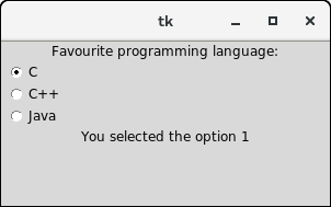
Next TopicPython Tkinter Scale
|
 For Videos Join Our Youtube Channel: Join Now
Feedback
- Send your Feedback to [email protected]
Help Others, Please Share


Like/Subscribe us for latest updates or newsletter 


