| |
Python Tutorial
Python OOPs
Python MySQL
Python MongoDB
Python SQLite
Python Questions
Plotly
Python Tkinter (GUI)
Python Web Blocker
Python MCQ
Related Tutorials
Python Programs

PltPcolor Python
Examples:The examples below show how the matplotlib.pyplot.pcolor() function operates. Example 1: Using the pcolor() method to create images. We may create 2-D image-style plots using the pcolor() method, as illustrated below. Code: Output: 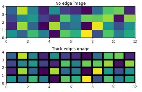
Example 2: Using Log scale with pcolor():Code: Output: 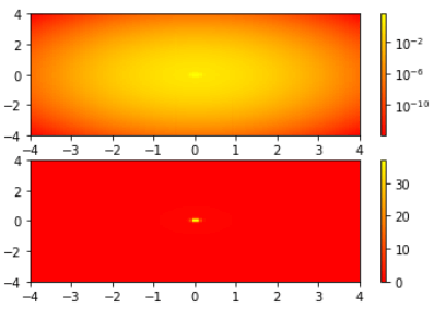
Example 3: Using pcolor().Code: Output: 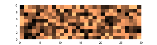
Multiplot Grid: Combining multiple charts can result in effective visualisations that can be utilised in a variety of projects, including this blog page. If you're interested in learning more about Python's support for multiple charts, you can check out this related tutorial: Here is an example of a Multiple Pcolor Chart Grid utilising the pyplot.pcolor function and pyplot.subplot() as seen below: Code: Output: 
Edgecolors Parameter: Edgecolors: This parameter specifies the hue of the lines dividing the grids. By setting the linewidths parameter to 0, as described below, you can also choose not to use the edge option. Simply put, linewidths are used to specify the width of the lines connecting pcolor grids. Colormaps can be applied to the entire chart with cmap. Saving pcolor plots: Using the code below, you can save pcolor plots just like other Pyplot charts. Just type the complete or relative path as shown below inside the savefig method: Conclusion:This Python Visualization Tutorial showed us how to use the pcolor function of PyPlot to create and save Python pcolor charts. pcolor(C) uses the values in matrix C to produce a pseudocolor plot. In a pseudocolor plot, matrix data is shown as a collection of coloured cells (known as faces). MATLAB® generates this image as a flat surface on the x-y axis. The surface is defined by an x- and y-coordinate grid corresponding to the corners (or vertices) of the faces.The grid encompasses the area where [m,n] = size and X=1:n and Y=1:m (C). The vertices' colors are defined by matrix C. Each face's colour is influenced by the colorof one of the four vertices around it. Which of the four vertices shows first in the x-y grid determines the color of the face. Through a few examples, we proved our understanding of the key pcolor settings and properties.
Next TopicPython Openssl Generate Certificate
|
 For Videos Join Our Youtube Channel: Join Now
Feedback
- Send your Feedback to [email protected]
Help Others, Please Share


