| |

Plotly with Matplotlib and Chart StudioMatplotlibPopular Python data visualization toolkit Matplotlib can create static yet production-ready graphs. The mpl_to_plotly() function in the plotly.tools package allows you to turn static Matplotlib figures into interactive graphs. The following script produces a Sine wave Line plot using Matplotlib's PyPlot API. Now we shall convert it into a plotly figure as follows ? OUTPUT: The Output for the following program will be: 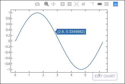
Chart StudioPlotly makes Chart Studio, an online tool for creating plots, available. It offers a graphical user interface for adding data to a grid, using stats tools, and analyzing it. Graphs can be downloaded or embedded. It is mostly used to make graph creation faster and more effective. Visit the URL https://plot.ly/create to launch the Chart Studio app after logging into your Plotly account. Below the plot area, the webpage gives a blank worksheet. Plot traces can be added in Chart Studio by selecting the Add Trace button. 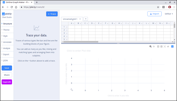
The menu offers the ability to save, export, and share plots and several plot structure components, including annotations, style, and others. Add some data to the worksheet and select a bar plot from the available trace types. 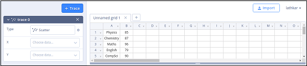
Click in the type text box and select bar plot. 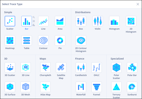
Then, enter the plot title by providing data columns for the x and y axes. 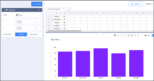
InstallationUse the package manager pip inside your Terminal to install Chart Studio's Python package. If you don't have pip installed on your machine, click here for pip's installation instructions. or Plotly's Python package is installed alongside the Chart Studio package and is updated frequently! To upgrade, run: Initialization for Online PlottingChart Studio provides a web service for hosting graphs! Create a free account to get started. Graphs are saved inside your online Chart Studio account, and you control the privacy. Public hosting is free; check out our paid plans for private hosting. After installing the Chart Studio package, you're ready to fire up Python: Python and set your credentials: It would help if you replaced 'DemoAccount' and 'lr1c37zw81' with your Plotly username and API key. The initialization step places a special .plotly/.credentials file in your home directory. Your ~/.plotly/.credentials file should look something like this: Online Plot PrivacyThree types of privacy settings are available for the plot: public, private, and secret. Public: This graph is open to everyone. It can show up in search engine results and your profile. This chart can be seen without logging into Chart Studio. This plot is private, only you can see it. It won't appear in search results, your profile, or the Plotly feed. For you to access this graph, you must be logged into Plotly. Other Chart Studio users can read this plot privately if you provide them access to your online Chart Studio account. They must be logged in to do so. By default, all plots are set to public. Users with free accounts have permission to keep one private plot. If you need to save private plots, upgrade to a pro account. If you're a Personal or Professional user and would like the default setting for your plots to be private, you can edit your Chart Studio configuration: Special Instructions for Chart Studio Enterprise UsersYour public cloud account's API key will be distinct from the API key for Chart Studio Enterprise. To locate your Chart Studio Enterprise API key, go to https://plotly.your-company.com/settings/api/. Don't forget to substitute the URL for your Chart Studio Enterprise server for "your-company.com." Change the Python API endpoint to point to your company's Plotly server rather than Plotly's cloud if your business has a Chart Studio Enterprise server. In python,: You can edit the graph with Python if you wish to use Plotly's default graph appearance. Frequently, we arrive at a visualization first and then the data rather than the other way around. Plotly is helpful for rapid exploration using matplotlib or the Plotly API. Insights and correlations that may be hidden in data can be explored, understood, and communicated with the help of data visualization. The core of data science is good visualization, whether for an initial exploratory study or a presentation to non-technical colleagues. The appropriate tool for the job relies on the type of data, the goal of the visualization, and the aesthetics you want to accomplish when deciding how to visualize data. In this essay, I'll contrast and show how to utilize matplotlib and Plotly, two popular Python visualization tools. Matplotlib vs. Plotly: Plotting Data with MatplotlibThe simplest method for plotting data in Python is Matplotlib. Users have complete flexibility over typefaces, line styles, colors, and axes attributes, much like when plotting in MATLAB. Even though it requires many additional lines of code, this enables comprehensive customization and precise control over each plot's aesthetics. Basemap and Cartopy are two third-party tools that enhance the capabilities of matplotlib and are excellent for visualizing geographic and map-like data. Higher-level interfaces are provided by Seaborn and Holoviews, making for a more natural experience. The Panda's package also includes Matplotlib, giving users a rapid and effective tool for exploratory analysis. I'll be using pandas in addition to Basemap, which doesn't come with the standard matplotlib installation. You can install Basemap by following the instructions here. To demonstrate the versatility of matplotlib, let's import a few different datasets: Two distinct datasets were taken from the UCI Machine Learning Repository. The first is a dataset on wine, which offers 178 precise observations of wine produced in the same Italian region. The 13 features that make up each observation are the outcome of a chemical analysis. ax = wine_df.plot(kind = 'scatter', x = 'Alcohol', y = 'OD280/OD315', c= 'Class', figsize=(12,8), colormap='jet') You'll see that every extra narrative aspect necessitates an extra line of code. This does not inherently increase complexity because Python is a clear-cut language, and beginners can understand each line. Adding other charting features with matplotlib simple, such as circles, lines, text, or even indicator arrows. You can find examples that show this here. The previous plots provide valuable information by showing us that two features are sufficient to divide the observations into three distinct clusters. The visualizations are rather straightforward. We can use Basemap to draw temperature data from each buoy in the El Nino dataset to demonstrate a somewhat more complicated example. Matplotlib and the numerous third-party packages based on it offer effective tools for charting data of different sorts. Despite being syntactically difficult, creating static visualizations of a high-caliber fit for publications or expert presentations is a great approach. Matplotlib vs. Plotly: Plotting Data with PlotlyAnother excellent Python visualization tool is Plotly, which works with geographic, scholarly, statistical, and financial data. Plotly, sometimes known as Plotly, is a firm brand that produces a full line of visualization tools for various programming languages that all enable the creation of interactive web-based visualizations and even web applications. Plotly is superior to matplotlib in several ways. Saves time when examining your dataset for the first time. Facilitates the modification and export of your plot and provides a more elaborate visualization ideal for communicating the significant insights buried in your dataset. Plotly provides a few capabilities that enable it to interact easily with pandas to increase plotting efficiency, just like matplotlib. Both an offline and an online option were available in earlier iterations of Plotly. Regardless of how you produce them, when you use plotly online, your data visualizations are automatically uploaded so that you can access them through the web interface. Although Chart Studio still offers this feature, I will use the offline version. An excellent choice for examining pandas' data frames is Plotly Express. It is a high-level wrapper included in the most recent version of Plotly. To create a scatter plot similar to the one we created with matplotlib, run: Feel free to play around with the interactive features of the plot. It is already clear that plotly creates superior visualizations to matplotlib with ease. It can also tackle our temperature data from the El Nino dataset without sweat. Try this: Notice that when you move your cursor over each buoy, the buoy number, temperature value, and location information are displayed. This is all done by default with Plotly, barely scratching the surface of what it can do. Matplotlib vs. Plotly: ConclusionsIn conclusion, matplotlib is a simple and rapid Python tool for building visualizations. It would be better suited for an early exploratory investigation or a simple design due to the vocabulary needed to create anything more complex than a basic plot. Due to the precise and logical declaration of each plot element, Matplotlib is a fantastic place for beginners to begin their education in data visualization. On the other hand, Plotly is a more advanced data visualization tool that is better suited for quickly producing intricate plots. Plotly's interactive features and sophisticated aesthetics are advantages that cannot be disregarded. Download and install the "Data Plotting" runtime environment for Windows 10 or CentOS 7, or create a unique Python runtime environment with just the packages you'll need for this project by creating a free ActiveState Platform account. JupyterLab Support -To use Plotly in jupyterrlab, install jupyterlab and ipywidget package using pip You'll need jupyter-dash to add widgets such as sliders, dropdowns, and buttons to Plotly charts in JupyterLab To start a jupyterLab, type the following command Jupyter Notebook Support -If you want to use plotly in classic jupyter notebook, then install Jupyter Notebook and ipywidgets using pip To start a jupyter notebook, type the following command in the command line or Terminal Chart studio support -The chart-studio package can upload plotly figures to Plotly's Chart Studio Cloud or On-Prem services. This package can be installed using a pip. Plotly Python example with code and dataTo create a graphical environment where you can create charts and display graphics, you must first utilize Zeppelin or Jupyter Notebook. After that, add Plotly to Python as follows: A well-liked Python library for building engaging and eye-catching data visualizations is called Plotly. It features interaction with Chart Studio for online sharing and collaboration, a high-level interface for creating charts and graphs, and Matplotlib for enhanced customization. Creating, customizing, and sharing interactive data visualizations using Plotly, Matplotlib, and Chart Studio. Part 1: Setting up the EnvironmentYou must ensure that the required libraries are installed before using Plotly with Matplotlib and Chart Studio. Using pip, you can install the following: Once the libraries are installed, you can import them into your Python script: Part 2: Creating Basic Visualizations with PlotlyPlotly offers a simple and intuitive API for creating various types of charts. Let's start by creating a basic scatter plot using Plotly's scatter function: This code generates a scatter plot using Plotly and displays it in your Jupyter Notebook or as a separate HTML file. Part 3: Enhancing Visualizations with Matplotlib IntegrationWhile Plotly is strong, combining it with Matplotlib will improve your visualizations. You can have precise control over how your charts look with Matplotlib. Use the to_mpl() method in Plotly to combine the two: With the help of Plotly, a scatter plot is created, converted to a Matplotlib figure, and then customized before being shown. Thanks to this connection, you may optimize your visualizations by using the full power of Matplotlib. Part 4: Interactive Features with PlotlyThe interactivity of Plotly is one of its main advantages. You can quickly add interactive elements like hover tooltips and zooming to your plots. Let's update our scatter plot to incorporate information about hovers: Now, labels will show up when you hover over data points. Part 5: Sharing Visualizations with Chart StudioPlotly's platform for online collaboration and data visualization sharing is Chart Studio. You can quickly submit your Plotly data to Chart Studio for sharing with others. You must first register for an account on the Chart Studio website. Once you've created an account, you may upload your Plotly figure to Chart Studio using the py.plot() function: Change "your_username" and "your_api_key" with your Chart Studio account details. The figure will be uploaded and opened in your default web browser using the py.plot() function. After that, you can invite people to participate in the visualization by sending the generated URL. Plotly:The Python graphing module Plotly enables you to design engaging and dynamic data visualizations. It offers a variety of high-level interfaces for making several types of plots, such as scatter plots, bar charts, line charts, and more. Plotly's important attributes include:Plotly visualizations come with an interactive feature by default. You can include features like hover tooltips, zooming, panning, and more to engage your audience and present thorough information. Usability: Plotly is simple and intuitive in its syntax, making it suitable for inexperienced and seasoned data scientists. Comparatively speaking, it frequently needs fewer lines of code than other visualization frameworks. Online platform: Plotly offers a tool called Chart Studio that allows you to post, share, and work with others on visualization projects. Integration: Plotly can be easily integrated with other libraries like Pandas, NumPy, and Matplotlib, allowing greater flexibility and customization. Here's an example of creating a line chart with Plotly: Matplotlib Integration with Plotly:Another well-liked Python library for producing static, highly customizable visualizations is Matplotlib. You can combine Plotly and Matplotlib to take advantage of the advantages of each library. You can make a plot using Plotly and then convert it to a Matplotlib figure for more precise customization. An instance of Matplotlib integration is shown here: Chart Studio is Plotly's online platform for sharing, working together on, and publishing interactive data visualizations. You can: Publish Visualisations: You may add your Plotly data to Chart Studio and share your visualizations as separate web pages or applications. Collaboration is supported by Chart Studio, allowing multiple users to edit the same visualization at once. Customization: In Chart Studio, you may add annotations, change data, and further customize your plots' layouts. Controlling Your Visualisations' Privacy Chart Studio offers tools for managing your visualizations' privacy settings. You can make them visible to everyone, only selected users, or private. An illustration of how to upload a Plotly figure to Chart Studio is given below: Change "your_username" and "your_api_key" with your Chart Studio account details. The figure will be uploaded using the py.plot() function, and you can provide people access to the produced URL. An essential tool for comprehending and delivering data insights is data visualization. There are other visualization packages available in Python. However, Plotly stands out for its interactive features. Additionally, you may use Chart Studio for online sharing and collaboration, combine Plotly with Matplotlib for fine-grained customization, and more. This thorough tutorial will show you how to use Plotly, combine it with Matplotlib, and utilize Chart Studio to make, improve, and share interactive data visualizations. A strong Python package that specializes in producing engaging and interactive data visualizations is called Plotly. It is a flexible tool that supports many different chart formats, ranging from straightforward scatter plots to intricate 3D visualizations and geographic maps. Plotly stands out due to its emphasis on interaction, which makes it a great option for data exploration and display. Key Features of PlotlyPlotly has several features that make it a preferred option for data scientists and analysts, including: Plotly visualizations are designed to be interactive. You can include features like hover tooltips, zooming, panning, and click events to engage your audience and provide them with more context for the data. Usefulness: Plotly offers a simple API that enables you to build intricate visualizations using only a small amount of code. Because of this, both new and seasoned users can use it. Online platform: Plotly provides a tool called Chart Studio that allows you to upload and distribute your visualizations to others. Additionally, this platform facilitates cooperation, making working as a team on tasks simpler. Integration: Plotly integrates seamlessly with other Python libraries like Pandas, NumPy, and Matplotlib. This allows you to leverage your existing data analysis workflows. 2. Getting Started with PlotlyInstallation Before you can start using Plotly, you need to install it. You can do this using pip: Basic Plotly UsagePlotly offers a variety of high-level interfaces for making various charts and graphs. Here is an example of how to use Plotly to make a straightforward scatter plot: In this example, we import Plotly, make a scatter plot, and add title and axis labels. Finally, we use Fig.show() to visualize the plot. Creating a Simple Scatter Plot
3. Enhancing Visualizations with MatplotlibWhile Plotly is strong, combining it with Matplotlib will improve your visualizations. Regarding fine-grained customization, Matplotlib is renowned for giving you complete control over your plots. Plotly and Matplotlib combined. Together, Plotly and Matplotlib may be used with ease. Using Plotly, you may make a plot that can later be transformed into a Matplotlib figure for more customization. Here is how to go about it: In this example, we first use Plotly to build a scatter plot, and then we use fig.to_mpl() to change it into a Matplotlib figure. After conversion, the Matplotlib figure is further customized with a title and axis labels before being shown using plt.show(). Converting Plotly Figures to MatplotlibThe secret to converting a Plotly figure into a Matplotlib figure is the fig.to_mpl() method. It keeps the Plotly plot's visual characteristics while letting you use Matplotlib's customizable features. Adaptation using Matplotlib Matplotlib's capability to precisely control the appearance of your plots is one of its advantages. Line styles, marking types, colors, annotations, and other features are all configurable. An illustration of how to alter a Matplotlib figure derived from a Plotly plot is shown here: Grid lines have been added by invoking plt.grid(True) on the Matplotlib figure in this example. This is merely one of many customization choices that Matplotlib offers. 4. Adding Interactivity with PlotlyOne of the standout features of Plotly is its interactivity. You can easily add interactive elements to your visualizations to engage your audience and provide additional insights. Hover Tooltips Hover tooltips are a great way to display additional information when a user hovers their mouse over data points. Here's how you can add hover tooltips to a Plotly scatter plot: We've added a "label" column to the data in this example, and we use the text argument in px.scatter to signal that the "label" column should be displayed as hover text. Label placement about data points can be adjusted using the textposition option. Zooming and PanningPlotly's integrated zooming and panning capabilities make it simple for users to study data thoroughly. These options are pre-installed in Plotly visualizations. Users can pan by clicking and dragging the plot and zoom in by selecting a portion of the plot. Adding AnnotationsAnnotations are an effective approach to provide your visualizations context and explanations. You can annotate particular plot points or data points. Here is an illustration of how to annotate a Plotly scatter plot: In this example, we'll use fig.add_annotation to add an annotation with the word "Important Point" at coordinates (3, 12). We altered the annotation's look, including the arrow, text color, and size. 5. Sharing and Collaborating with Chart StudioChart Studio is Plotly's online platform for sharing, collaborating, and publishing data visualizations. It streamlines the process of making your interactive plots accessible to others. Introduction to Chart Studio Chart Studio is accessible through a web-based interface, and it offers the following advantages: Online sharing: Plotly visualizations can be shared as stand-alone web pages by uploading them to Chart Studio. This is especially helpful for disseminating information to non-technical stakeholders and a larger audience. Editing collaboratively in real-time is supported by Chart Studio. Multiple users can collaborate on the same visualization simultaneously, so it is an effective tool for group tasks. Customization in the Cloud: You can add more customizations to your Plotly visualizations within Chart Studio. This implies that you can change your visualizations without having to start over. Chart Studio has several privacy settings available. You have complete control over who may view your work since you can decide whether to make your visualizations public, private, or shared solely with select individuals. Embedding: Chart Studio makes it easy to embed your interactive visualizations into websites, blogs, reports, and applications. This makes your data-driven content more accessible. Uploading Visualizations to Chart Studio To start with Chart Studio, you must create an account on the Chart Studio website. Once you have an account, you can upload Plotly figures and share them. Here's an example of how to upload a Plotly figure to Chart Studio: Replace "your_username" and "your_api_key" in this code with the login information for your Chart Studio account. Your credentials are set using the tools.set_credentials_file method and the Plotly figure is uploaded to Chart Studio using py.plot. The visualization will also launch on your default web browser. Collaboration and Privacy ControlYou can work together on your visualizations with others using Chart Studio. Multiple users can collaborate on your visualization once when you share the link. Additionally, Chart Studio has other privacy options: Public: Your visualization is accessible to everyone. Private: The visualization can only be accessed by you, its creator. Shared: You can limit which users have access to the visualization. Integration of Visualisations It's simple to integrate your Chart Studio visualizations into other platforms. Chart Studio's embed code can be added to websites, blogs, or software programs. As a result, you can easily incorporate interactive storylines into your digital content. 6. Advanced Plotly FeaturesPlotly offers advanced features and capabilities that go beyond the basics. Let's explore some of these advanced features. Plotly Express Plotly Express is a high-level interface for creating a wide range of visualizations with minimal code. It simplifies the process of creating complex plots. Here's an example of a Plotly Express bar chart: Conclusion:In conclusion, combining Plotly with Chart Studio, Matplotlib, and other tools offers a strong method for creating, customizing, and sharing interactive data visualizations. Plotly improves your capacity to produce interactive and dynamic charts, whereas Matplotlib is a well-known Python package for static plots. You can share these interactive charts online and collaborate with others using Chart Studio, a feature of Plotly. You may easily switch from a Matplotlib plot to a Plotly plot, add interactivity, and publish it to Chart Studio for online sharing and collaboration by following the instructions in the preceding comment. This mix of libraries and tools provides a flexible and user-friendly method for creating and sharing data visualizations in a range of situations, from data analysis to presentations and reports.
Next TopicPlotly with Pandas and Cufflinks
|
 For Videos Join Our Youtube Channel: Join Now
Feedback
- Send your Feedback to [email protected]
Help Others, Please Share


