| |

Stacked Bar Charts using PygalBar charts are a popular way to visualize and compare data across different categories. When dealing with multiple data series contributing to a whole, stacked bar charts offer a compelling solution. PyGal, a versatile Python library for creating interactive charts, allows you to create stacked bar charts that effectively display data distribution easily. In this article, we will delve into the world of stacked bar charts in PyGal, exploring their creation, customization, and practical applications. What is a Stacked Bar chart?Stacked bar charts are a variation of the traditional bar chart that enables you to display multiple data series stacked one on the other on a single bar. This allows viewers to understand the individual values of each category and the cumulative contribution of each data series to the total. Stacked bar charts are particularly useful for showcasing data composition within categories. When to use a Stacked Bar ChartStacked bar charts are used in various situations where you must represent and compare data across different categories while showing the cumulative composition of multiple data series. They are particularly useful when you want to emphasize both the individual values within each category and the overall contribution of each data series to the whole. Here are some common scenarios where stacked bar charts are used:
Remember, the key advantage of stacked bar charts is their ability to display individual and cumulative values visually and intuitively. However, like any data visualization technique, they should be used thoughtfully to ensure the message is clear and not misleading to the audience. Advantages of Stacked Bar Chart:1. Data Composition:Stacked bar charts excel at illustrating how different components contribute to a whole. They provide a visual representation that lets viewers quickly grasp each category's relative proportions within a single bar. This advantage is particularly useful when you want to show the composition of a total value, such as expenses in a budget or the distribution of energy sources in a country's energy production. 2. Comparison Across Categories:Stacked bar charts allow for easy comparison of multiple data series across different categories. By stacking the segments on top of each other, these charts provide a clear view of the individual values within each category and the cumulative totals. This feature is especially helpful when you need to compare the distribution of data across various groups, such as sales performance of products or demographic data. 3. Highlighting Patterns:Stacked bar charts can effectively highlight patterns and trends in data. For example, when depicting changes over time, each bar can represent a distinct period, and the stacked segments can help viewers observe shifts in data distribution over those periods. This is particularly advantageous for revealing changes in proportions or showing how different factors contribute to a changing total. 4. Emphasis on Total:One of the key advantages of stacked bar charts is their ability to emphasize the cumulative total. This can be valuable when you want to showcase different components' overall impact or share. By visualizing how each segment adds up to the total, you can help viewers understand the significance of each category within the larger context. 5. Simple and Clear:Stacked bar charts provide a simple and clear representation of data. They are intuitive to understand and can effectively communicate complex information without overwhelming the audience with intricate details. This makes them suitable for a wide range of audiences, including those needing better versed in data analysis techniques. 6. Storytelling:Stacked bar charts can be used to tell a compelling, data-driven story. By visually illustrating how different elements contribute to an outcome or scenario, you can guide your audience through the narrative you wish to convey. This storytelling approach can make your data more engaging and memorable. In summary, stacked bar charts offer several advantages, making them a powerful data visualization tool. They showcase data composition, facilitate comparisons across categories, and highlight patterns and trends. Their emphasis on cumulative totals, simplicity, and ability to support storytelling further enhance their effectiveness in conveying meaningful insights from your data. Disadvantages of Stacked Bar Charts:1. Complex Data Comparison:While stacked bar charts are effective for comparing data within a category, they can be less suitable for comparing absolute values between different categories. The focus on cumulative totals might need clearer to compare individual data points, especially when the categories have significantly different totals. 2. Misinterpretation:There's a potential for misinterpretation when using stacked bar charts. Viewers might be more inclined to focus on the differences between the cumulative totals of the segments rather than the individual values within each category. This can lead to an inaccurate understanding of the data's finer details. 3. Limited for Large Data Sets:Stacked bar charts can become cluttered and challenging to read when dealing with many data series or categories. As more segments are stacked, the bars can become visually overwhelming and difficult to distinguish, making it harder for viewers to extract meaningful insights. 4. Loss of Detail:As more data series are stacked within a single bar, the lower segments of the bars can become hard to discern visually. This loss of detail might hinder viewers from accurately interpreting the specific values of those lower segments, especially if the data is complex or nuanced. 5. Lack of Precision:Stacked bar charts are less suited for precise data analysis, such as comparing exact values, due to the inherent complexity of cumulative values. If you need to perform precise calculations or make fine-grained comparisons, other chart types, like clustered or grouped bar charts, might be more suitable. 6. Color Dependency:The effective use of color is crucial in stacked bar charts. Poor color choices or accessibility issues, such as colorblindness, can hinder understanding and confuse viewers. Over-reliance on color to distinguish segments can create barriers for those who need help perceiving certain colors. 7. Limited for Negative Values:Stacked bar charts need to be better suited for representing negative values. When negative values are present, the stacking arrangement can lead to misleading interpretations, as the lower segments might be positioned above the zero baseline. 8. Focus on Relative Proportions:While stacked bar charts are excellent at showing relative proportions within each category, there might be better choices for displaying precise values or absolute quantities. If your primary goal is to convey exact values, other chart types might be more suitable, like grouped bar charts or simple bar charts. In conclusion, while stacked bar charts have advantages, such as illustrating data composition and cumulative contributions, they also come with limitations that must be carefully considered. They may only be optimal for some data and comparisons, especially when precise values, direct comparisons between categories, or negative values are involved. When using stacked bar charts, it's important to ensure that they effectively convey the intended message and are easily interpretable by your target audience. Python Implementation of StackedBarIn this example, we'll create a simple stacked bar chart to visualize the sales distribution of two products (Product A and Product B) across different regions. 1. Import PygalIn this section, we import the Pygal library, which provides the tools to create various interactive charts, including the stacked bar chart. 2. Prepare your DataDefine your data. We'll use sample sales data for two products across different regions in this example. Here, we define the data that we want to visualize. In this example, we have two data series (product_a_sales and product_b_sales) representing the sales of two products across different regions (regions). 3. Create a Stacked Bar ChartCreate an instance of the StackedBar class from PyGal and set the title of your chart: We create an instance of the StackedBar class from the Pygal library. This will be the object we use to build our stacked bar chart. We also titled the chart "Sales Distribution by Region". 4. Add Data Series to the Chart:Add the data series for each product to the chart: Here, we add the data series to the chart. We specify the label for each data series (Product A and Product B) and provide the corresponding sales data (product_a_sales and product_b_sales). 5. Customize the ChartCustomize the chart by setting labels, titles, colors, and other properties. For example: In this section, we customize the appearance of the chart. We set the x-axis labels to the regions list, add x-axis and y-axis titles, place the legend at the bottom of the chart, and disable the "fancy" mode for tooltips. 6. Render and Display the ChartFinally, render the chart to a file or display it in the browser: Finally, we use the render_to_file method to generate an SVG file named 'stacked_bar_chart.svg' containing the rendered chart. This file can be opened in a web browser or embedded in documents or presentations. You can modify the data, labels, titles, and customization options based on your specific use case to create a stacked bar chart tailored to your data visualization needs. Output: 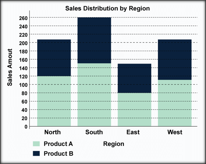
ConclusionIn summary, stacked bar charts represent a pivotal visualization technique, offering an insightful approach to comprehending data distribution and composition. This article has provided an accessible blueprint for constructing these charts using the PyGal library. Stacked bar charts excel in capturing relative proportions within categories, finding applications in diverse sectors, from business strategies to healthcare analytics. While stacked bar charts effectively simplify intricate datasets and enhance communication, it is vital to acknowledge their limitations and adhere to design best practices. By embracing PyGal's capabilities, users can craft interactive charts that present data-driven insights and facilitate sound decision-making processes. In the ever-evolving landscape of data visualization, stacked bar charts remain a versatile and adaptable tool, evolving alongside technology and data needs. As you craft meaningful visualizations, remember stacked bar charts' unique strengths and considerations, allowing them to play an essential role in your data exploration and communication endeavors. In the dynamic realm of data visualization, stacked bar charts continue to uphold their versatile and influential status. Empowered by PyGal's functionalities, one can readily harness their potential, contributing to compelling narrative construction and rigorous data scrutiny. As you navigate the intricacies of visual storytelling, stacked bar charts emerge as a steadfast ally, ready to unravel complex data threads and offer clarity in the pursuit of knowledge-driven understanding. |
 For Videos Join Our Youtube Channel: Join Now
Feedback
- Send your Feedback to [email protected]
Help Others, Please Share


