| |
Python Tutorial
Python OOPs
Python MySQL
Python MongoDB
Python SQLite
Python Questions
Plotly
Python Tkinter (GUI)
Python Web Blocker
Python MCQ
Related Tutorials
Python Programs

Pair Plot in PythonAn Introduction to Seaborn PairplotIn this tutorial, we will understand Seaborn Pairplot with the help of the pairplot() function in the Python programming language. This function can considerably help analyze the exploratory data for machine learning projects. We will also discover the syntax of the pairplot() function of the seaborn library and perform some of its examples. But before we get started, let us understand the Seaborn library in brief. What is the Seaborn library in Python?Python community provides an open-source library designed for data visualization known as Seaborn. Seaborn library has been developed on top of matplotlib library and closely integrated with the data structures of Pandas in Python. Visualization is the central concept of the Seaborn library, helping the users explore and understand the data. Since the Seaborn library combines and integrates different libraries, it is reasonably necessary for the learners to be familiar with NumPy, Matplotlib, and Pandas libraries. There are various functionalities that the Seaborn library provides. Some of them are listed below:
Now, let us understand how to download and install the Seaborn library. How to install the Seaborn library?In the following section, we will discuss the steps entangled in the installation process of the Seaborn Library. Using the pip installer We can install the latest version of the Seaborn library with the help of the pip installer. All we have to do is to type the following command in a command shell or terminal. Using the conda installer Anaconda is a multi-platform free Python distribution for SciPy stack available for Windows, Linux, and Mac. We can install the latest version of the Seaborn library using the conda installer using the command shown below: Apart from these two, we can install the development version of the Seaborn library. Installing Development version using GitHub In order to install the development version, we can go to the link given below: https://github.com/mwaskom/seabornSome Dependencies While downloading and installing the Seaborn library, there are few dependencies one has to take care of. These dependencies are as follows:
Initializing the Seaborn library Once we are done downloading and installing the Seaborn library, let us create an empty Python file and use the following syntax in order to initialize the library or Save the program and execute the file. If the program does not return the import error, the library has been installed successfully. Else consider reinstalling the library as described above. The Seaborn library provides the user to plot a wide range of plots such as:
In this tutorial, we will only be discussing Seaborn Pair Plots and the pairplot() function. So, let's get started. Understanding the Seaborn Pairplot functionThe Seaborn Pairplot function allows the users to create an axis grid via which each numerical variable stored in data is shared across the X- and Y-axis in the structure of columns and rows. We can create the Scatter plots in order to display the pairwise relationships in addition to the distribution plot displaying the data distribution in the column diagonally. The pairplot() function can also be used to showcase the subset of variables, or we can plot different types of variables on rows and columns. Let us have a look at the syntax of the Seaborn Pairplot function, shown below: Syntax of the Seaborn Pairplot function Parameters of Pairplot function:
Let us consider some examples to understand the working of the pairplot() function: Example 1: Output: 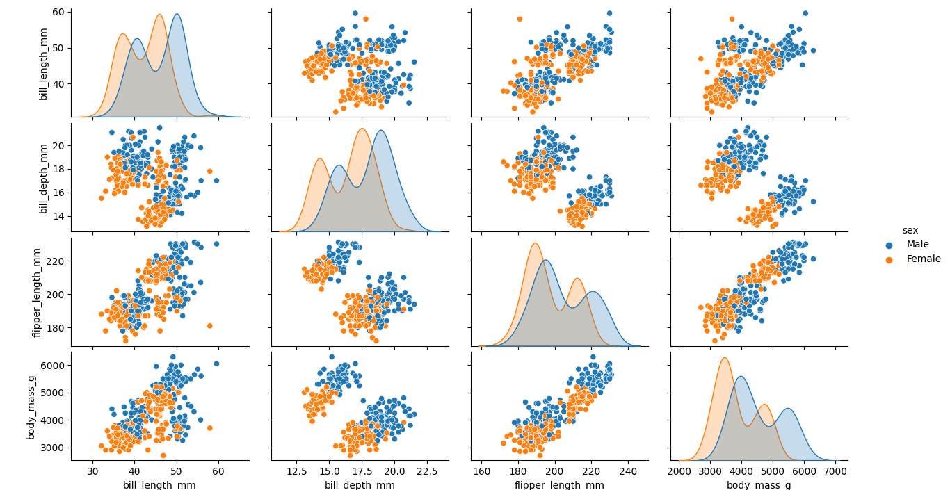
Explanation: In the above example, we have imported the required libraries and load the data set of penguins to work with using the Seaborn load_dataset() function. We have then used the pairplot() function to visualize the plot with the hue parameter set to the value 'gender'. At last, we have used the Matplotlib show() function to display the plot to the users. As a result, the pair plot has been generated successfully. Example 2: Output: 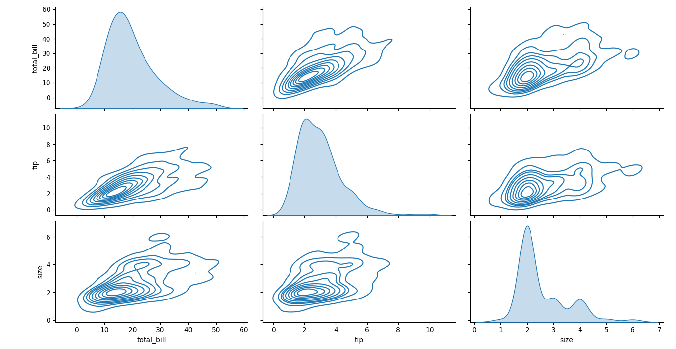
Explanation: In the above example, we have imported the required libraries and load the data set of tips to work with using the Seaborn load_dataset() function. We have then used the pairplot() function to visualize the plot with the kind parameter set to the value 'kde'. At last, we have used the Matplotlib show() function to display the plot to the users. As a result, the pair plot has been generated successfully.
Next TopicData Hiding in Python
|
 For Videos Join Our Youtube Channel: Join Now
Feedback
- Send your Feedback to [email protected]
Help Others, Please Share


